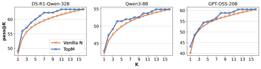
## Chart: pass@K vs. K for Different Models
### Overview
The image presents three line charts, each depicting the relationship between 'pass@K' (y-axis) and 'K' (x-axis) for different language models: DS-R1-Owen-32B, Qwen3-8B, and GPT-OSS-20B. Each chart compares two data series: "Vanilla N" and "TopM". The charts visually demonstrate how the 'pass@K' metric changes as the value of 'K' increases for each model and sampling method.
### Components/Axes
* **X-axis Label:** "K" - ranging from 1 to 15, with markers at integer values.
* **Y-axis Label:** "pass@K" - ranging from approximately 40 to 65, with markers at intervals of 5.
* **Chart Titles:**
* "DS-R1-Owen-32B" (Top-left chart)
* "Qwen3-8B" (Top-center chart)
* "GPT-OSS-20B" (Top-right chart)
* **Legend:** Located in the top-left corner of each chart.
* "Vanilla N" - represented by an orange line with a circular marker.
* "TopM" - represented by a blue line with a circular marker.
### Detailed Analysis or Content Details
**Chart 1: DS-R1-Owen-32B**
* **Vanilla N:** The line slopes upward, starting at approximately 50 at K=1, reaching around 58 at K=7, and plateauing around 62-63 from K=9 onwards. Approximate data points: (1, 50), (3, 53), (5, 56), (7, 58), (9, 61), (11, 62), (13, 62), (15, 63).
* **TopM:** The line also slopes upward, but starts higher at approximately 53 at K=1, reaches around 63 at K=7, and plateaus around 64-65 from K=9 onwards. Approximate data points: (1, 53), (3, 58), (5, 61), (7, 63), (9, 64), (11, 64), (13, 65), (15, 65).
**Chart 2: Qwen3-8B**
* **Vanilla N:** The line slopes upward, starting at approximately 43 at K=1, reaching around 54 at K=7, and plateauing around 56-57 from K=9 onwards. Approximate data points: (1, 43), (3, 47), (5, 51), (7, 54), (9, 56), (11, 56), (13, 57), (15, 57).
* **TopM:** The line slopes upward, starting at approximately 42 at K=1, reaching around 55 at K=7, and plateauing around 57-58 from K=9 onwards. Approximate data points: (1, 42), (3, 46), (5, 50), (7, 55), (9, 57), (11, 57), (13, 58), (15, 58).
**Chart 3: GPT-OSS-20B**
* **Vanilla N:** The line slopes upward, starting at approximately 41 at K=1, reaching around 52 at K=7, and plateauing around 55-56 from K=9 onwards. Approximate data points: (1, 41), (3, 45), (5, 49), (7, 52), (9, 55), (11, 55), (13, 56), (15, 56).
* **TopM:** The line slopes upward, starting at approximately 44 at K=1, reaching around 56 at K=7, and plateauing around 58-60 from K=9 onwards. Approximate data points: (1, 44), (3, 48), (5, 52), (7, 56), (9, 58), (11, 59), (13, 60), (15, 60).
### Key Observations
* In all three charts, "TopM" consistently outperforms "Vanilla N" across all values of K.
* The performance gains from "Vanilla N" to "TopM" appear to diminish as K increases, with the lines flattening out and converging at higher K values.
* DS-R1-Owen-32B generally achieves the highest 'pass@K' values, followed by GPT-OSS-20B, and then Qwen3-8B.
* The rate of improvement in 'pass@K' with increasing K is steepest at lower K values (1-7) for all models and sampling methods.
### Interpretation
The charts demonstrate the impact of different sampling methods ("Vanilla N" and "TopM") on the 'pass@K' metric for three different language models. 'pass@K' likely represents the percentage of times the model successfully completes a task when considering the top K possible outputs. The consistent outperformance of "TopM" suggests that selecting from the most probable outputs (TopM) leads to higher success rates compared to a more naive sampling approach ("Vanilla N").
The diminishing returns observed at higher K values indicate that beyond a certain point, increasing the number of considered outputs does not significantly improve performance. This suggests that the most informative outputs are concentrated within the top K possibilities, and exploring beyond that point yields diminishing benefits.
The differences in overall 'pass@K' values between the models suggest varying levels of capability. DS-R1-Owen-32B appears to be the most capable model, followed by GPT-OSS-20B and Qwen3-8B, based on this metric. The charts provide valuable insights into the trade-offs between sampling methods and model performance, which can inform the selection of appropriate configurations for specific applications.