## Horizontal Stacked Bar Chart: Answer Confidence Score (all queries)
### Overview
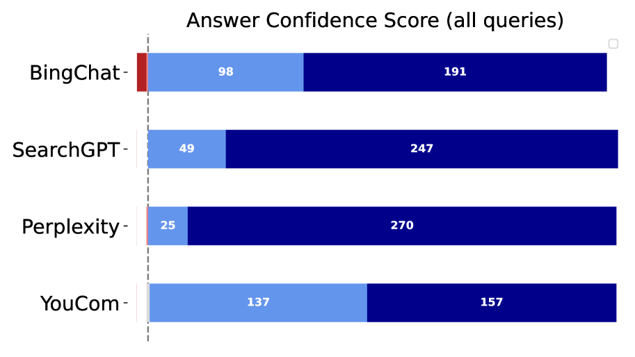
The image displays a horizontal stacked bar chart titled "Answer Confidence Score (all queries)". It compares four different AI-powered search or chat systems based on a metric of "confidence score," which is broken down into two distinct, color-coded components for each system. The chart presents numerical counts for each component within the bars.
### Components/Axes
* **Chart Title:** "Answer Confidence Score (all queries)" (centered at the top).
* **Y-Axis (Categories):** Lists four systems from top to bottom:
1. BingChat
2. SearchGPT
3. Perplexity
4. YouCom
* **X-Axis:** Represents a numerical count. There are no explicit axis labels, tick marks, or a scale provided. The values are instead embedded directly within the bar segments.
* **Bars:** Each system has a single horizontal bar composed of two stacked segments.
* **Left Segment:** Light blue color.
* **Right Segment:** Dark blue color.
* **Legend:** **No legend is visible in the provided image.** The meaning of the light blue and dark blue segments is not defined.
* **Other Elements:** A vertical dashed gray line runs from the top to the bottom of the chart area, positioned just to the right of the y-axis labels. A small, empty checkbox icon is visible in the top-right corner of the chart area.
### Detailed Analysis
The chart provides the following numerical data for each system, listed as [Light Blue Segment Value, Dark Blue Segment Value]:
1. **BingChat:**
* Light Blue: 98
* Dark Blue: 191
* **Total (Implied):** 289
* **Trend:** The dark blue segment is approximately twice the size of the light blue segment.
2. **SearchGPT:**
* Light Blue: 49
* Dark Blue: 247
* **Total (Implied):** 296
* **Trend:** The dark blue segment is significantly larger (about 5x) than the light blue segment.
3. **Perplexity:**
* Light Blue: 25
* Dark Blue: 270
* **Total (Implied):** 295
* **Trend:** The dark blue segment is overwhelmingly dominant, being over 10 times larger than the very small light blue segment.
4. **YouCom:**
* Light Blue: 137
* Dark Blue: 157
* **Total (Implied):** 294
* **Trend:** The two segments are relatively balanced, with the dark blue segment being only slightly larger.
### Key Observations
* **Total Query Count Consistency:** The implied total count for each system (sum of both segments) is very consistent, ranging from 289 to 296. This suggests the chart likely compares performance across the same or a very similar set of ~295 queries.
* **Dominant Segment Variation:** There is a dramatic variation in the proportion of the two confidence score components across systems. Perplexity shows the most extreme skew towards the dark blue component, while YouCom shows the most balanced distribution.
* **Inverse Relationship:** There appears to be an inverse relationship between the light blue and dark blue values across the first three systems (BingChat, SearchGPT, Perplexity). As the light blue value decreases, the dark blue value increases.
* **YouCom as an Outlier:** YouCom breaks the inverse trend observed in the first three systems. It has the highest light blue value (137) and a moderate dark blue value (157), resulting in a profile distinct from the others.
* **Missing Context:** The critical absence of a legend or axis label for the "confidence score" components makes definitive interpretation impossible. The vertical dashed line's purpose is also unclear without a label.
### Interpretation
This chart visualizes a comparative analysis of how four AI systems distribute their "answer confidence" across two unlabeled categories for a fixed set of queries.
* **What the Data Suggests:** The data implies a fundamental difference in how these systems generate or report confidence. Perplexity's profile (very low light blue, very high dark blue) suggests it is either highly confident or operates with a binary confidence model where most answers fall into one high-confidence bucket. In contrast, YouCom's balanced profile suggests a more graduated or uncertain confidence scoring system. BingChat and SearchGPT represent intermediate states.
* **Relationship Between Elements:** The systems are directly compared on the same metric. The consistent total count allows for a fair comparison of the *composition* of confidence scores, not just the absolute numbers. The vertical line may serve as a visual benchmark or separator, but its meaning is lost without a label.
* **Notable Anomalies:** The primary anomaly is the complete lack of semantic labels for the two confidence components. Without knowing what "light blue" and "dark blue" represent (e.g., "High/Medium Confidence," "Supported/Unsupported," "Certain/Uncertain"), the chart's practical insight is severely limited. It successfully shows a stark difference in distribution but fails to explain what that difference means. The chart is technically precise but informationally incomplete.