## Heatmap: Timing Analysis
### Overview
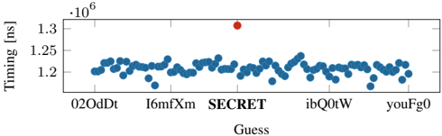
The heatmap displays the timing data for various guesses, with the x-axis representing different guesses and the y-axis representing the timing in nanoseconds (ns). The color intensity indicates the magnitude of the timing difference.
### Components/Axes
- **X-axis**: Labeled "Guess" with values ranging from "02OdDt" to "youFg0".
- **Y-axis**: Labeled "Timing [ns]" with values ranging from 1.2 to 1.35.
- **Legend**: Located at the top right corner, indicating the color coding for different guesses.
- **Data Points**: Blue dots representing the timing data for each guess.
### Detailed Analysis or ### Content Details
The heatmap shows a distribution of timing data with most points clustered around the 1.2 ns mark. There is a single red dot at approximately 1.35 ns, indicating a significant outlier. The color intensity varies, with darker shades representing higher timing differences.
### Key Observations
- The majority of guesses have a timing difference of around 1.2 ns.
- There is a notable outlier at 1.35 ns.
- The distribution is relatively even, with no single guess dominating the timing data.
### Interpretation
The heatmap suggests that most guesses have a timing difference of around 1.2 ns, which could indicate a consistent performance or a standard deviation in the timing data. The outlier at 1.35 ns could be due to a specific event or condition that caused a significant delay. The even distribution of data points suggests that the timing differences are relatively consistent across the guesses.