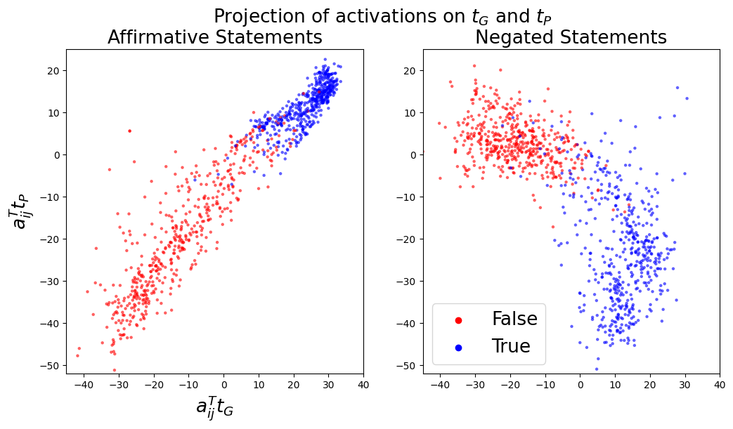
## Scatter Plot: Projection of activations on tG and tP
### Overview
The image consists of two scatter plots, side by side, showing the projection of activations on tG and tP for affirmative and negated statements. Each plot displays data points colored red (False) or blue (True). The x-axis represents aij^T tG, and the y-axis represents aij^T tP.
### Components/Axes
* **Title:** Projection of activations on tG and tP
* **Subtitles:**
* Left Plot: Affirmative Statements
* Right Plot: Negated Statements
* **X-axis (both plots):** aij^T tG
* Scale: -40 to 40, with tick marks every 10 units.
* **Y-axis (both plots):** aij^T tP
* Scale: -50 to 20, with tick marks every 10 units.
* **Legend (bottom-right):**
* Red: False
* Blue: True
### Detailed Analysis
**Left Plot: Affirmative Statements**
* **Red (False) Data Points:**
* Trend: The red data points form a somewhat linear cluster, generally sloping upwards from the bottom-left to the top-right.
* Range: X values range from approximately -40 to 10. Y values range from approximately -50 to 10.
* **Blue (True) Data Points:**
* Trend: The blue data points are clustered in the top-right quadrant.
* Range: X values range from approximately 0 to 30. Y values range from approximately 0 to 20.
**Right Plot: Negated Statements**
* **Red (False) Data Points:**
* Trend: The red data points are clustered in the top-left quadrant.
* Range: X values range from approximately -40 to 10. Y values range from approximately 0 to 20.
* **Blue (True) Data Points:**
* Trend: The blue data points form a curved cluster, generally sloping downwards from the top-right to the bottom-right.
* Range: X values range from approximately 0 to 40. Y values range from approximately -40 to 10.
### Key Observations
* In the Affirmative Statements plot, the "True" data points (blue) are clearly separated from the "False" data points (red), indicating a strong correlation between the activation projections and the truth value of the statement.
* In the Negated Statements plot, the "True" and "False" data points are more separated than in the Affirmative Statements plot, but still show a distinct clustering pattern. The "False" data points (red) are concentrated in the upper-left, while the "True" data points (blue) are concentrated in the lower-right.
### Interpretation
The plots visualize how activations are projected onto tG and tP for affirmative and negated statements, differentiating between true and false statements. The separation of "True" and "False" data points in both plots suggests that the model is able to distinguish between these categories based on the activation projections. The different distributions in the Affirmative and Negated Statements plots indicate that negation affects the activation patterns. The model appears to represent truth and falsehood differently depending on whether the statement is affirmative or negated.