TECHNICAL ASSET FINGERPRINT
07134b4ef81b862d1bb470b4
Click to view fullscreen
Press ESC or click to close
FOUND IN PAPERS
EXPERT: healer-alpha-free VERSION 1
RUNTIME: free/openrouter/healer-alpha
INTEL_VERIFIED
\n
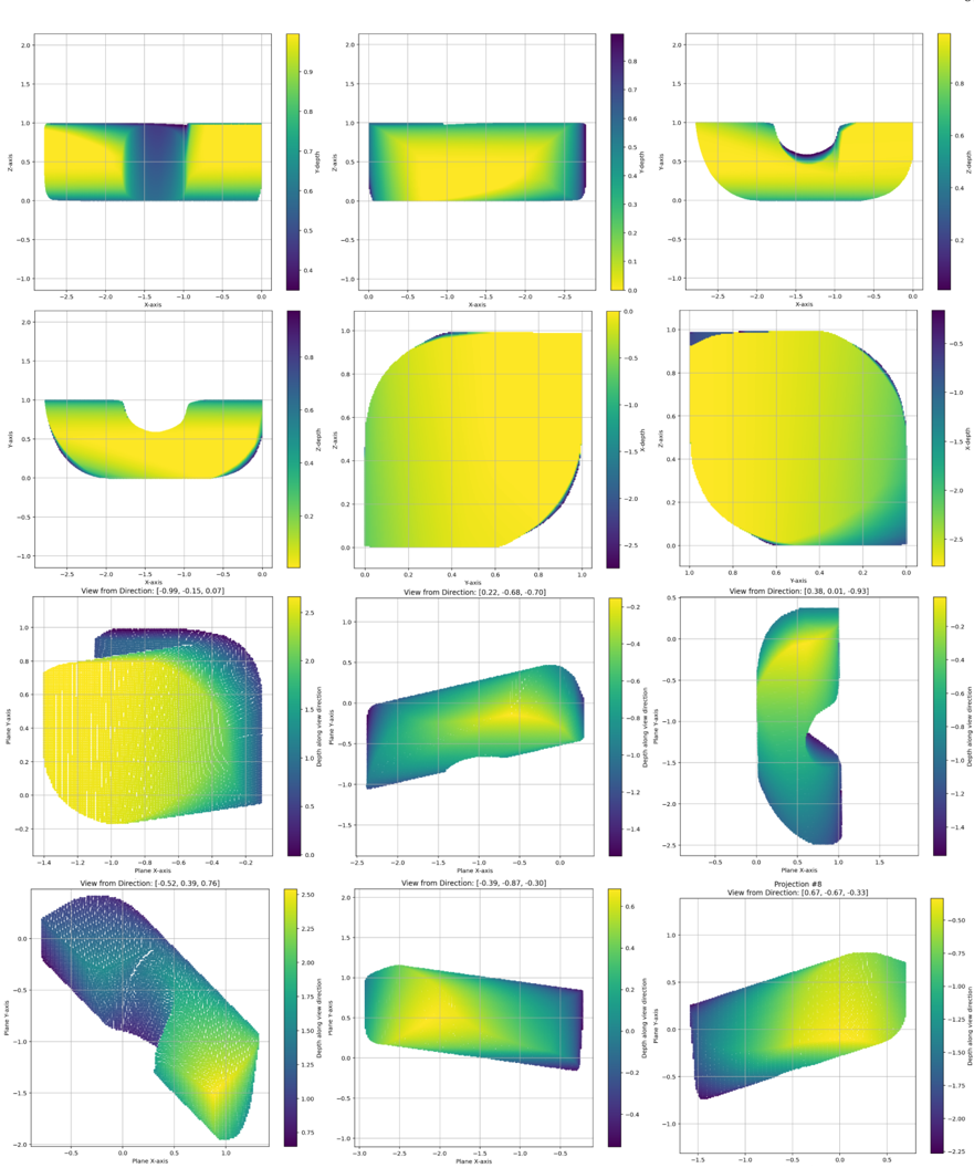
## 3D Scalar Field Visualization: Multi-View Projections
### Overview
The image displays a 4x3 grid of 12 subplots, each presenting a different 2D projection or view of a 3D scalar field. The visualization uses a consistent color map (dark blue/purple for low values, transitioning through green to yellow for high values) to represent the magnitude of a scalar quantity across a 3D surface or volume. The plots appear to be generated from scientific visualization software (e.g., Matplotlib, ParaView) and show a complex, non-convex geometric object from various angles.
### Components/Axes
* **Grid Structure:** 12 individual plots arranged in 4 rows and 3 columns.
* **Common Elements per Plot:**
* **2D Axes:** Each plot has an X-axis and a Y-axis (or Z-axis, depending on the view). Axis labels are consistently present but vary between "X-axis", "Y-axis", "Z-axis", "Plane X-axis", "Plane Y-axis", and "Depth along view direction".
* **Color Bar:** A vertical color bar is positioned to the right of each plot, mapping color to numerical values. The range varies per plot.
* **Grid Lines:** Light gray grid lines are present in the background of each plot.
* **View Annotations:** The bottom two rows (plots 7-12) include text above each plot specifying the camera orientation: "View from Direction: [x, y, z]" or "Projection #8".
* **Data Representation:** The data is shown as a filled contour plot or a surface plot with a color map. Some plots (notably 7, 10) also display an underlying wireframe mesh.
### Detailed Analysis
**Row 1 (Top):**
1. **Plot 1 (Top-Left):** View of a rectangular block with a central depression. Axes: X-axis (-2.5 to 0.0), Z-axis (-1.0 to 2.0). Color Bar: ~0.4 (dark blue) to ~0.9 (yellow). High values (yellow) dominate the top surface, with a low-value (blue) vertical band in the center.
2. **Plot 2 (Top-Center):** Side view of the same block. Axes: X-axis (0.0 to -2.5), Y-axis (-1.0 to 1.0). Color Bar: 0.0 to 0.8. Shows a gradient from high values (yellow) on the left to lower values (green/blue) on the right.
3. **Plot 3 (Top-Right):** View showing a U-shaped or channel-like structure. Axes: X-axis (-2.5 to 0.0), Z-axis (-1.0 to 2.0). Color Bar: 0.2 to 0.8. The interior of the "U" shows lower values (green/blue) compared to the outer surfaces (yellow).
**Row 2:**
4. **Plot 4 (Left):** Similar U-shaped view as Plot 3, but from a slightly different angle. Axes: X-axis (-2.5 to 0.0), Y-axis (-1.0 to 1.0). Color Bar: 0.2 to 0.8.
5. **Plot 5 (Center):** A near-circular or elliptical projection. Axes: X-axis (0.0 to 1.0), Z-axis (-2.5 to 0.0). Color Bar: -2.5 to 0.0. The entire region is high-value (yellow), suggesting this view captures a peak area.
6. **Plot 6 (Right):** Another circular projection, rotated 90 degrees from Plot 5. Axes: X-axis (0.0 to 1.0), Y-axis (-2.5 to 0.0). Color Bar: -2.5 to 0.0. Similar high-value (yellow) distribution.
**Row 3:**
7. **Plot 7 (Left):** "View from Direction: [0.99, -0.15, 0.07]". Shows a complex, rounded 3D shape with a visible wireframe mesh. Axes: Plane X-axis (-1.4 to -0.2), Plane Y-axis (-0.2 to 1.0). Color Bar: 0.0 to 2.5. A high-value (yellow) region is visible on the left, transitioning to lower values (blue) on the right.
8. **Plot 8 (Center):** "View from Direction: [0.22, -0.68, -0.70]". Shows a curved, elongated surface. Axes: Plane X-axis (-2.5 to 0.0), Depth along view direction (-1.5 to 0.5). Color Bar: -1.4 to -0.2. The surface shows a gradient from higher values (yellow/green) at the top to lower values (blue) at the bottom.
9. **Plot 9 (Right):** "View from Direction: [0.38, 0.01, 0.93]". Shows a vertical, fin-like structure. Axes: Plane X-axis (-0.5 to 1.5), Depth along view direction (-2.5 to 0.5). Color Bar: -1.4 to -0.2. A high-value (yellow) region is concentrated at the top of the structure.
**Row 4 (Bottom):**
10. **Plot 10 (Left):** "View from Direction: [0.52, 0.39, 0.76]". Shows a dense, angled view of the object with a prominent wireframe mesh. Axes: Plane X-axis (-0.5 to 1.0), Plane Y-axis (-2.0 to 0.0). Color Bar: 0.75 to 2.50. A strong gradient from high values (yellow) at the bottom-right to low values (blue) at the top-left is evident.
11. **Plot 11 (Center):** "View from Direction: [-0.39, -0.87, -0.30]". Shows a smooth, curved surface. Axes: Plane X-axis (-3.0 to -0.5), Depth along view direction (-1.0 to 1.0). Color Bar: -0.4 to 0.6. A central high-value (yellow) region is surrounded by lower values (green/blue).
12. **Plot 12 (Right):** "Projection #8", "View from Direction: [0.67, -0.67, -0.33]". Shows a twisted or folded surface. Axes: Plane X-axis (-1.5 to 0.5), Depth along view direction (-2.25 to -0.50). Color Bar: -2.00 to -0.50. The surface exhibits a complex gradient, with high values (yellow) along one edge and low values (blue) along another.
### Key Observations
1. **Consistent Color Mapping:** All plots use the same perceptual colormap (viridis-like), allowing for direct comparison of relative scalar values across different views.
2. **Geometric Complexity:** The object is not a simple primitive. It features flat surfaces, curved sections, depressions, and protrusions, as revealed by the changing profiles across views.
3. **View-Dependent Value Range:** The scalar value range on the color bars changes significantly between plots (e.g., Plot 5: -2.5 to 0.0 vs. Plot 7: 0.0 to 2.5). This indicates that different views are highlighting different regions of the scalar field's total range.
4. **Spatial Correlation of High Values:** High values (yellow) often appear on what seem to be outer surfaces or specific features (like the top of the fin in Plot 9), while low values (blue) are found in recesses or on opposing sides.
5. **Mesh Visibility:** The explicit wireframe in Plots 7 and 10 suggests these might be raw simulation meshes, while the others are smoothed or interpolated surface renders.
### Interpretation
This visualization is a comprehensive multi-view analysis of a 3D scalar field defined on a complex geometry. The scalar field could represent a physical quantity like temperature, stress, pressure, chemical concentration, or a mathematical function evaluated over the domain.
* **Purpose:** The grid of views is designed to provide a complete understanding of the spatial distribution of the scalar quantity, which cannot be grasped from a single perspective. It helps identify where maxima, minima, and gradients occur relative to the object's shape.
* **Data Suggestion:** The data suggests the scalar field is not uniform. It has distinct high-value and low-value regions that are spatially correlated with the geometry's features. The varying color bar ranges imply the visualization is likely "clipped" to show detail in specific value ranges for each view, rather than using a single global range.
* **Anomalies/Notable Points:** The most striking feature is the dramatic difference in value ranges. For instance, the circular views (Plots 5 & 6) show only negative values, while the view in Plot 7 shows only positive values. This strongly indicates the scalar field has both positive and negative regions, and these views are zoomed into those specific regimes. The "Projection #8" label on the final plot may indicate it is part of a larger series of analyzed projections.
* **Underlying Process:** The complexity of both the geometry and the scalar field distribution points to an output from a computational simulation (e.g., Finite Element Analysis, Computational Fluid Dynamics) or a detailed 3D scan/medical imaging dataset where a measured property is being visualized. The multiple "View from Direction" vectors are crucial for reconstructing the 3D mental model of the object and its associated data.
DECODING INTELLIGENCE...