TECHNICAL ASSET FINGERPRINT
07b89f94cb7e27ee5798ea98
Click to view fullscreen
Press ESC or click to close
FOUND IN PAPERS
EXPERT: healer-alpha-free VERSION 1
RUNTIME: free/openrouter/healer-alpha
INTEL_VERIFIED
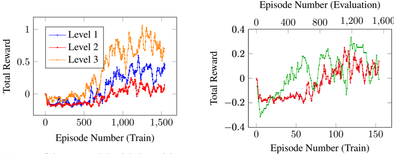
## Line Charts: Training Reward Progression Across Levels and Evaluation Phases
### Overview
The image contains two separate line charts presented side-by-side. Both charts plot "Total Reward" against "Episode Number," but they represent different experimental conditions or scales. The left chart compares three distinct "Levels" during training. The right chart appears to compare two different conditions (represented by green and red lines) across a dual-axis system that correlates training episodes with evaluation episodes.
### Components/Axes
**Left Chart:**
* **Chart Type:** Line chart with three data series.
* **X-Axis (Bottom):** Label: "Episode Number (Train)". Scale: Linear, from 0 to 1500, with major ticks at 0, 500, 1000, 1500.
* **Y-Axis (Left):** Label: "Total Reward". Scale: Linear, from 0 to 1, with major ticks at 0, 0.5, 1.
* **Legend:** Located in the top-left quadrant of the plot area. It defines three series:
* `Level 1`: Blue line with circular markers.
* `Level 2`: Red line with circular markers.
* `Level 3`: Orange line with circular markers.
**Right Chart:**
* **Chart Type:** Line chart with two data series and a dual x-axis.
* **X-Axis (Bottom):** Label: "Episode Number (Train)". Scale: Linear, from 0 to 150, with major ticks at 0, 50, 100, 150.
* **X-Axis (Top):** Label: "Episode Number (Evaluation)". Scale: Linear, from 0 to 1600, with major ticks at 0, 400, 800, 1200, 1600. This axis is aligned with the bottom axis, suggesting a fixed ratio (e.g., 1 train episode corresponds to ~10.67 evaluation episodes).
* **Y-Axis (Left):** Label: "Total Reward". Scale: Linear, from -0.4 to 0.4, with major ticks at -0.4, -0.2, 0, 0.2, 0.4.
* **Legend:** Not visible within the cropped image frame. The two lines are distinguished by color: green and red.
### Detailed Analysis
**Left Chart - Training Progress by Level:**
* **Trend Verification:**
* **Level 1 (Blue):** Shows a general upward trend with significant volatility. It starts near 0, dips slightly, then rises with large oscillations, reaching peaks near 0.6-0.7.
* **Level 2 (Red):** Exhibits a much flatter, noisier trend. It fluctuates primarily between -0.1 and 0.2, showing minimal net improvement over 1500 episodes.
* **Level 3 (Orange):** Demonstrates the strongest and most consistent upward trend. After an initial period near 0, it climbs steadily with moderate noise, achieving the highest rewards, frequently exceeding 0.8 and peaking above 1.0 (note: the y-axis limit is 1, but the line visually exceeds it, indicating a possible data point or rendering artifact at ~1.1 around episode 1300).
* **Key Data Points (Approximate):**
* At Episode 0: All levels start near Total Reward = 0.
* At Episode 500: Level 1 ≈ 0.1, Level 2 ≈ 0.0, Level 3 ≈ 0.2.
* At Episode 1000: Level 1 ≈ 0.4, Level 2 ≈ 0.1, Level 3 ≈ 0.7.
* At Episode 1500: Level 1 ≈ 0.4, Level 2 ≈ 0.1, Level 3 ≈ 0.9.
**Right Chart - Training vs. Evaluation Correlation:**
* **Trend Verification:**
* **Green Line:** Shows a clear, noisy upward trend. It starts at a significant negative reward, recovers to near zero around train episode 25, and then climbs into positive territory, peaking around 0.3.
* **Red Line:** Also shows an upward trend but with a different pattern. It starts near zero, dips sharply negative, recovers more slowly than the green line, and exhibits a pronounced spike/drop pattern in the later episodes (e.g., a sharp drop near train episode 120).
* **Key Data Points & Spatial Grounding (Approximate):**
* **Green Line:** Minimum at ~Train Ep 5 / Eval Ep ~53: Reward ≈ -0.3. Crosses zero around Train Ep 25 / Eval Ep ~267. Maximum around Train Ep 110 / Eval Ep ~1173: Reward ≈ 0.3.
* **Red Line:** Minimum at ~Train Ep 15 / Eval Ep ~160: Reward ≈ -0.2. Crosses zero around Train Ep 80 / Eval Ep ~853. Shows a local maximum near Train Ep 100 / Eval Ep ~1067: Reward ≈ 0.2, followed by a sharp drop.
### Key Observations
1. **Performance Hierarchy (Left Chart):** There is a clear and consistent performance hierarchy: Level 3 > Level 1 > Level 2. Level 3 not only achieves the highest reward but also shows the most stable improvement.
2. **Volatility:** All learning curves are highly volatile, indicating a stochastic training environment or high variance in the reward signal.
3. **Negative Rewards (Right Chart):** The right chart's y-axis includes negative values, suggesting a penalty-based reward system or a task where initial actions lead to worse-than-neutral outcomes.
4. **Dual-Axis Interpretation (Right Chart):** The alignment of the top (Evaluation) and bottom (Train) axes implies a fixed evaluation schedule. For example, an evaluation is likely performed every ~10.67 training episodes (1600 eval / 150 train).
5. **Divergent Late-Stage Behavior (Right Chart):** After train episode 100, the green and red lines diverge significantly in pattern, with the red line showing more extreme fluctuations.
### Interpretation
These charts likely visualize the training performance of reinforcement learning agents in a multi-level or multi-condition task.
* **Left Chart Interpretation:** The data suggests that the task difficulty or learning complexity varies significantly across "Levels." Level 3 appears to be the most conducive to learning, possibly due to a better-shaped reward function, more informative state representation, or a more tractable problem structure. Level 2 shows minimal learning, indicating a potential failure mode, insufficient exploration, or an improperly configured agent for that specific level.
* **Right Chart Interpretation:** This chart compares two different algorithms, hyperparameter settings, or environmental variants (green vs. red). The green condition demonstrates faster initial recovery from negative rewards and a higher peak performance. The red condition is slower to learn and exhibits instability later in training. The dual-axis setup is crucial for understanding the true sample efficiency; while the x-axis shows only 150 training episodes, the corresponding 1600 evaluation episodes suggest that evaluation is frequent, providing a dense signal of progress.
* **Overall Implication:** The contrast between the two charts highlights different aspects of evaluation. The left chart compares performance across distinct task categories (Levels), while the right chart compares learning dynamics between two methods on a single task, plotted against both training effort (episodes) and evaluation frequency. The high volatility across all curves underscores the challenge of achieving stable learning in this domain.
DECODING INTELLIGENCE...