## Line Graphs: Training and Evaluation Performance Across Levels
### Overview
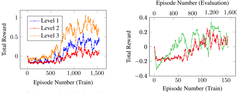
The image contains two line graphs comparing total reward performance across training episodes. The left graph tracks three levels (1, 2, 3) during training, while the right graph compares two models/conditions during evaluation. All data points are approximate due to visual estimation.
### Components/Axes
**Left Graph (Training):**
- **X-axis**: Episode Number (Train) ranging from 0 to 1,600
- **Y-axis**: Total Reward (0 to 1)
- **Legend**: Top-right corner with three entries:
- Blue line: Level 1
- Red line: Level 2
- Orange line: Level 3
**Right Graph (Evaluation):**
- **X-axis**: Episode Number (Train) ranging from 0 to 1,600
- **Y-axis**: Total Reward (-0.4 to 0.4)
- **Lines**:
- Green line (no legend label)
- Red line (no legend label)
- **Note**: No explicit legend present for the right graph.
### Detailed Analysis
**Left Graph Trends:**
1. **Level 3 (Orange)**:
- Starts near 0 at 0 episodes
- Sharp upward trend to ~0.8 by 600 episodes
- Peaks at ~1.0 around 1,200 episodes
- Declines to ~0.6 by 1,600 episodes
2. **Level 2 (Red)**:
- Begins near 0
- Gradual rise to ~0.6 by 1,000 episodes
- Peaks at ~0.8 around 1,400 episodes
- Fluctuates downward to ~0.4 by 1,600 episodes
3. **Level 1 (Blue)**:
- Starts near 0
- Slow rise to ~0.4 by 1,000 episodes
- Peaks at ~0.6 around 1,600 episodes
- Shows minimal fluctuation
**Right Graph Trends:**
1. **Green Line**:
- Starts at -0.2
- Steady upward trajectory to 0.4 by 1,600 episodes
- No significant dips after initial rise
2. **Red Line**:
- Begins at -0.2
- Sharp rise to 0.3 around 1,200 episodes
- Sharp decline to -0.1 by 1,600 episodes
- Multiple fluctuations between 0.1 and 0.3
### Key Observations
1. **Training Performance**:
- Level 3 outperforms Levels 1 and 2 in total reward during training
- All levels show diminishing returns after ~1,200 episodes
- Level 1 lags significantly behind Levels 2 and 3
2. **Evaluation Performance**:
- Green line demonstrates consistent improvement over time
- Red line exhibits overfitting-like behavior (peak then collapse)
- Evaluation rewards are lower in magnitude (-0.4 to 0.4 vs 0 to 1)
3. **Data Gaps**:
- No explicit legend for the right graph's lines
- Unclear relationship between training levels and evaluation lines
- Missing context for negative reward values in evaluation
### Interpretation
The data suggests a tiered learning system where higher levels (3 > 2 > 1) achieve better training performance, though all plateau after ~1,200 episodes. The evaluation graph reveals two distinct models: the green line shows stable improvement (possibly a well-generalized model), while the red line demonstrates unstable performance with a sharp peak followed by collapse (potential overfitting or unstable training). The negative reward values in evaluation may indicate penalty systems or different task constraints compared to training. The absence of a legend for the right graph limits direct comparison between training levels and evaluation models, suggesting either a visualization oversight or intentional separation of metrics.