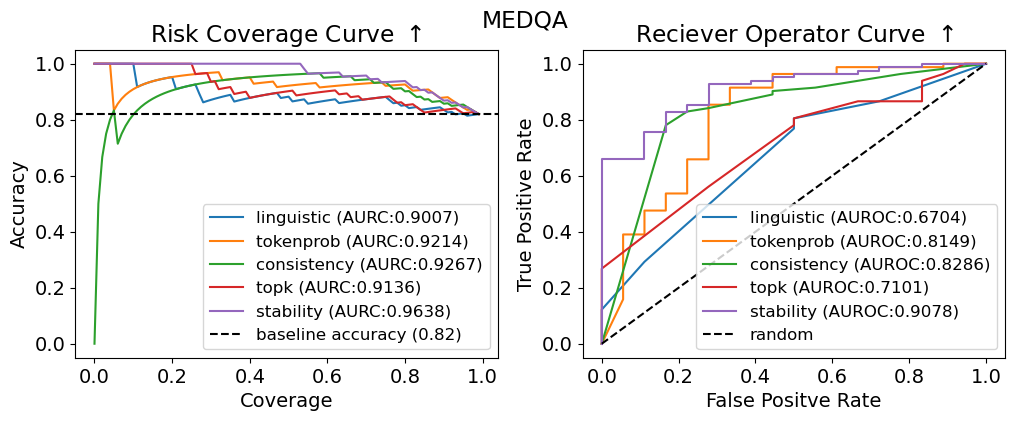
## Charts: Risk Coverage and Receiver Operator Curves
### Overview
The image presents two charts side-by-side. The left chart is a "Risk Coverage Curve" and the right chart is a "Receiver Operator Curve" (ROC). Both charts evaluate the performance of different methods (linguistic, tokenprob, consistency, topk, stability) against a baseline, likely in a medical context given the "MEDQA" title. Both charts share a similar color scheme for the methods being evaluated.
### Components/Axes
**Left Chart (Risk Coverage Curve):**
* **Title:** Risk Coverage Curve ↑ (The arrow indicates increasing is better)
* **X-axis:** Coverage (ranging from 0.0 to 1.0)
* **Y-axis:** Accuracy (ranging from 0.0 to 1.0)
* **Legend (top-right):**
* linguistic (AUROC: 0.9007) - Yellow
* tokenprob (AUROC: 0.9214) - Blue
* consistency (AUROC: 0.9267) - Green
* topk (AUROC: 0.9136) - Red
* stability (AUROC: 0.9638) - Purple
* baseline accuracy (0.82) - Black dashed line
**Right Chart (Receiver Operator Curve):**
* **Title:** Receiver Operator Curve ↑ (The arrow indicates increasing is better)
* **X-axis:** False Positive Rate (ranging from 0.0 to 1.0)
* **Y-axis:** True Positive Rate (ranging from 0.0 to 1.0)
* **Legend (top-right):**
* linguistic (AUROC: 0.6704) - Yellow
* tokenprob (AUROC: 0.8149) - Blue
* consistency (AUROC: 0.8286) - Green
* topk (AUROC: 0.7101) - Red
* stability (AUROC: 0.9078) - Purple
* random - Black dashed line
### Detailed Analysis or Content Details
**Left Chart (Risk Coverage Curve):**
* The 'stability' line (purple) shows the highest accuracy across all coverage values, consistently above 0.9. It slopes downward slightly as coverage increases.
* The 'consistency' line (green) is also high, generally above 0.9, and similar to 'stability' in its trend.
* 'tokenprob' (blue) and 'topk' (red) lines are slightly lower, hovering around 0.85-0.95.
* 'linguistic' (yellow) is the lowest of the methods, starting around 0.8 and decreasing more rapidly with increasing coverage.
* The baseline accuracy (black dashed) is a horizontal line at approximately 0.82. All methods outperform the baseline.
**Right Chart (Receiver Operator Curve):**
* The 'stability' line (purple) demonstrates the best performance, curving sharply upwards and reaching a True Positive Rate close to 1.0 with a False Positive Rate below 0.2.
* 'consistency' (green) and 'tokenprob' (blue) show moderate performance, with curves that are less steep than 'stability' but still above the 'random' line.
* 'linguistic' (yellow) and 'topk' (red) have the lowest performance, with curves that are closer to the 'random' line.
* The 'random' line (black dashed) represents the performance of a random classifier, serving as a benchmark.
### Key Observations
* 'Stability' consistently outperforms all other methods on both charts, indicating it is the most robust approach.
* The Risk Coverage Curve shows that higher coverage generally comes at the cost of accuracy, particularly for the 'linguistic' method.
* The ROC curve highlights the ability of each method to discriminate between true positives and false positives.
* The AUROC (Area Under the Receiver Operating Characteristic curve) values provided in the legend quantify the overall performance of each method. Higher AUROC values indicate better performance.
### Interpretation
These charts evaluate the effectiveness of different methods for identifying risks or making predictions in a medical question answering (MEDQA) context. The "Risk Coverage Curve" assesses how well each method can identify a broad range of risks while maintaining accuracy. The "Receiver Operator Curve" evaluates the trade-off between sensitivity (True Positive Rate) and specificity (1 - False Positive Rate).
The consistent superior performance of the 'stability' method suggests that it is the most reliable approach for this task. It achieves high accuracy across a wide range of coverage levels and effectively discriminates between true and false positives. The lower performance of the 'linguistic' method indicates that relying solely on linguistic features may not be sufficient for accurate risk assessment. The baseline accuracy provides a point of reference, and all methods demonstrate improvement over random chance. The difference in AUROC values between the methods is significant, indicating varying degrees of predictive power. The charts suggest that a combination of methods, potentially weighted towards 'stability', could yield the best overall performance.