## Line Graph: Gemini-2.0-Flash
### Overview
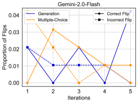
The image is a line graph titled "Gemini-2.0-Flash" that compares two data series: "Generation" (blue line) and "Multiple-Choice" (orange line). The x-axis represents "Iterations" (1–5), and the y-axis represents "Proportion of Flips" (0.00 to 0.04). A legend in the top-right corner distinguishes "Correct Flip" (solid black circle) and "Incorrect Flip" (dashed black square).
### Components/Axes
- **X-axis (Iterations)**: Labeled "Iterations" with discrete markers at 1, 2, 3, 4, 5.
- **Y-axis (Proportion of Flips)**: Labeled "Proportion of Flips" with a scale from 0.00 to 0.04 in increments of 0.01.
- **Legend**: Located in the top-right corner.
- "Correct Flip": Solid black circle.
- "Incorrect Flip": Dashed black square.
- **Data Series**:
- "Generation": Blue solid line.
- "Multiple-Choice": Orange dashed line.
### Detailed Analysis
- **Generation (Blue Line)**:
- Iteration 1: ~0.02.
- Iteration 2: ~0.00.
- Iteration 3: ~0.02.
- Iteration 4: ~0.00.
- Iteration 5: ~0.04.
- **Trend**: The line starts at 0.02, drops to 0.00 at iteration 2, rises to 0.02 at iteration 3, drops to 0.00 at iteration 4, and spikes sharply to 0.04 at iteration 5.
- **Multiple-Choice (Orange Line)**:
- Iteration 1: ~0.00.
- Iteration 2: ~0.03.
- Iteration 3: ~0.00.
- Iteration 4: ~0.01.
- Iteration 5: ~0.00.
- **Trend**: The line starts at 0.00, rises to 0.03 at iteration 2, drops to 0.00 at iteration 3, rises to 0.01 at iteration 4, and drops to 0.00 at iteration 5.
### Key Observations
1. **Generation Line**: Exhibits a volatile pattern with a significant spike at iteration 5, suggesting a sudden increase in flip proportion.
2. **Multiple-Choice Line**: Peaks at iteration 2 (0.03) and shows a sharp decline afterward, indicating early variability followed by stabilization.
3. **Legend Discrepancy**: The legend labels "Correct Flip" and "Incorrect Flip" do not directly correspond to the data series labels ("Generation" and "Multiple-Choice"). This may imply that the legend refers to markers (e.g., data points) rather than the lines themselves, but no markers are explicitly shown in the image.
### Interpretation
The graph illustrates how the proportion of flips varies across iterations for two methods: "Generation" and "Multiple-Choice." The "Generation" line’s sharp increase at iteration 5 could indicate a critical change in behavior or an anomaly, while the "Multiple-Choice" line’s early peak suggests higher initial variability. The legend’s "Correct Flip" and "Incorrect Flip" labels remain ambiguous without explicit markers on the lines, but they may relate to the nature of the flips (e.g., correct vs. incorrect predictions) rather than the data series themselves. The data highlights the dynamic relationship between iteration count and flip proportion, with the "Generation" method showing more pronounced fluctuations over time.