## Scatter Plot with Trend Line and Confidence Bands: Speed vs. Time
### Overview
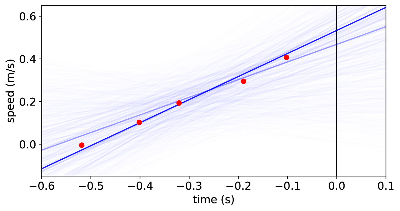
The image is a scatter plot illustrating the relationship between **time (in seconds)** (x-axis) and **speed (in meters per second)** (y-axis). It includes red data points, a blue linear trend line, light blue confidence bands (or multiple model fits), and a vertical black reference line at \( x = 0 \) (time = 0 s).
### Components/Axes
- **X-axis (Horizontal)**:
- Label: `time (s)`
- Ticks: \(-0.6, -0.5, -0.4, -0.3, -0.2, -0.1, 0.0, 0.1\) (spanning ~\(-0.6\) to \(0.1\) seconds).
- **Y-axis (Vertical)**:
- Label: `speed (m/s)`
- Ticks: \(0.0, 0.2, 0.4, 0.6\) (spanning ~\(-0.1\) to \(0.6\) m/s, as the trend line starts below \(0.0\) at \(x = -0.6\)).
- **Data Points (Red Dots)**:
Approximate coordinates (time, speed):
- \((-0.5, 0.0)\)
- \((-0.4, 0.1)\)
- \((-0.3, 0.2)\)
- \((-0.2, 0.3)\)
- \((-0.1, 0.4)\)
- **Trend Line (Blue)**:
A linear line with a **positive slope** (increasing from left to right), passing through/near the red data points.
- **Confidence Bands (Light Blue Lines)**:
Multiple light blue lines surrounding the blue trend line, indicating variability/uncertainty in the model (e.g., confidence intervals or multiple model fits).
- **Vertical Reference Line (Black)**:
At \( x = 0 \) (time = 0 s), likely a critical time point (e.g., event trigger, measurement start).
### Detailed Analysis
- **Data Trend**: The red dots show a **strong positive linear relationship** between time and speed. As time increases (moves from \(-0.5\) to \(-0.1\) s), speed increases (from ~\(0.0\) to ~\(0.4\) m/s). The spacing between points is consistent (each ~\(0.1\) s in time, ~\(0.1\) m/s in speed), reinforcing linearity.
- **Trend Line Slope**: The blue line has a slope of ~\(1\) m/s² (since speed vs. time slope = acceleration). For example:
- From \( x = -0.5 \) (speed = \(0.0\) m/s) to \( x = -0.1 \) (speed = \(0.4\) m/s):
\(\Delta \text{time} = 0.4\) s, \(\Delta \text{speed} = 0.4\) m/s → Slope = \(0.4 / 0.4 = 1\) m/s².
- **Confidence Bands**: The light blue lines are wider at the extremes (\(x = -0.6\) and \(x = 0.1\)) and narrower in the middle, typical of linear regression confidence intervals (uncertainty increases at the edges of the data range).
- **Vertical Line at \( x = 0 \)**: At \( x = 0 \), the blue trend line predicts a speed of ~\(0.5\) m/s (extrapolating from \( x = -0.1 \) (speed = \(0.4\) m/s) to \( x = 0 \)).
### Key Observations
- **Linear Consistency**: All red data points lie close to the blue trend line, with no obvious outliers.
- **Uniform Spacing**: Data points are evenly spaced in time (~\(0.1\) s intervals) and speed (~\(0.1\) m/s intervals), confirming a linear pattern.
- **Confidence Band Symmetry**: Light blue lines are symmetric around the trend line, indicating a well-behaved model with balanced uncertainty.
### Interpretation
- **What the Data Suggests**: The plot demonstrates a **constant acceleration** (linear speed-time relationship). The red points, blue trend line, and light blue bands collectively show that speed increases linearly with time, with consistent uncertainty.
- **Element Relationships**: Time (x-axis) is the independent variable, speed (y-axis) is the dependent variable. The red points are observed data, the blue line is the best-fit model, and the light blue lines represent uncertainty. The vertical line at \( x = 0 \) likely marks a critical time (e.g., experiment start).
- **Trends/Anomalies**: No anomalies; the linear trend is robust across the time range. The confidence bands confirm the model’s reliability, with uncertainty increasing at the data’s edges.
This description captures all visual elements, trends, and relationships, enabling reconstruction of the plot’s information without the image.