## Scatter Plot: Speed vs. Time
### Overview
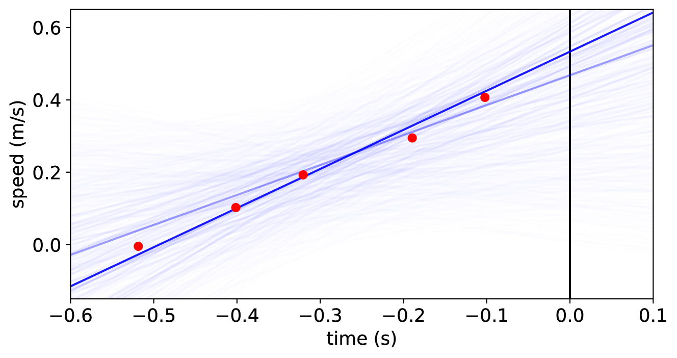
The image is a scatter plot showing the relationship between speed (m/s) and time (s). It includes a primary blue line representing a linear fit, several translucent blue lines representing possible variations, and red data points. A vertical black line marks time = 0.
### Components/Axes
* **X-axis:** Time (s), ranging from -0.6 to 0.1, with tick marks at -0.6, -0.5, -0.4, -0.3, -0.2, -0.1, 0.0, and 0.1.
* **Y-axis:** Speed (m/s), ranging from 0.0 to 0.6, with tick marks at 0.0, 0.2, 0.4, and 0.6.
* **Data Points:** Five red data points are scattered across the plot.
* **Linear Fit:** A solid blue line represents the primary linear fit to the data.
* **Variations:** Many translucent blue lines show possible variations around the primary linear fit.
* **Vertical Line:** A solid black vertical line is positioned at time = 0.
### Detailed Analysis
* **Red Data Points:**
* Point 1: Approximately at (-0.5, 0.0)
* Point 2: Approximately at (-0.4, 0.1)
* Point 3: Approximately at (-0.3, 0.2)
* Point 4: Approximately at (-0.2, 0.3)
* Point 5: Approximately at (-0.1, 0.4)
* **Blue Line (Linear Fit):** The blue line slopes upward, indicating a positive correlation between time and speed. It starts at approximately (-0.6, -0.1) and extends to approximately (0.1, 0.6).
* **Translucent Blue Lines:** These lines show a range of possible linear fits, with the density of lines decreasing as you move away from the primary blue line. They all generally slope upwards.
### Key Observations
* The speed generally increases with time.
* The red data points appear to be relatively close to the primary blue line, suggesting a good fit.
* The translucent blue lines indicate uncertainty in the linear fit, with more variation at the extremes of the time range.
### Interpretation
The plot suggests a linear relationship between time and speed. The red data points support this relationship, and the blue line represents the best linear fit. The translucent blue lines represent the uncertainty in the fit, likely due to limited data or noise. The vertical line at time = 0 serves as a reference point. The data suggests that as time increases, the speed also increases, and the model provides a reasonable approximation of this relationship, although with some uncertainty.