# Technical Document Extraction: Github Rescaled Range Analysis
## 1. Component Isolation
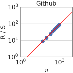
* **Header:** Contains the title "Github".
* **Main Chart Area:** A log-log scatter plot with a superimposed linear regression line.
* **Axes:**
* **Y-axis (Vertical):** Labeled "R / S" with logarithmic scaling.
* **X-axis (Horizontal):** Labeled "$n$" with logarithmic scaling.
## 2. Metadata and Labels
| Element | Content |
| :--- | :--- |
| **Title** | Github |
| **Y-Axis Label** | R / S (Rescaled Range) |
| **X-Axis Label** | $n$ (Observation window size/number of observations) |
| **Y-Axis Scale** | Logarithmic ($10^0, 10^1, 10^2, 10^3$) |
| **X-Axis Scale** | Logarithmic ($10^0, 10^3$) |
## 3. Data Series Analysis
### Trend Verification
* **Data Points (Blue Circles):** The series consists of approximately 10-12 blue circular markers. The trend is strictly upward and linear on the log-log scale, indicating a power-law relationship between $n$ and $R/S$.
* **Regression Line (Red Solid Line):** A continuous red line that passes through the center of the blue data points. It slopes upward from the bottom-left toward the top-right.
### Spatial Grounding and Data Extraction
The plot uses a log-log coordinate system. Based on the axis markers:
* **Data Point Range:**
* The first data point (bottom-left) is located at approximately $n \approx 10^{1.5}$ (roughly 30-40) and $R/S \approx 10^{0.9}$ (roughly 8).
* The final data point (top-right) is located just before the $10^3$ mark on the x-axis ($n \approx 800-900$) and just below the $10^2$ mark on the y-axis ($R/S \approx 80-90$).
* **Linearity:** The data points are highly clustered and follow the red regression line with very low variance, suggesting a strong Hurst exponent ($H$) calculation for the Github dataset.
## 4. Technical Summary
This image represents a **Hurst Exponent analysis (Rescaled Range analysis)** for a dataset labeled "Github".
* **Relationship:** The plot shows that as the window size $n$ increases, the rescaled range $R/S$ increases proportionally.
* **Mathematical Implication:** Because the slope of the line on this log-log plot appears to be greater than 0.5 (the line rises nearly two orders of magnitude on the Y-axis for roughly 1.5 orders of magnitude on the X-axis), it suggests a persistent time series (long-term memory) in the Github data being analyzed.
* **Visual Consistency:** The red line acts as a "best fit" for the blue empirical data points, confirming a stable power-law scaling across the observed range of $n$.