## Line Chart: Continual Train
### Overview
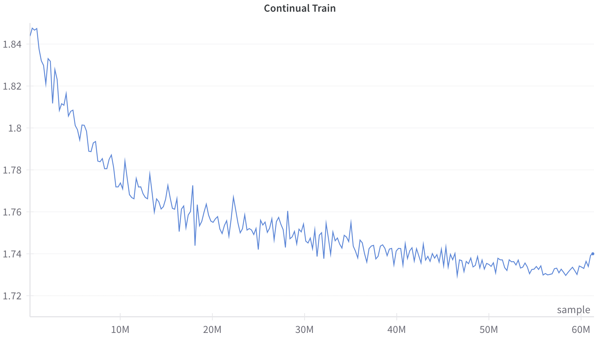
This image is a line chart displaying a single data series representing a metric tracked over a period of "Continual Train[ing]". The chart shows a noisy but distinct downward trend that gradually levels off, characteristic of a machine learning model's loss curve during training.
### Components/Axes
**Header Region:**
* **Title:** "Continual Train" (Located top-center).
**Main Chart Region:**
* **Data Series:** A single, jagged blue line representing the tracked metric. There is no legend, as there is only one series. A distinct blue dot marks the final data point on the far right.
* **Gridlines:** Faint, light gray horizontal lines span the chart area, corresponding to the Y-axis major tick marks.
**Axes Region:**
* **Y-Axis (Left):**
* **Label:** None explicitly provided.
* **Scale:** Linear.
* **Markers:** 1.72, 1.74, 1.76, 1.78, 1.8, 1.82, 1.84.
* **X-Axis (Bottom):**
* **Label:** "sample" (Located bottom-right, just above the axis line).
* **Scale:** Linear.
* **Markers:** 10M, 20M, 30M, 40M, 50M, 60M. (The 'M' likely denotes Millions). Faint vertical tick marks indicate these intervals.
### Detailed Analysis
**Trend Verification:**
The blue line exhibits a clear, non-linear downward trend characterized by high-frequency, jagged fluctuations (noise) throughout its entirety.
1. **Initial Phase (0 to ~15M):** The line slopes downward rapidly. The amplitude of the fluctuations appears slightly larger in this phase.
2. **Middle Phase (~15M to ~45M):** The rate of descent slows significantly, transitioning into a more gradual decline. The curve becomes convex.
3. **Late Phase (~45M to 60M+):** The line largely plateaus, oscillating around a horizontal baseline.
4. **Terminal Phase (>60M):** At the very end of the chart, the line shows a distinct, sharp upward spike, terminating in a marked dot.
**Approximate Data Points (with uncertainty due to noise):**
* **Start (x ≈ 0):** The line begins at its highest point, approximately **y ≈ 1.845**.
* **x = 10M:** The line fluctuates between roughly **y ≈ 1.765 and 1.785**.
* **x = 20M:** The line fluctuates between roughly **y ≈ 1.745 and 1.765**.
* **x = 30M:** The line fluctuates between roughly **y ≈ 1.740 and 1.755**.
* **x = 40M:** The line fluctuates between roughly **y ≈ 1.735 and 1.745**.
* **x = 50M:** The line fluctuates between roughly **y ≈ 1.730 and 1.740**.
* **Minimum (x ≈ 55M - 58M):** The lowest points of the fluctuations dip to approximately **y ≈ 1.728**.
* **End Point (x ≈ 61M):** The final marked dot sits exactly on the gridline for **y = 1.74**.
### Key Observations
* **High Variance:** The line is never smooth; it constantly zig-zags up and down between consecutive points, indicating high variance in the metric being measured at each step.
* **Asymptotic Behavior:** The overall curve resembles an exponential decay, approaching a lower bound (asymptote) near 1.73.
* **Final Anomaly:** The sharp rise from ~1.73 to exactly 1.74 at the very end of the training run breaks the established plateau trend.
### Interpretation
* **Context:** Given the title "Continual Train" and the x-axis label "sample" (measured in millions), this chart almost certainly represents the training process of a machine learning model (likely a neural network).
* **Y-Axis Meaning:** Although unlabeled, the y-axis represents a training metric that the system is trying to minimize. Based on the values (1.72 - 1.84) and the downward trend, this is highly likely to be a **Loss Function** (such as Cross-Entropy loss for a language model or classification task).
* **Noise Interpretation:** The jaggedness of the line is typical of **Stochastic Gradient Descent (SGD)** or its variants (like Adam). Because the model updates its weights based on small "mini-batches" of samples rather than the entire dataset at once, the loss fluctuates depending on how "difficult" or representative a specific batch is.
* **Learning Progression:** The rapid initial drop shows the model quickly learning the easiest, most prominent patterns in the data. The plateau indicates that the model is converging; it has extracted most of the learnable information given its current architecture, learning rate, and the provided data.
* **The Final Spike:** The sudden jump to 1.74 at the end of the graph is notable. In a machine learning context, this could represent a few things:
* A particularly "bad" or anomalous batch of data at the end of the run.
* A learning rate anomaly (e.g., a sudden increase if a scheduler is misconfigured).
* The beginning of catastrophic forgetting or instability, which is a known issue in "Continual Learning" setups where a model is trained on new data distributions sequentially.