\n
## Line Chart: Continual Train
### Overview
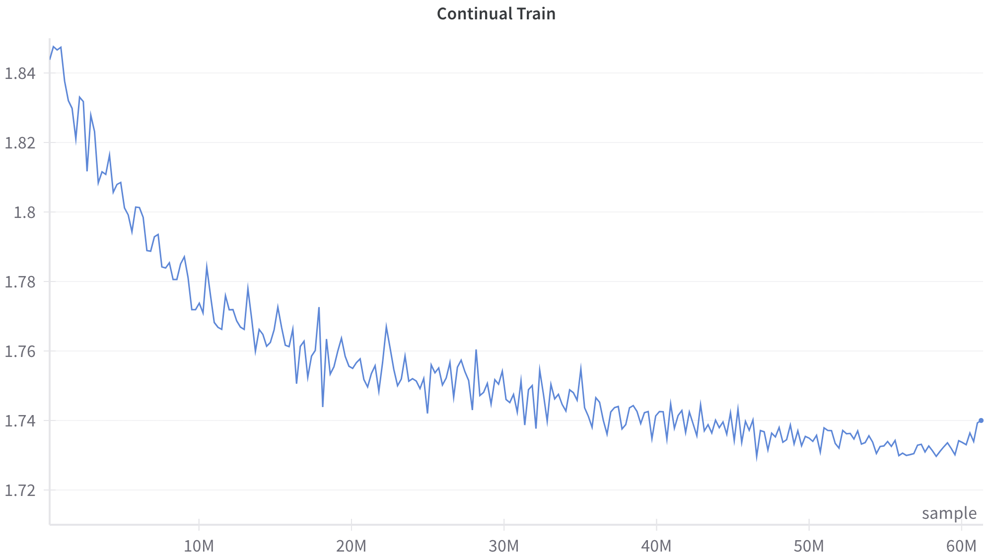
The image presents a line chart depicting a decreasing trend over a range of values on the x-axis, likely representing a training process or iterations. The y-axis represents a numerical value, potentially a loss or error metric. The chart is titled "Continual Train".
### Components/Axes
* **Title:** "Continual Train" - positioned at the top-center of the chart.
* **X-axis:** Labeled "sample" at the bottom-right. The scale appears to be in millions (M), ranging from 0M to 60M. The axis markers are at 10M, 20M, 30M, 40M, 50M, and 60M.
* **Y-axis:** The scale ranges from approximately 1.72 to 1.84. No explicit label is present, but it likely represents a loss or error value. The axis markers are at 1.72, 1.74, 1.76, 1.78, 1.8, 1.82, and 1.84.
* **Data Series:** A single blue line representing the data.
* **Legend:** No explicit legend is present, but the line is labeled "sample" on the x-axis.
### Detailed Analysis
The blue line starts at approximately 1.84 at 0M on the x-axis. The line exhibits a steep downward slope initially, decreasing rapidly to around 1.78 by 10M. From 10M to 30M, the slope becomes less steep, with the line fluctuating between approximately 1.76 and 1.80. Between 30M and 60M, the line continues to decrease, but the fluctuations become more pronounced, oscillating between approximately 1.73 and 1.77.
Here's a breakdown of approximate values at specific points:
* 0M: 1.84
* 5M: ~1.82
* 10M: ~1.78
* 15M: ~1.77
* 20M: ~1.76
* 25M: ~1.75
* 30M: ~1.75
* 35M: ~1.74
* 40M: ~1.74
* 45M: ~1.74
* 50M: ~1.73
* 55M: ~1.73
* 60M: ~1.73
### Key Observations
* The initial decrease is significant, suggesting rapid learning or improvement in the early stages.
* The rate of decrease slows down considerably after 10M, indicating diminishing returns.
* The fluctuations between 30M and 60M suggest the model is approaching a stable state, or that the training process is becoming more sensitive to noise or local optima.
* The final value at 60M is approximately 1.73, representing the lowest point achieved during the training process.
### Interpretation
The chart likely represents the training loss of a machine learning model over time (or iterations). The continual decrease in loss indicates that the model is learning and improving its performance. The initial steep decline suggests rapid progress, while the subsequent flattening and fluctuations suggest that the model is converging towards a minimum loss value. The fluctuations in the later stages could be due to several factors, such as the learning rate being too high, the presence of noisy data, or the model getting stuck in a local minimum. The "sample" label on the x-axis suggests that the training process is being evaluated on a set of samples. The overall trend suggests that the model is successfully learning from the data, but further optimization or adjustments may be needed to achieve even better performance. The chart demonstrates a typical learning curve, where the loss decreases over time, eventually reaching a plateau.