## Bar Chart: Comparison of PathPieceR (14) and PathPieceL (15) Overall Accuracy
### Overview
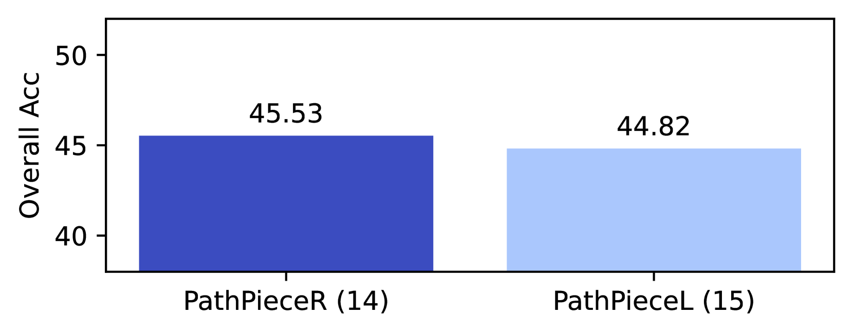
The image is a bar chart comparing the **Overall Accuracy (Overall Acc)** of two methods: **PathPieceR (14)** and **PathPieceL (15)**. The chart uses two vertical bars to represent the performance metrics, with numerical values explicitly labeled on top of each bar.
---
### Components/Axes
- **Y-Axis**: Labeled **"Overall Acc"**, scaled from **40 to 50** in increments of 5.
- **X-Axis**: Categorical axis with two labels:
- **PathPieceR (14)** (blue bar)
- **PathPieceL (15)** (light blue bar)
- **Legend**: Not explicitly present, but colors differentiate the methods:
- **Dark blue** for PathPieceR (14)
- **Light blue** for PathPieceL (15)
---
### Detailed Analysis
- **PathPieceR (14)**:
- Bar height corresponds to **45.53** (labeled in black text).
- Positioned on the left side of the chart.
- **PathPieceL (15)**:
- Bar height corresponds to **44.82** (labeled in black text).
- Positioned on the right side of the chart.
- **Visual Trends**:
- PathPieceR (14) has a slightly higher bar than PathPieceL (15), indicating marginally better performance.
- The difference between the two values is **0.71** (45.53 - 44.82).
---
### Key Observations
1. **Performance Comparison**: PathPieceR (14) outperforms PathPieceL (15) by **0.71** in Overall Accuracy.
2. **Proximity of Values**: The small difference suggests the methods have comparable performance, though PathPieceR (14) holds a slight edge.
3. **Axis Precision**: The y-axis scale (40–50) provides context for interpreting the values as percentages or normalized metrics.
---
### Interpretation
The chart demonstrates that **PathPieceR (14)** achieves marginally higher Overall Accuracy than **PathPieceL (15)**. While the difference is small, it may indicate a subtle advantage in PathPieceR (14) for the evaluated task. The absence of error bars or statistical significance markers leaves uncertainty about whether the difference is meaningful. The use of distinct colors (dark blue vs. light blue) effectively distinguishes the two methods, even without a formal legend. This visualization is useful for quickly comparing the performance of the two approaches but lacks additional context (e.g., sample size, error margins) to fully assess the reliability of the results.