## Line Chart: EGA vs. Environment Step for Different Numbers of Actions
### Overview
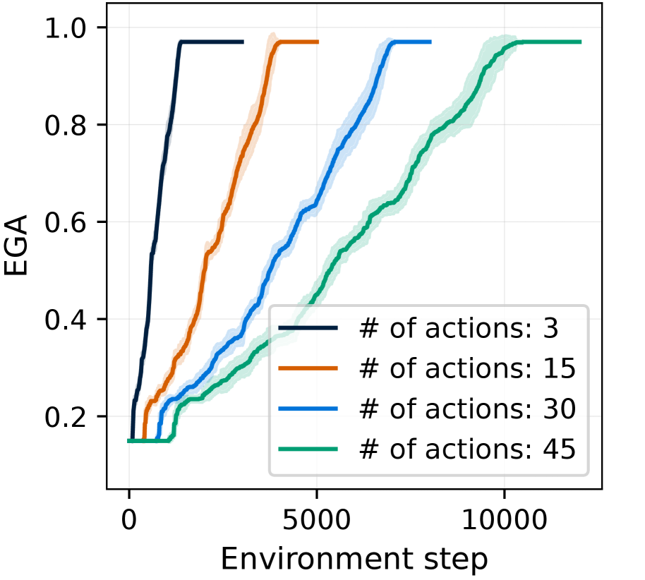
The image is a line chart that plots EGA (likely an abbreviation for an evaluation metric) against the environment step for different numbers of actions (3, 15, 30, and 45). The chart shows how the EGA changes over time (environment steps) for each action configuration.
### Components/Axes
* **X-axis:** Environment step, ranging from 0 to 10000.
* **Y-axis:** EGA, ranging from 0 to 1.0.
* **Legend (bottom-right):**
* Dark Blue: # of actions: 3
* Orange: # of actions: 15
* Blue: # of actions: 30
* Green: # of actions: 45
### Detailed Analysis
* **Dark Blue Line (# of actions: 3):**
* The line starts at an EGA of approximately 0.15.
* It quickly rises to an EGA of approximately 0.97 around environment step 500.
* The line then plateaus at approximately 0.97 for the remainder of the environment steps.
* **Orange Line (# of actions: 15):**
* The line starts at an EGA of approximately 0.15.
* It rises more gradually than the dark blue line, reaching an EGA of approximately 0.97 around environment step 4000.
* The line then plateaus at approximately 0.97 for the remainder of the environment steps.
* **Blue Line (# of actions: 30):**
* The line starts at an EGA of approximately 0.15.
* It rises even more gradually than the orange line, reaching an EGA of approximately 0.97 around environment step 8000.
* The line then plateaus at approximately 0.97 for the remainder of the environment steps.
* **Green Line (# of actions: 45):**
* The line starts at an EGA of approximately 0.15.
* It rises the most gradually of all the lines, reaching an EGA of approximately 0.97 around environment step 10000.
* The line then plateaus at approximately 0.97 for the remainder of the environment steps.
### Key Observations
* All lines eventually reach a similar EGA value of approximately 0.97.
* The number of actions significantly affects the rate at which the EGA increases. Fewer actions lead to a faster increase in EGA.
* The shaded regions around each line likely represent the variance or standard deviation of the EGA for each action configuration.
### Interpretation
The chart suggests that using fewer actions leads to faster learning (as measured by EGA) in the environment. However, all configurations eventually reach a similar level of performance. This could indicate that while fewer actions allow for quicker initial progress, the ultimate performance ceiling is similar regardless of the number of actions. The shaded regions indicate the variability in performance, which could be due to factors like randomness in the environment or the learning algorithm. The data demonstrates a trade-off between the speed of learning and the number of actions.