\n
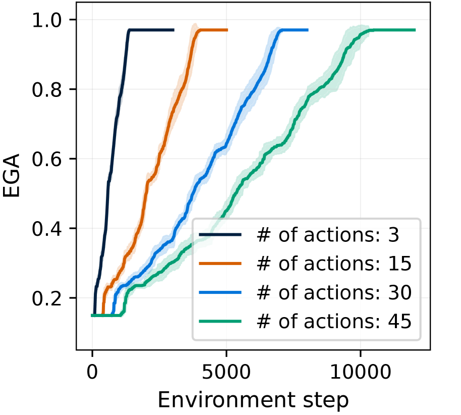
## Line Chart: EGA vs. Environment Step for Different Action Counts
### Overview
This line chart depicts the relationship between the Environment Step and the EGA (presumably a performance metric) for different numbers of actions. The chart shows how EGA changes over time (Environment Step) for each action count. Shaded regions around the lines represent uncertainty or variance.
### Components/Axes
* **X-axis:** Environment step, ranging from approximately 0 to 11000.
* **Y-axis:** EGA, ranging from approximately 0.1 to 1.0.
* **Legend:** Located in the bottom-right corner, listing the following data series:
* "# of actions: 3" (Dark Blue Line)
* "# of actions: 15" (Orange Line)
* "# of actions: 30" (Blue Line)
* "# of actions: 45" (Teal Line)
* **Grid:** A light gray grid is present in the background to aid in reading values.
### Detailed Analysis
Let's analyze each line individually, noting trends and approximate data points.
* **# of actions: 3 (Dark Blue):** This line starts at approximately 0.15 at Environment Step 0. It rapidly increases to approximately 0.95 by Environment Step 2000, then plateaus around 0.95-1.0 for the remainder of the chart. The shaded region around this line is relatively small, indicating low variance.
* **# of actions: 15 (Orange):** This line begins at approximately 0.15 at Environment Step 0. It increases more gradually than the previous line, reaching approximately 0.9 by Environment Step 3000. It then plateaus around 0.95-1.0 for the rest of the chart. The shaded region is wider than the previous line, suggesting higher variance.
* **# of actions: 30 (Blue):** This line starts at approximately 0.15 at Environment Step 0. It increases at a rate between the previous two lines, reaching approximately 0.9 by Environment Step 4000. It plateaus around 0.95-1.0 for the remainder of the chart. The shaded region is similar in width to the orange line.
* **# of actions: 45 (Teal):** This line starts at approximately 0.15 at Environment Step 0. It exhibits the slowest increase, reaching approximately 0.85 by Environment Step 6000 and 0.95 by Environment Step 9000. It plateaus around 0.95-1.0 for the remainder of the chart. The shaded region is the widest, indicating the highest variance.
### Key Observations
* All lines converge towards an EGA value of approximately 1.0 as the Environment Step increases.
* The number of actions significantly impacts the speed at which EGA reaches its plateau. Fewer actions (3) lead to faster convergence, while more actions (45) lead to slower convergence.
* The variance (as indicated by the shaded regions) increases with the number of actions.
* The initial EGA value is consistent across all action counts (approximately 0.15).
### Interpretation
The data suggests that increasing the number of actions initially slows down the rate at which the EGA metric improves. While all action counts eventually reach a similar level of performance (EGA ≈ 1.0), the time required to do so varies considerably. This could indicate a trade-off between exploration and exploitation. Fewer actions might allow for quicker exploitation of initial gains, while more actions might be necessary for thorough exploration of the environment, but at the cost of slower initial progress. The increasing variance with higher action counts suggests that the outcome becomes more unpredictable as the number of actions increases, potentially due to increased complexity or sensitivity to initial conditions. The EGA metric likely represents a measure of success or learning within the environment, and the chart demonstrates how the choice of action count influences the learning process.