## Bar Charts: Flight Rating Distributions
### Overview
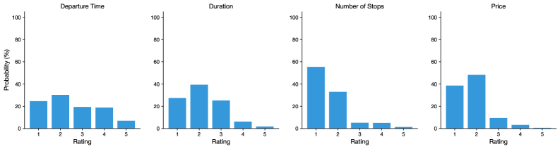
The image displays four separate bar charts arranged horizontally in a single row. Each chart visualizes the probability distribution (in percentage) of user ratings (1 to 5) for a different flight attribute. The charts share identical axes and styling, using blue bars on a white background.
### Components/Axes
* **Chart Titles (Top of each subplot):** "Departure Time", "Duration", "Number of Stops", "Price".
* **Y-Axis (Common to all charts):** Labeled "Probability (%)". The scale runs from 0 to 100 with major tick marks at 0, 20, 40, 60, 80, and 100.
* **X-Axis (Common to all charts):** Labeled "Rating". The scale shows discrete categories: 1, 2, 3, 4, 5.
* **Data Series:** Each chart contains five vertical bars, one for each rating category (1-5). All bars are the same shade of blue. There is no legend, as the color is consistent and the categories are defined by the x-axis.
### Detailed Analysis
**1. Departure Time Chart:**
* **Trend:** The distribution is relatively flat with a slight peak at rating 2.
* **Approximate Values:**
* Rating 1: ~25%
* Rating 2: ~30% (Highest)
* Rating 3: ~20%
* Rating 4: ~20%
* Rating 5: ~8% (Lowest)
**2. Duration Chart:**
* **Trend:** A clear peak at rating 2, followed by a steady decline for higher ratings.
* **Approximate Values:**
* Rating 1: ~28%
* Rating 2: ~40% (Highest)
* Rating 3: ~25%
* Rating 4: ~8%
* Rating 5: ~2% (Lowest)
**3. Number of Stops Chart:**
* **Trend:** A very strong skew towards rating 1, with a sharp drop-off for all other ratings.
* **Approximate Values:**
* Rating 1: ~55% (Highest)
* Rating 2: ~35%
* Rating 3: ~5%
* Rating 4: ~5%
* Rating 5: ~2% (Lowest)
**4. Price Chart:**
* **Trend:** Similar to the Duration chart, with a pronounced peak at rating 2.
* **Approximate Values:**
* Rating 1: ~38%
* Rating 2: ~48% (Highest)
* Rating 3: ~10%
* Rating 4: ~4%
* Rating 5: ~1% (Lowest)
### Key Observations
* **Consistent Low Ratings:** Across all four attributes, ratings 4 and 5 consistently have the lowest probabilities, rarely exceeding 10%.
* **Dominant Ratings:** Each attribute has a dominant rating category: "Number of Stops" is overwhelmingly rated 1, while "Duration" and "Price" are most frequently rated 2. "Departure Time" has the most even distribution.
* **Attribute Sensitivity:** The "Number of Stops" chart shows the most polarized response, suggesting users have a very strong preference (likely for fewer stops, hence the high rating 1 probability). "Departure Time" appears to be the least polarizing factor.
### Interpretation
This data likely represents user satisfaction or preference ratings for different aspects of a flight booking or experience. The distributions suggest:
1. **"Number of Stops" is the most critical differentiator.** The extreme skew towards rating 1 indicates that a non-stop flight (or a flight with the minimum number of stops) is highly valued and is perhaps a primary decision-making factor. Flights with more stops receive disproportionately poor ratings.
2. **"Duration" and "Price" are important but follow a similar, less extreme pattern.** The peak at rating 2 suggests that for these factors, a "good but not perfect" offering is most common or most accepted. Very long durations or very high prices (which would correspond to ratings 4 and 5) are strongly avoided or result in poor satisfaction.
3. **"Departure Time" is a more neutral factor.** The flatter distribution implies that user satisfaction with departure times is more varied and less tied to a single ideal. This could mean acceptable departure windows are broader, or that this factor is less important in the overall rating.
**Overall Implication:** To maximize positive ratings (or booking likelihood), a flight service should prioritize offering non-stop routes. Competitive pricing and reasonable duration are also key, but the data shows a clear hierarchy where minimizing stops is paramount. The low probabilities for ratings 4 and 5 across the board indicate that extreme negatives in any category are rare, suggesting the dataset may come from a context where baseline service levels are already acceptable.