## Bar Charts: Feature Rating Distributions
### Overview
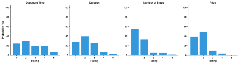
The image contains four bar charts, each displaying the distribution of ratings for a different feature: Departure Time, Duration, Number of Stops, and Price. The y-axis represents the probability (%), and the x-axis represents the rating from 1 to 5. All bars are blue.
### Components/Axes
* **X-axis (Rating):** Discrete values from 1 to 5, representing the rating level.
* **Y-axis (Probability (%)):** Continuous scale from 0 to 100%, with tick marks at 0, 20, 40, 60, 80, and 100.
* **Chart Titles:**
* Top-left: "Departure Time"
* Top-middle-left: "Duration"
* Top-middle-right: "Number of Stops"
* Top-right: "Price"
### Detailed Analysis
**1. Departure Time**
* Trend: The distribution is relatively uniform, with a slight peak at rating 2.
* Rating 1: Approximately 25%
* Rating 2: Approximately 30%
* Rating 3: Approximately 20%
* Rating 4: Approximately 20%
* Rating 5: Approximately 5%
**2. Duration**
* Trend: The distribution is skewed towards lower ratings, with a peak at rating 2.
* Rating 1: Approximately 28%
* Rating 2: Approximately 40%
* Rating 3: Approximately 25%
* Rating 4: Approximately 5%
* Rating 5: Approximately 2%
**3. Number of Stops**
* Trend: The distribution is heavily skewed towards lower ratings, with a significant peak at rating 1.
* Rating 1: Approximately 55%
* Rating 2: Approximately 33%
* Rating 3: Approximately 5%
* Rating 4: Approximately 5%
* Rating 5: Approximately 2%
**4. Price**
* Trend: The distribution is skewed towards lower ratings, with a peak at rating 2.
* Rating 1: Approximately 38%
* Rating 2: Approximately 48%
* Rating 3: Approximately 8%
* Rating 4: Approximately 3%
* Rating 5: Approximately 1%
### Key Observations
* The "Number of Stops" feature has the most skewed distribution, with the highest probability for a rating of 1.
* The "Departure Time" feature has the most uniform distribution compared to the others.
* All features show a decreasing probability as the rating increases from 2 to 5.
* Ratings of 4 and 5 are relatively rare across all features.
### Interpretation
The bar charts provide insights into how users rate different features. The "Number of Stops" is the most negatively perceived feature, with a high probability of receiving a rating of 1. "Price" and "Duration" also tend to receive lower ratings. "Departure Time" is rated more evenly, suggesting it is less of a concern for users. These ratings could reflect user preferences or expectations regarding these features. The data suggests that minimizing the number of stops is a key factor in user satisfaction, followed by price and duration.