## Bar Charts: Probability Distribution by Rating
### Overview
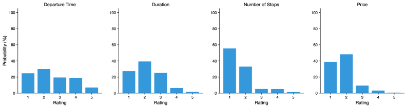
The image contains four bar charts arranged in a 2x2 grid, each depicting the probability distribution of different metrics (Departure Time, Duration, Number of Stops, Price) across a 5-point rating scale (1 to 5). All charts share identical axis labels and use blue bars to represent data.
### Components/Axes
- **X-axis**: "Rating" (categories: 1, 2, 3, 4, 5)
- **Y-axis**: "Probability (%)" (scale: 0 to 100, increments of 20)
- **Chart Titles**:
- Top-left: "Departure Time"
- Top-right: "Duration"
- Bottom-left: "Number of Stops"
- Bottom-right: "Price"
- **Legend**: None present.
### Detailed Analysis
1. **Departure Time**
- Rating 1: ~25%
- Rating 2: ~30%
- Rating 3: ~20%
- Rating 4: ~18%
- Rating 5: ~5%
- **Trend**: Probability decreases steadily from 1 to 5.
2. **Duration**
- Rating 1: ~25%
- Rating 2: ~40%
- Rating 3: ~25%
- Rating 4: ~5%
- Rating 5: ~1%
- **Trend**: Peaks at Rating 2, then declines sharply.
3. **Number of Stops**
- Rating 1: ~55%
- Rating 2: ~35%
- Rating 3: ~5%
- Rating 4: ~5%
- Rating 5: ~1%
- **Trend**: Dominated by Rating 1, with steep declines afterward.
4. **Price**
- Rating 1: ~40%
- Rating 2: ~50%
- Rating 3: ~10%
- Rating 4: ~2%
- Rating 5: ~0.5%
- **Trend**: Peaks at Rating 2, then drops sharply.
### Key Observations
- **Consistent Decline**: Departure Time, Duration, and Price show decreasing probabilities for higher ratings (4–5).
- **Outliers**:
- Number of Stops has the highest probability at Rating 1 (~55%).
- Duration and Price peak at Rating 2 (~40% and ~50%, respectively).
- **Low Probability for High Ratings**: All metrics assign <5% probability to Rating 5.
### Interpretation
The data suggests that higher ratings (4–5) are associated with lower probabilities across all metrics, indicating potential dissatisfaction or avoidance of extreme values. For example:
- **Departure Time**: Customers may prefer moderate departure times (Rating 2) over very early or late ones.
- **Duration**: Longer durations (Rating 2) are most common, possibly reflecting unavoidable travel constraints.
- **Number of Stops**: A high probability at Rating 1 implies that frequent stops are strongly disliked.
- **Price**: Mid-range prices (Rating 2) dominate, suggesting price sensitivity or market positioning.
The absence of high probabilities for Rating 5 across all metrics highlights a possible bias toward moderate or negative perceptions, which could inform service optimization or customer satisfaction strategies.