## Statistical Diagnostic Plots: Residual Analysis
### Overview
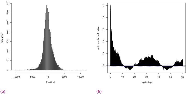
The image displays two side-by-side statistical diagnostic plots, labeled (a) and (b), used to assess the properties of residuals from a time-series or regression model. The plots are presented in a standard scientific format with black data elements on a white background.
### Components/Axes
**Plot (a) - Left Panel:**
* **Type:** Histogram
* **X-axis Label:** "Residual"
* **X-axis Scale:** Linear, ranging from approximately -10000 to 10000. Major tick marks are at -10000, -5000, 0, 5000, and 10000.
* **Y-axis Label:** "Frequency"
* **Y-axis Scale:** Linear, ranging from 0 to 1400. Major tick marks are at 0, 200, 400, 600, 800, 1000, 1200, and 1400.
* **Data Representation:** A dense histogram composed of numerous thin, vertical black bars.
* **Legend:** None present.
**Plot (b) - Right Panel:**
* **Type:** Autocorrelation Function (ACF) Plot
* **X-axis Label:** "Lag in days"
* **X-axis Scale:** Linear, ranging from 0 to 60. Major tick marks are at 0, 10, 20, 30, 40, 50, and 60.
* **Y-axis Label:** "Autocorrelation function"
* **Y-axis Scale:** Linear, ranging from 0.0 to 1.0. Major tick marks are at 0.0, 0.2, 0.4, 0.6, 0.8, and 1.0.
* **Data Representation:** A solid black line plot showing the autocorrelation coefficient at each lag.
* **Reference Line:** A horizontal dashed blue line at y=0.0, indicating zero autocorrelation.
* **Legend:** None present. The blue line is a standard reference element.
**Panel Labels:**
* The label "(a)" is positioned in the bottom-left corner below the first plot.
* The label "(b)" is positioned in the bottom-left corner below the second plot.
### Detailed Analysis
**Plot (a) - Residual Histogram:**
* **Trend/Distribution:** The histogram shows a unimodal, roughly symmetric distribution centered near a residual value of 0. The distribution appears leptokurtic (peaked with heavy tails).
* **Key Data Points (Approximate):**
* **Peak Frequency:** The highest bar reaches a frequency of approximately 1350-1400, located at a residual value very close to 0.
* **Central Mass:** The vast majority of residuals fall between -2500 and +2500.
* **Tails:** The frequency drops off sharply beyond ±5000. There are very few residuals beyond ±7500, with the visible range extending to ±10000.
**Plot (b) - Autocorrelation Function:**
* **Trend:** The autocorrelation starts at a maximum of 1.0 at lag 0 (by definition). It then decays rapidly over the first ~10 days, followed by a damped oscillatory pattern.
* **Key Data Points & Patterns (Approximate):**
* **Lag 0:** Autocorrelation = 1.0.
* **Initial Decay:** The correlation drops to ~0.2 by lag 5 and to near 0.0 by lag 10.
* **First Trough:** The correlation dips slightly below the zero line (negative correlation) between lags ~12 and ~22, with a minimum of approximately -0.05 around lag 17.
* **First Secondary Peak:** A broad, lower-amplitude peak occurs between lags ~25 and ~40, reaching a maximum of approximately 0.15-0.18 around lag 32.
* **Second Trough:** Another shallow negative region appears between lags ~42 and ~52.
* **Second Secondary Peak:** A smaller positive peak is visible between lags ~55 and 60, reaching approximately 0.08.
### Key Observations
1. **Residual Distribution:** The residuals in plot (a) are centered at zero, which is a desirable property indicating the model is unbiased on average. The symmetric, bell-shaped curve suggests the residuals may be approximately normally distributed, though the high peak indicates more mass near the mean than a perfect normal distribution.
2. **Autocorrelation Structure:** Plot (b) reveals significant structure in the residuals. The rapid initial decay suggests short-term memory, while the subsequent oscillations (peaks near lags 30 and 60) indicate a potential seasonal or periodic pattern in the data that the model has not fully captured. The periodicity appears to be roughly monthly (30-day lags).
3. **Model Implication:** The presence of autocorrelation, especially the clear periodic pattern, violates the common regression assumption of independent errors. This suggests the underlying model could be improved by incorporating terms to account for this temporal structure (e.g., seasonal components, ARIMA errors).
### Interpretation
These plots serve as a diagnostic report card for a statistical model. Plot (a) passes a key test: the model's errors (residuals) are centered and symmetrically distributed, meaning it doesn't consistently over- or under-predict. However, plot (b) reveals a critical flaw. The residuals are not independent "white noise"; they contain a predictable, wave-like pattern repeating roughly every 30 days. This is a classic signature of unmodeled seasonality.
In essence, the model has successfully captured the main trend and perhaps some short-term dynamics (hence the quick initial decay in ACF), but it has missed a monthly cycle. The data likely has a monthly seasonal component (e.g., related to calendar months, billing cycles, or natural monthly patterns) that is still present in the residuals. To improve the model, one should investigate and explicitly include a seasonal factor with a period of approximately 30 days. The plots provide clear, visual evidence guiding this next step in the modeling process.