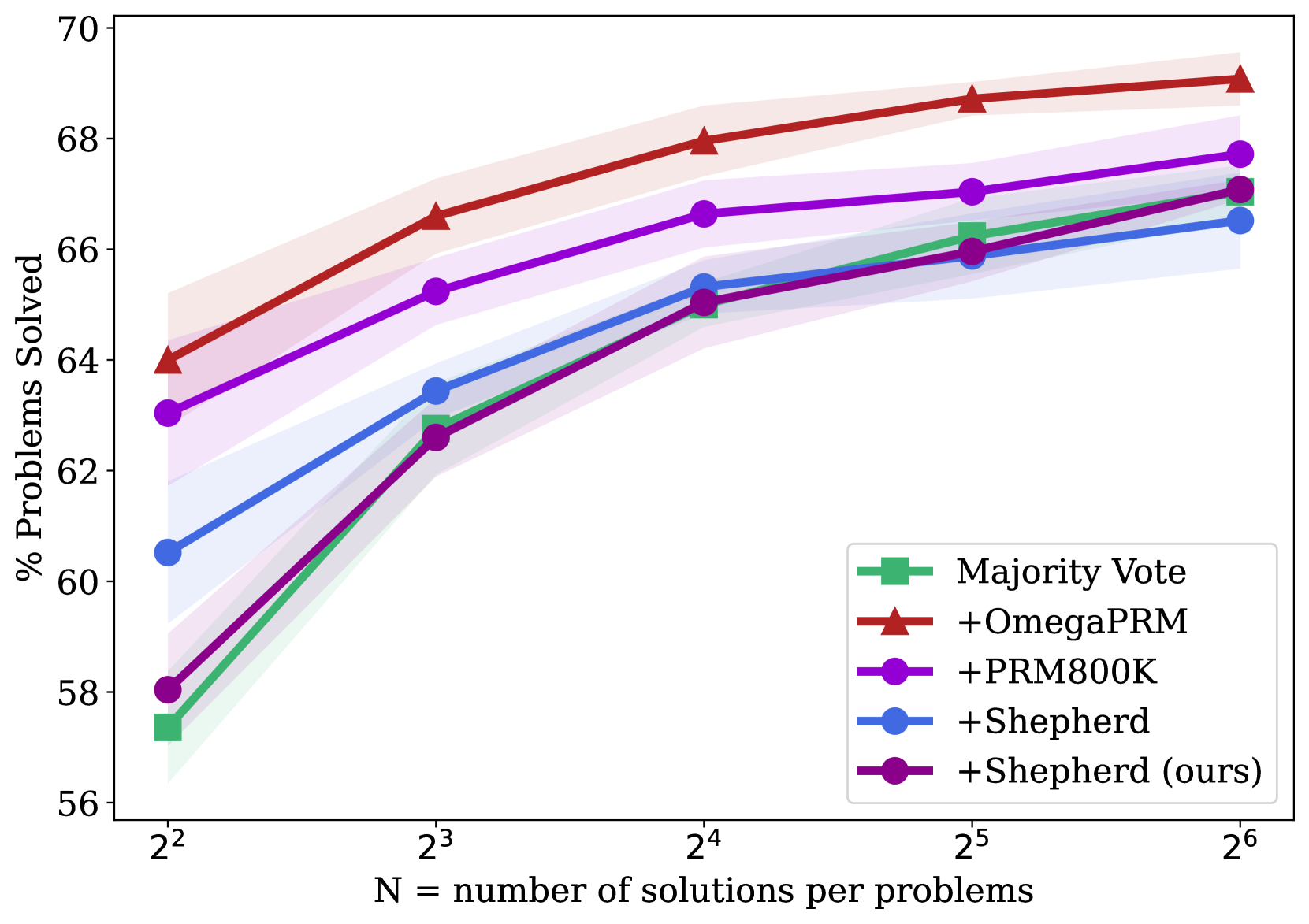
## Chart: Problem Solving Performance vs. Number of Solutions
### Overview
The image is a line chart comparing the performance of different problem-solving methods as the number of solutions per problem increases. The y-axis represents the percentage of problems solved, and the x-axis represents the number of solutions per problem, expressed as powers of 2. The chart includes data for "Majority Vote", "+OmegaPRM", "+PRM800K", "+Shepherd", and "+Shepherd (ours)". Each line is accompanied by a shaded region, presumably indicating the confidence interval or standard deviation.
### Components/Axes
* **Title:** Implicit, but the chart depicts the relationship between problem-solving performance and the number of solutions.
* **X-axis:**
* Label: "N = number of solutions per problems"
* Scale: 2<sup>2</sup>, 2<sup>3</sup>, 2<sup>4</sup>, 2<sup>5</sup>, 2<sup>6</sup>
* **Y-axis:**
* Label: "% Problems Solved"
* Scale: 56, 58, 60, 62, 64, 66, 68, 70
* **Legend:** Located on the right side of the chart.
* Green square: Majority Vote
* Red triangle: +OmegaPRM
* Purple circle: +PRM800K
* Blue circle: +Shepherd
* Dark Purple circle: +Shepherd (ours)
### Detailed Analysis
**1. Majority Vote (Green):**
* Trend: The line slopes upward, indicating improved performance with more solutions.
* Data Points:
* 2<sup>2</sup>: ~57.5%
* 2<sup>3</sup>: ~62.8%
* 2<sup>4</sup>: ~65.2%
* 2<sup>5</sup>: ~66%
* 2<sup>6</sup>: ~66.5%
**2. +OmegaPRM (Red):**
* Trend: The line slopes upward, indicating improved performance with more solutions. It consistently outperforms the other methods.
* Data Points:
* 2<sup>2</sup>: ~64%
* 2<sup>3</sup>: ~67%
* 2<sup>4</sup>: ~68%
* 2<sup>5</sup>: ~68.8%
* 2<sup>6</sup>: ~69.2%
**3. +PRM800K (Purple):**
* Trend: The line slopes upward, indicating improved performance with more solutions.
* Data Points:
* 2<sup>2</sup>: ~63.2%
* 2<sup>3</sup>: ~65.3%
* 2<sup>4</sup>: ~66.6%
* 2<sup>5</sup>: ~67%
* 2<sup>6</sup>: ~67.8%
**4. +Shepherd (Blue):**
* Trend: The line slopes upward, indicating improved performance with more solutions.
* Data Points:
* 2<sup>2</sup>: ~60.5%
* 2<sup>3</sup>: ~63.5%
* 2<sup>4</sup>: ~63.5%
* 2<sup>5</sup>: ~66%
* 2<sup>6</sup>: ~66.5%
**5. +Shepherd (ours) (Dark Purple):**
* Trend: The line slopes upward, indicating improved performance with more solutions.
* Data Points:
* 2<sup>2</sup>: ~58%
* 2<sup>3</sup>: ~62.5%
* 2<sup>4</sup>: ~65%
* 2<sup>5</sup>: ~66%
* 2<sup>6</sup>: ~67%
### Key Observations
* +OmegaPRM consistently achieves the highest percentage of problems solved across all values of N.
* All methods show improved performance as the number of solutions per problem (N) increases.
* The performance difference between the methods appears to decrease as N increases, with the exception of +OmegaPRM.
* The shaded regions around each line suggest some variability in the results, but the overall trends are clear.
### Interpretation
The chart demonstrates that increasing the number of solutions per problem generally improves the performance of problem-solving methods. +OmegaPRM consistently outperforms the other methods, suggesting it is a more effective approach. The diminishing returns observed as N increases suggest that there may be a point beyond which adding more solutions provides little additional benefit. The comparison between "+Shepherd" and "+Shepherd (ours)" might indicate the impact of a specific modification or optimization made to the Shepherd method. The shaded regions indicate the statistical uncertainty in the measurements, which should be considered when drawing conclusions.