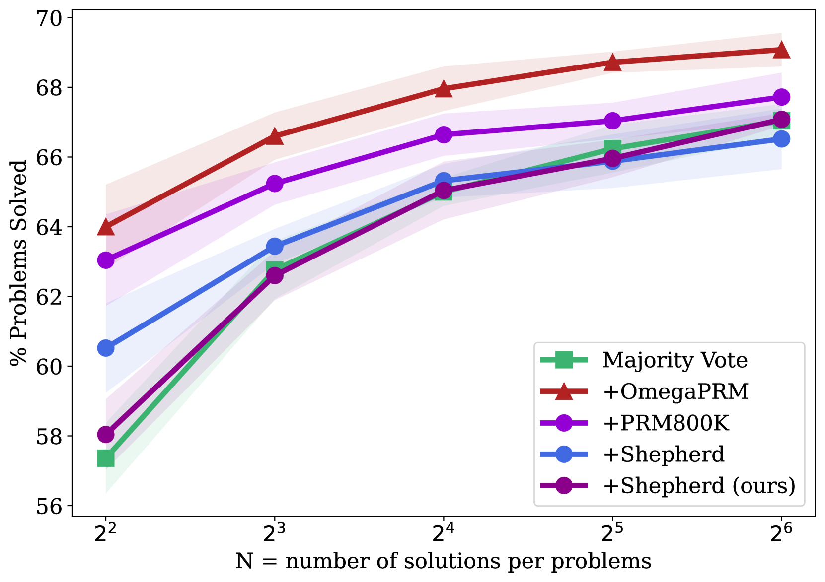
## Line Chart: Performance Comparison of Problem-Solving Methods
### Overview
This line chart compares the performance of five different methods or models in solving problems. The performance is measured as the percentage of problems solved, plotted against an increasing number of solutions generated per problem. All methods show improved performance as the number of solutions increases, but their starting points and rates of improvement differ.
### Components/Axes
* **X-Axis (Horizontal):** Labeled "N = number of solutions per problems". It uses a logarithmic scale with base 2, marked at points: 2² (4), 2³ (8), 2⁴ (16), 2⁵ (32), and 2⁶ (64).
* **Y-Axis (Vertical):** Labeled "% Problems Solved". It is a linear scale ranging from 56 to 70, with major tick marks every 2 units (56, 58, 60, 62, 64, 66, 68, 70).
* **Legend:** Located in the bottom-right quadrant of the chart area. It contains five entries, each with a colored line, a unique marker, and a label:
1. **Green line with square marker:** "Majority Vote"
2. **Red line with upward-pointing triangle marker:** "+OmegaPRM"
3. **Purple line with circle marker:** "+PRM800K"
4. **Blue line with circle marker:** "+Shepherd"
5. **Dark purple/magenta line with circle marker:** "+Shepherd (ours)"
* **Data Series:** Each method is represented by a solid line connecting data points at each x-axis value. Each line is surrounded by a semi-transparent shaded band of the same color, likely representing a confidence interval or standard deviation.
### Detailed Analysis
**Trend Verification:** All five data series exhibit a clear upward, concave-down trend. The rate of improvement (slope) is steepest between N=2² and N=2³ and gradually flattens as N increases, suggesting diminishing returns.
**Data Point Extraction (Approximate Values):**
| Method | N=2² (4) | N=2³ (8) | N=2⁴ (16) | N=2⁵ (32) | N=2⁶ (64) |
| :--- | :--- | :--- | :--- | :--- | :--- |
| **+OmegaPRM (Red, Triangle)** | ~64.0% | ~66.6% | ~67.9% | ~68.7% | ~69.1% |
| **+PRM800K (Purple, Circle)** | ~63.0% | ~65.2% | ~66.7% | ~67.1% | ~67.7% |
| **+Shepherd (Blue, Circle)** | ~60.5% | ~63.4% | ~65.3% | ~66.0% | ~66.5% |
| **+Shepherd (ours) (Dark Purple/Magenta, Circle)** | ~58.0% | ~62.6% | ~65.0% | ~66.0% | ~67.1% |
| **Majority Vote (Green, Square)** | ~57.4% | ~62.8% | ~65.0% | ~66.2% | ~67.1% |
### Key Observations
1. **Consistent Leader:** The "+OmegaPRM" method consistently outperforms all others at every data point, maintaining a clear gap.
2. **Convergence at High N:** The performance of "Majority Vote," "+Shepherd (ours)," and "+Shepherd" converges significantly as N increases. At N=2⁶, the last three methods are within approximately 0.6 percentage points of each other (66.5% to 67.1%).
3. **Strongest Improvement:** The "+Shepherd (ours)" method shows the most dramatic improvement, starting at the lowest point (~58.0%) and nearly catching up to the second-tier methods by N=2⁶.
4. **Diminishing Returns:** All curves flatten noticeably after N=2⁴ (16 solutions), indicating that generating more solutions beyond this point yields progressively smaller gains in solve rate.
5. **Uncertainty Bands:** The shaded confidence intervals are wider at lower N values (especially for "+OmegaPRM" and "+PRM800K" at N=2²), suggesting greater variance in performance when fewer solutions are used. The bands narrow as N increases.
### Interpretation
The chart demonstrates the effectiveness of different techniques for improving problem-solving performance through increased sampling (generating more solutions). The data suggests that:
* **Methodology Matters Significantly:** The choice of method (e.g., +OmegaPRM vs. Majority Vote) has a larger impact on performance than simply increasing the number of solutions for lower N values. +OmegaPRM provides a substantial and consistent advantage.
* **The Value of "Ours":** The "+Shepherd (ours)" method, while starting poorly, exhibits a superior scaling law. Its steep improvement curve suggests it may be more efficient at leveraging additional solution samples, potentially making it a competitive choice at higher computational budgets (higher N).
* **Practical Trade-off:** The flattening curves highlight a key trade-off between computational cost (proportional to N) and performance gain. The optimal operating point likely lies around N=2⁴ or N=2⁵, where most of the benefit is captured before severe diminishing returns set in.
* **Baseline Comparison:** "Majority Vote," a common baseline, is outperformed by all specialized methods (+OmegaPRM, +PRM800K) at all points. It is only competitive with the Shepherd variants at high N, indicating that more sophisticated methods provide better "bang for the buck" at lower sample counts.