\n
## Network Diagram: Relationship Visualization
### Overview
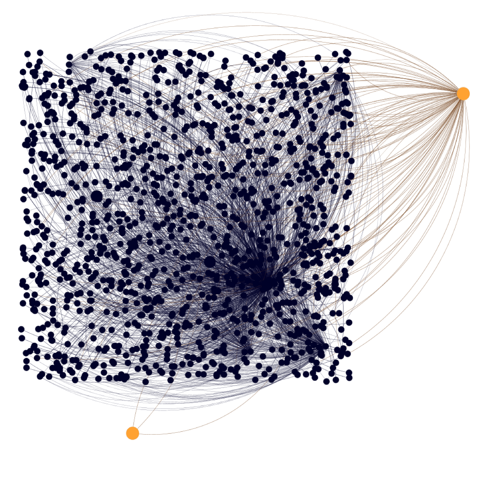
The image depicts a network diagram, visually representing relationships between numerous nodes. The majority of nodes are densely clustered in the lower-left quadrant, with connections radiating outwards. Two distinct, larger nodes are positioned in the top-right and bottom-right corners, connected to a subset of the central cluster via sparse lines. The diagram appears to illustrate a hierarchical or radiating network structure.
### Components/Axes
There are no explicit axes or scales present in the image. The diagram consists of:
* **Nodes:** Represented by circles. Most are dark blue, with two highlighted in orange.
* **Edges:** Represented by lines connecting the nodes. Most are light gray, with a few orange lines.
* **Node Density:** The central area has a high density of nodes, while the periphery has a lower density.
* **Color Coding:** Dark blue nodes represent the majority of the network, while orange nodes appear to be focal points or outliers.
### Detailed Analysis or Content Details
The diagram contains approximately 300-400 nodes (difficult to count precisely due to density).
* **Central Cluster:** The majority of the nodes (approximately 350) are densely packed in the lower-left quadrant. These nodes are interconnected by a complex web of light gray lines. The density of connections is highest in the center of this cluster and decreases towards the edges.
* **Top-Right Node:** A single, larger orange node is located in the top-right corner. Approximately 20-30 light gray lines connect this node to the central cluster.
* **Bottom-Right Node:** A single, larger orange node is located in the bottom-right corner. Approximately 5-10 light gray lines connect this node to the central cluster.
* **Orange Connections:** The two orange nodes are connected to the central cluster via light gray lines. There are also a few orange lines connecting the top-right node to a small subset of nodes within the central cluster.
* **Line Distribution:** The lines are distributed unevenly. The central cluster has a high density of lines, while the connections to the orange nodes are sparse.
### Key Observations
* **Centralization:** The network appears to be centralized around the dense cluster in the lower-left quadrant.
* **Outliers:** The two orange nodes stand out as potential outliers or focal points within the network.
* **Hierarchical Structure:** The radiating connections from the orange nodes suggest a hierarchical structure, where the orange nodes may represent higher-level entities or sources.
* **Sparse Connections:** The sparse connections between the orange nodes and the central cluster indicate that these nodes may not be directly connected to all elements of the network.
### Interpretation
The diagram likely represents a complex system of relationships, such as a social network, a knowledge graph, or a communication network. The dense central cluster could represent a core group or a common set of entities, while the orange nodes could represent influential individuals, key concepts, or external sources. The radiating connections suggest that these outliers have an impact on the central cluster, but are not fully integrated into it.
The lack of labels or quantitative data makes it difficult to draw definitive conclusions. However, the visual structure suggests that the network is not entirely random and that there are underlying patterns and relationships that are worth investigating. The diagram could be used to identify key players, understand the flow of information, or explore the structure of a complex system.
The diagram is a qualitative visualization, and does not provide specific data points or numerical values. It is a representation of relationships, and its interpretation depends on the context in which it is used. The orange nodes could represent anything from high-degree nodes to specific categories of nodes, depending on the application. Further investigation would be needed to determine the precise meaning of the diagram.