\n
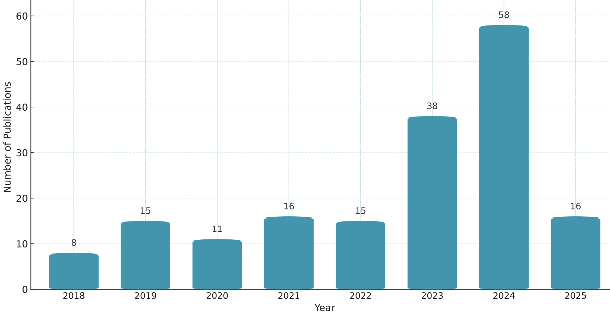
## Bar Chart: Number of Publications Over Time
### Overview
The image presents a bar chart illustrating the number of publications over the years 2018 to 2025. The chart uses a teal color for all bars. The x-axis represents the year, and the y-axis represents the number of publications.
### Components/Axes
* **X-axis:** Year, ranging from 2018 to 2025.
* **Y-axis:** Number of Publications, ranging from 0 to 60, with increments of 10.
* **Bars:** Represent the number of publications for each year.
* **Gridlines:** Horizontal gridlines are present to aid in reading the values.
### Detailed Analysis
The chart shows a generally increasing trend in the number of publications from 2018 to 2024, followed by a decrease in 2025. Let's examine the data points:
* **2018:** Approximately 8 publications.
* **2019:** Approximately 15 publications. The bar height increases significantly from 2018 to 2019.
* **2020:** Approximately 11 publications. A slight decrease from 2019.
* **2021:** Approximately 16 publications. A slight increase from 2020.
* **2022:** Approximately 15 publications. Remains relatively stable compared to 2021.
* **2023:** Approximately 38 publications. A substantial increase from 2022.
* **2024:** Approximately 58 publications. The highest number of publications in the observed period.
* **2025:** Approximately 16 publications. A significant decrease from 2024, returning to a level similar to 2021.
### Key Observations
* The most significant increase in publications occurs between 2022 and 2023.
* The year 2024 shows the peak in publication numbers.
* There is a sharp decline in publications in 2025, which is a notable outlier.
* The data suggests a period of growth followed by a sudden drop.
### Interpretation
The chart likely represents the research output in a specific field over time. The increasing trend from 2018 to 2024 could indicate growing interest, funding, or research activity in that field. The dramatic drop in 2025 is a significant anomaly. Possible explanations include:
* **Funding cycles:** A major funding program might have ended, leading to reduced research output.
* **Shift in research focus:** Researchers may have moved to different areas of study.
* **Publication delays:** Publications planned for 2025 may have been delayed and will appear in subsequent years.
* **Data collection issues:** There might be an error in the data collection or reporting for 2025.
Further investigation would be needed to determine the underlying cause of the decline in 2025. The chart highlights the importance of considering temporal trends when analyzing research output and the need to investigate unexpected changes.