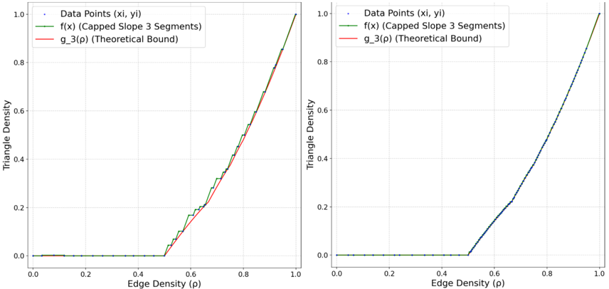
## Line Chart: Triangle Density vs. Edge Density
### Overview
The image contains two identical line charts comparing triangle density to edge density. The charts display three data series: "Data Points (xi, yi)", "f(x) (Capped Slope 3 Segments)", and "g_3(ρ) (Theoretical Bound)". The x-axis represents edge density (ρ), and the y-axis represents triangle density.
### Components/Axes
* **Title:** Implicitly, the chart explores the relationship between edge density and triangle density.
* **X-Axis:** Edge Density (ρ), ranging from 0.0 to 1.0 in increments of 0.2.
* **Y-Axis:** Triangle Density, ranging from 0.0 to 1.0 in increments of 0.2.
* **Legend (Top-Left):**
* Dark Blue: Data Points (xi, yi)
* Green: f(x) (Capped Slope 3 Segments)
* Red: g_3(ρ) (Theoretical Bound)
### Detailed Analysis
**Chart 1 (Left):**
* **Data Points (xi, yi) (Dark Blue):** The data points remain at approximately 0.0 triangle density until an edge density of approximately 0.5. After this point, the data points increase linearly to approximately 1.0 triangle density at an edge density of 1.0.
* **f(x) (Capped Slope 3 Segments) (Green):** This line also remains at approximately 0.0 triangle density until an edge density of approximately 0.5. After this point, the line increases linearly to approximately 1.0 triangle density at an edge density of 1.0. The green line appears to be a piecewise linear approximation of the blue data points.
* **g_3(ρ) (Theoretical Bound) (Red):** This line remains at approximately 0.0 triangle density until an edge density of approximately 0.5. After this point, the line increases linearly to approximately 0.8 triangle density at an edge density of 1.0.
**Chart 2 (Right):**
* **Data Points (xi, yi) (Dark Blue):** The data points remain at approximately 0.0 triangle density until an edge density of approximately 0.5. After this point, the data points increase linearly to approximately 1.0 triangle density at an edge density of 1.0.
* **f(x) (Capped Slope 3 Segments) (Green):** This line also remains at approximately 0.0 triangle density until an edge density of approximately 0.5. After this point, the line increases linearly to approximately 1.0 triangle density at an edge density of 1.0. The green line appears to be a piecewise linear approximation of the blue data points.
* **g_3(ρ) (Theoretical Bound) (Red):** This line is not visible in the second chart.
### Key Observations
* Both charts show a similar trend: triangle density remains at zero until an edge density of around 0.5, after which it increases linearly.
* The "Data Points" and "f(x)" series overlap significantly in both charts, suggesting that "f(x)" is a good approximation of the data.
* The "g_3(ρ)" series in the first chart represents a theoretical bound that is lower than the actual data points and the "f(x)" approximation.
* The second chart does not show the "g_3(ρ)" series.
### Interpretation
The charts illustrate the relationship between edge density and triangle density in a network or graph. The data suggests that a certain threshold of edge density (around 0.5) must be reached before triangles start to form in the network. The "f(x)" series, representing a capped slope 3 segments function, provides a good approximation of the actual data points. The "g_3(ρ)" series in the first chart represents a theoretical upper bound on the triangle density, which is less than the actual observed triangle density. The absence of the "g_3(ρ)" series in the second chart might indicate a different theoretical model or a deliberate omission for comparison purposes.