\n
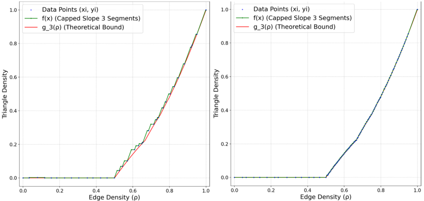
## Chart: Triangle Density vs. Edge Density
### Overview
The image presents two charts displaying the relationship between Edge Density (p) and Triangle Density. Both charts share the same axes and legend, but differ in the visualization of the data points. The left chart includes a green line representing f(x) (Capped Slope 3 Segments) and a red line representing g_3(p) (Theoretical Bound), alongside scattered blue data points. The right chart only shows the data points as a blue line and the f(x) line in green.
### Components/Axes
* **X-axis Title:** "Edge Density (p)" - Scale ranges from approximately 0.0 to 1.0, with markings at 0.2, 0.4, 0.6, 0.8, and 1.0.
* **Y-axis Title:** "Triangle Density" - Scale ranges from approximately 0.0 to 1.0, with markings at 0.2, 0.4, 0.6, 0.8, and 1.0.
* **Legend (Top-Left of both charts):**
* "Data Points (xi, yi)" - Represented by blue dots/line.
* "f(x) (Capped Slope 3 Segments)" - Represented by a green line.
* "g_3(p) (Theoretical Bound)" - Represented by a red line.
### Detailed Analysis or Content Details
**Left Chart:**
* **Data Points (xi, yi):** The blue data points are scattered, showing a generally increasing trend.
* At p ≈ 0.0, Triangle Density ≈ 0.0.
* At p ≈ 0.2, Triangle Density ≈ 0.02.
* At p ≈ 0.4, Triangle Density ≈ 0.1.
* At p ≈ 0.6, Triangle Density ≈ 0.3.
* At p ≈ 0.8, Triangle Density ≈ 0.6.
* At p ≈ 1.0, Triangle Density ≈ 0.95.
* **f(x) (Capped Slope 3 Segments):** The green line starts at approximately (0.0, 0.0) and increases with a changing slope. It appears to have three distinct segments with different slopes.
* From p ≈ 0.0 to p ≈ 0.3, the slope is relatively shallow.
* From p ≈ 0.3 to p ≈ 0.7, the slope increases significantly.
* From p ≈ 0.7 to p ≈ 1.0, the slope decreases slightly.
* **g_3(p) (Theoretical Bound):** The red line starts at approximately (0.0, 0.0) and increases with a similar trend to f(x), but appears to be consistently below f(x) until approximately p ≈ 0.9, where it converges.
**Right Chart:**
* **Data Points (xi, yi):** The blue line follows the same trend as the scattered data points in the left chart, showing a generally increasing relationship between Edge Density and Triangle Density.
* At p ≈ 0.0, Triangle Density ≈ 0.0.
* At p ≈ 0.2, Triangle Density ≈ 0.02.
* At p ≈ 0.4, Triangle Density ≈ 0.1.
* At p ≈ 0.6, Triangle Density ≈ 0.3.
* At p ≈ 0.8, Triangle Density ≈ 0.6.
* At p ≈ 1.0, Triangle Density ≈ 0.95.
* **f(x) (Capped Slope 3 Segments):** The green line is identical to the one in the left chart, starting at approximately (0.0, 0.0) and increasing with a changing slope.
### Key Observations
* Both charts demonstrate a positive correlation between Edge Density and Triangle Density. As Edge Density increases, Triangle Density also tends to increase.
* The f(x) line (Capped Slope 3 Segments) appears to provide a model or approximation of the relationship, while g_3(p) represents a theoretical lower bound.
* The right chart simplifies the visualization by presenting the data points as a continuous line, potentially highlighting the overall trend more clearly.
* The data points in the left chart show some variability around the f(x) line, suggesting that the model is not a perfect fit for all data.
### Interpretation
The charts likely represent a study of network structures, where Edge Density refers to the proportion of possible edges that are actually present, and Triangle Density measures the clustering or interconnectedness of nodes within the network. The f(x) function could be a model attempting to capture the relationship between these two metrics, potentially based on the observed data. The g_3(p) function represents a theoretical limit or bound on the Triangle Density given a certain Edge Density.
The three-segment slope of f(x) suggests that the relationship between Edge Density and Triangle Density is not linear, but changes in different phases. The convergence of f(x) and g_3(p) at higher Edge Densities indicates that the network becomes increasingly saturated with triangles as more edges are added.
The right chart's simplification to a line emphasizes the overall trend, while the left chart's scatter plot provides a more nuanced view of the data, revealing the inherent variability in real-world networks. The difference in visualization suggests that the purpose of the two charts may be different – one for highlighting the overall trend, and the other for showing the raw data and the model's fit.