\n
## [Chart/Diagram Type]: Comparative Line Charts with Data Points
### Overview
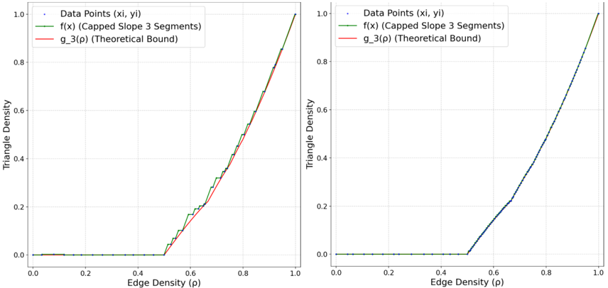
The image displays two side-by-side line charts comparing the relationship between "Edge Density (ρ)" and "Triangle Density." Each chart plots empirical data points against two theoretical or fitted models: a "Capped Slope 3 Segments" function and a "Theoretical Bound." The left chart shows a distinct step-like fitted function and a separate theoretical bound curve, while the right chart shows the data points and fitted function aligning much more closely, with the theoretical bound not visibly distinct.
### Components/Axes
**Common Elements (Both Charts):**
* **X-Axis:** Labeled "Edge Density (ρ)". Scale ranges from 0.0 to 1.0 with major tick marks at 0.0, 0.2, 0.4, 0.6, 0.8, and 1.0.
* **Y-Axis:** Labeled "Triangle Density". Scale ranges from 0.0 to 1.0 with major tick marks at 0.0, 0.2, 0.4, 0.6, 0.8, and 1.0.
* **Legend (Top-Left Corner):**
* Blue dot: "Data Points (xi, yi)"
* Green line: "f(x) (Capped Slope 3 Segments)"
* Red line: "g_3(ρ) (Theoretical Bound)"
**Left Chart Specifics:**
* The green line ("f(x)") exhibits a clear, multi-segment step function behavior. It remains flat near y=0 until approximately x=0.5, then increases in a series of distinct, steep linear segments with flat plateaus between them.
* The red line ("g_3(ρ)") is a smooth, convex curve that begins rising from y=0 at approximately x=0.5 and increases monotonically to y=1.0 at x=1.0. It lies below the green step function for most of its trajectory after x=0.5.
**Right Chart Specifics:**
* The green line ("f(x)") appears as a much smoother, continuous curve with a sharp change in slope (a "kink") at approximately x=0.5. It does not show the pronounced step-like plateaus seen in the left chart.
* The red line ("g_3(ρ)") is not visibly distinct from the green line or the data points in this chart, suggesting it may be perfectly overlaid or omitted.
### Detailed Analysis
**Left Chart Data & Trends:**
1. **Data Points (Blue):** For Edge Density (ρ) from 0.0 to approximately 0.5, the Triangle Density is consistently at or very near 0.0. After ρ ≈ 0.5, the data points show a rapid, roughly linear increase in Triangle Density, reaching approximately 1.0 at ρ = 1.0. The points exhibit some scatter around the trend.
2. **f(x) - Capped Slope 3 Segments (Green):** This is a piecewise linear, step-like function.
* Segment 1: Flat at y=0 from x=0.0 to x≈0.5.
* Segment 2: A steep linear increase from (x≈0.5, y=0) to a plateau at y≈0.18.
* Segment 3: Another steep linear increase to a plateau at y≈0.35.
* Segment 4: A final steep linear increase from the last plateau to (x=1.0, y=1.0).
3. **g_3(ρ) - Theoretical Bound (Red):** A smooth, convex curve. It intersects y=0 at x≈0.5 and rises to y=1.0 at x=1.0. Key approximate points: (0.6, 0.1), (0.7, 0.25), (0.8, 0.5), (0.9, 0.78).
**Right Chart Data & Trends:**
1. **Data Points (Blue):** The pattern is similar to the left chart: near-zero Triangle Density for ρ < 0.5, followed by a sharp increase. However, the data points in the rising region (ρ > 0.5) appear to have significantly less scatter and follow a smoother, more defined curve.
2. **f(x) - Capped Slope 3 Segments (Green):** In this chart, the function appears as a smooth curve with a single sharp transition (a "kink") at ρ ≈ 0.5, where it changes from a slope of 0 to a positive, increasing slope. It lacks the intermediate plateaus visible in the left chart's green line.
3. **g_3(ρ) - Theoretical Bound (Red):** Not visibly distinguishable from the green line or the dense cluster of data points.
### Key Observations
1. **Threshold Behavior:** Both charts demonstrate a clear phase transition or threshold effect. Triangle Density is effectively zero until Edge Density reaches a critical value of approximately ρ = 0.5, after which it increases rapidly.
2. **Model Fit Discrepancy:** The left chart shows a poor fit between the step-like "Capped Slope" model (green) and the smooth "Theoretical Bound" (red). The right chart shows an excellent fit between the data and a smoother version of the "Capped Slope" model, with the theoretical bound likely coinciding.
3. **Data Scatter:** The empirical data points (blue) in the left chart show more variance or noise around the trend for ρ > 0.5 compared to the tightly clustered points in the right chart.
4. **Spatial Layout:** The legends are identically placed in the top-left of each plot area. The charts share identical axis labels and scales, facilitating direct comparison.
### Interpretation
These charts likely illustrate the results of a simulation or experiment studying the formation of triangles in a network (e.g., a random graph) as a function of its edge density. The "Triangle Density" measures the prevalence of 3-node cliques.
* **The Threshold at ρ=0.5:** This is a critical finding. It suggests that below an edge density of 50%, triangles are extremely rare in the studied system. Once the network becomes sufficiently connected (ρ > 0.5), triangle formation becomes not just possible but prolific, with density scaling nearly linearly with further increases in edge density.
* **Model Comparison:** The left panel may represent an initial or simplified theoretical model ("Capped Slope 3 Segments") that approximates the true relationship with a step function. The red "Theoretical Bound" represents a more accurate, smooth analytical prediction. The right panel likely shows either a refined model fit or results from a different experimental condition where the empirical data aligns perfectly with the smooth theoretical prediction, rendering the step-function approximation unnecessary.
* **Underlying Principle:** The data demonstrates a non-linear, threshold-driven relationship between local connectivity (edges) and higher-order structure (triangles). This is a fundamental concept in network science, often related to percolation theory or the emergence of complex structure in random graphs. The sharp transition indicates a phase change in the network's topological properties.