\n
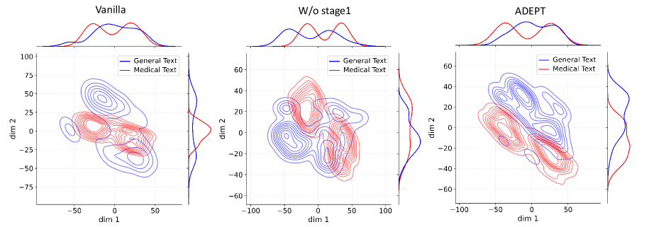
## Scatter Plot: Dimensionality Reduction Comparison
### Overview
The image presents three scatter plots, each representing a dimensionality reduction of text data. The plots compare the distribution of "General Text" and "Medical Text" across two dimensions (dim 1 and dim 2) for three different models: "Vanilla", "W/o stage1", and "ADEPT". Each plot also includes a density plot above the scatter, showing the marginal distribution of each text type along a combined dimension.
### Components/Axes
Each plot shares the following components:
* **Title:** Indicates the model being used ("Vanilla", "W/o stage1", "ADEPT"). Positioned at the top-center.
* **X-axis:** Labeled "dim 1", ranging from approximately -100 to 100 (scales vary slightly between plots).
* **Y-axis:** Labeled "dim 2", ranging from approximately -75 to 100 (scales vary slightly between plots).
* **Legend:** Located in the top-right corner, distinguishing between "General Text" (blue) and "Medical Text" (red).
* **Density Plot:** Positioned above the scatter plot, showing the probability density of each text type. The x-axis of the density plot corresponds to a combined dimension.
### Detailed Analysis or Content Details
**Plot 1: Vanilla**
* **General Text (Blue):** The blue contour lines form a roughly elliptical shape, centered around (approximately -30, 20). The density plot shows a single peak around -30.
* **Medical Text (Red):** The red contour lines also form an elliptical shape, but are more elongated and centered around (approximately 0, -20). The density plot shows a single peak around 0.
* The two distributions are somewhat overlapping, but distinguishable.
**Plot 2: W/o stage1**
* **General Text (Blue):** The blue contour lines form a more complex, elongated shape, centered around (approximately -20, 0). The density plot shows a peak around -20 and a smaller peak around 50.
* **Medical Text (Red):** The red contour lines form a more diffuse, elongated shape, centered around (approximately 50, -20). The density plot shows a peak around 50.
* The distributions are more separated than in the "Vanilla" plot.
**Plot 3: ADEPT**
* **General Text (Blue):** The blue contour lines form a relatively compact, elliptical shape, centered around (approximately -20, 20). The density plot shows a single peak around -20.
* **Medical Text (Red):** The red contour lines form a more elongated shape, centered around (approximately 0, -30). The density plot shows a single peak around 0.
* The distributions are well-separated, with minimal overlap.
### Key Observations
* The "Vanilla" model shows the most overlap between the distributions of "General Text" and "Medical Text".
* Removing "stage1" ("W/o stage1") increases the separation between the distributions, but also introduces a secondary peak in the density plot for "General Text".
* The "ADEPT" model achieves the best separation between the distributions, with minimal overlap and clear single peaks in the density plots.
* The shape and orientation of the contour lines vary significantly between the models, indicating different dimensionality reduction characteristics.
### Interpretation
The plots demonstrate the effectiveness of different models in separating "General Text" from "Medical Text" in a reduced dimensional space. The "Vanilla" model struggles to distinguish between the two text types, as evidenced by the significant overlap in their distributions. Removing "stage1" improves separation but introduces complexity. The "ADEPT" model appears to be the most successful, achieving clear separation and a simpler distribution for both text types. This suggests that the "ADEPT" model learns a more effective representation for distinguishing between general and medical language. The density plots provide additional insight into the marginal distributions, confirming the improved separation achieved by the "ADEPT" model. The varying shapes of the contour lines indicate that each model employs a different strategy for dimensionality reduction, resulting in different representations of the text data.