\n
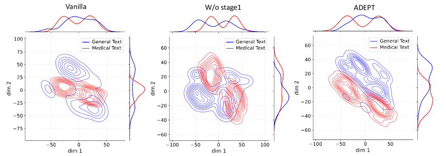
## Comparative Contour Plot with Marginal Distributions: Vanilla, W/o stage1, ADEPT
### Overview
The image displays three side-by-side plots comparing the 2D embedding distributions of "General Text" and "Medical Text" as produced by three different models or model variants: "Vanilla", "W/o stage1" (Without stage 1), and "ADEPT". Each plot is a contour plot with marginal density distributions shown on the top and right axes.
### Components/Axes
* **Plot Titles (Top Center):** "Vanilla", "W/o stage1", "ADEPT".
* **Axes Labels:**
* X-axis (Bottom): "dim 1" for all three plots.
* Y-axis (Left): "dim 2" for all three plots.
* **Axis Scales:**
* **Vanilla:** dim 1 ranges approximately from -75 to 75. dim 2 ranges approximately from -75 to 100.
* **W/o stage1:** dim 1 ranges approximately from -100 to 100. dim 2 ranges approximately from -60 to 60.
* **ADEPT:** dim 1 ranges approximately from -100 to 100. dim 2 ranges approximately from -60 to 60.
* **Legend (Top-right corner of each main plot area):**
* A blue line labeled "General Text".
* A red line labeled "Medical Text".
* **Plot Elements:**
* **Main Area:** 2D contour plots showing the density of data points for each text type. Blue contours represent "General Text", red contours represent "Medical Text".
* **Marginal Plots:** Density curves (histograms/KDEs) along the top (for dim 1 distribution) and right side (for dim 2 distribution) of each main plot, colored blue and red to match their respective text type.
### Detailed Analysis
**1. Vanilla Plot (Left):**
* **Contour Analysis:** The blue ("General Text") and red ("Medical Text") contour clouds show significant overlap, particularly in the central region around dim1=0, dim2=0. The "General Text" distribution appears more spread out, especially along the positive dim2 axis. The "Medical Text" distribution is more concentrated but still overlaps substantially with the blue contours.
* **Marginal Distributions (Top - dim1):** Both the blue and red density curves are broad and overlapping, with multiple peaks. The red curve ("Medical Text") has a slightly more pronounced peak near dim1=0.
* **Marginal Distributions (Right - dim2):** The blue curve is very broad, spanning from approximately -75 to 100. The red curve is narrower, centered around dim2=0, but still overlaps with the lower portion of the blue curve.
**2. W/o stage1 Plot (Center):**
* **Contour Analysis:** The separation between the two distributions is more pronounced than in the "Vanilla" plot. The blue ("General Text") contours form a cluster primarily in the lower-left quadrant (negative dim1, negative dim2). The red ("Medical Text") contours form a cluster primarily in the upper-right quadrant (positive dim1, positive dim2). There is a region of overlap in the center.
* **Marginal Distributions (Top - dim1):** The blue and red curves are now clearly bimodal and separated. The blue curve peaks in the negative dim1 region, while the red curve peaks in the positive dim1 region.
* **Marginal Distributions (Right - dim2):** Similar separation is visible. The blue curve peaks in the negative dim2 region, and the red curve peaks in the positive dim2 region.
**3. ADEPT Plot (Right):**
* **Contour Analysis:** This plot shows the clearest separation between the two text types. The blue ("General Text") contours are densely clustered in a distinct region, primarily in the lower-left to central area. The red ("Medical Text") contours form a separate, dense cluster in the upper-right area. The overlap between the two is minimal compared to the other plots.
* **Marginal Distributions (Top - dim1):** The separation is very clear. The blue curve has a sharp peak in the negative dim1 region (around -50). The red curve has a sharp peak in the positive dim1 region (around +25).
* **Marginal Distributions (Right - dim2):** The separation is also very clear here. The blue curve peaks in the negative dim2 region (around -20). The red curve peaks in the positive dim2 region (around +20).
### Key Observations
1. **Progressive Separation:** There is a clear visual progression from high overlap ("Vanilla") to moderate separation ("W/o stage1") to strong separation ("ADEPT") between the embedding distributions of General Text and Medical Text.
2. **Cluster Tightening:** As the models progress from Vanilla to ADEPT, the contour clusters for each text type become tighter and more defined, indicating less variance within each category in the learned embedding space.
3. **Marginal Distribution Clarity:** The marginal density plots provide a clear, 1D confirmation of the separation observed in the 2D contours. The peaks for General and Medical text become sharper and move further apart along both dimensions in the ADEPT model.
4. **Spatial Grounding:** In all plots, the legend is consistently placed in the top-right corner of the main plot area. The color coding (blue=General, red=Medical) is consistent across all elements (contours, marginal lines, legend).
### Interpretation
This visualization demonstrates the effectiveness of the "ADEPT" model (and to a lesser extent, the "W/o stage1" variant) in learning a disentangled representation space for text from different domains. The "Vanilla" model fails to distinguish between general and medical text, mapping them to largely overlapping regions. This could hinder performance on domain-specific tasks.
The progression suggests that the architectural or training modifications in "W/o stage1" and especially "ADEPT" successfully encourage the model to encode domain-specific semantic features into distinct dimensions of the embedding space. The clear separation in the ADEPT plot implies that a classifier or downstream task could more easily distinguish between or specialize for these text types using its embeddings. This is a desirable property for building specialized NLP models for fields like medicine, where domain-specific language understanding is critical. The tight clustering also suggests more consistent and confident representations within each domain.