## Screenshot: Quiz Interface Navigation
### Overview
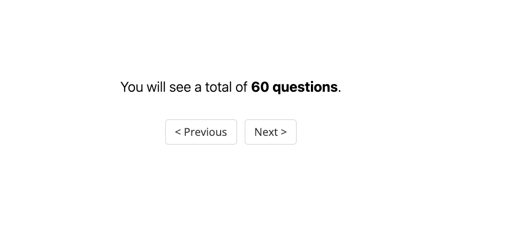
The image displays a minimalist user interface for a quiz or assessment platform. The primary text indicates the total number of questions in the assessment, with navigation controls for progressing through the questions.
### Components/Axes
- **Text Elements**:
- "You will see a total of 60 questions." (Centered, bold font)
- "Previous" (Left-aligned button, left-facing arrow `<` prefix)
- "Next" (Right-aligned button, right-facing arrow `>` suffix)
- **UI Layout**:
- Two rectangular buttons with rounded corners, separated by negative space.
- Buttons have a light gray background with dark gray text and borders.
### Detailed Analysis
- **Textual Content**:
- The total question count is explicitly stated as **60**, with the number emphasized in bold.
- Navigation buttons use directional arrows (`<` and `>`) to indicate functionality.
- **Styling**:
- Text uses a sans-serif font (likely system default).
- Buttons follow a flat design aesthetic with no gradients or shadows.
### Key Observations
- The interface prioritizes clarity, with no decorative elements.
- The "60 questions" text is the focal point, suggesting this is a progress indicator or introductory screen.
- Buttons are symmetrically placed, implying equal importance to backward/forward navigation.
### Interpretation
This interface is designed for a linear assessment experience, where users navigate sequentially through 60 questions. The absence of additional controls (e.g., "Submit," "Skip") suggests this is either a pre-quiz screen or a simplified navigation layer. The emphasis on the total question count may aim to set user expectations for the assessment's length. The minimalist design reduces cognitive load, focusing attention on progression rather than aesthetics.