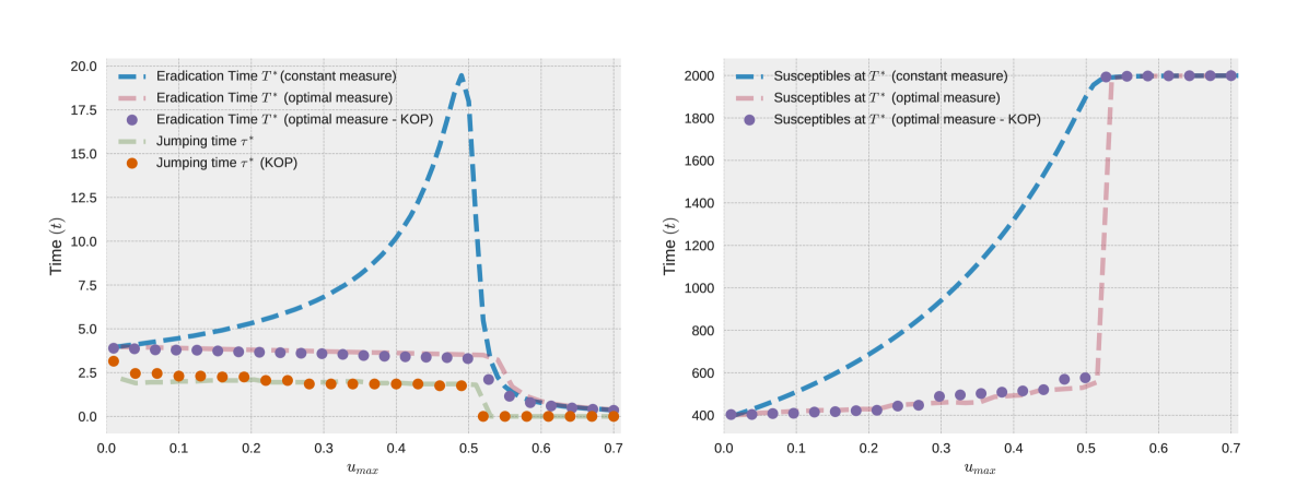
# Technical Document Extraction: Chart Analysis
## Chart 1: Time (t) vs. u_max
### Axes
- **X-axis**: `u_max` (range: 0.0 to 0.7)
- **Y-axis**: `Time (t)` (range: 0.0 to 20.0)
### Legend
1. **Eradication Time T* (constant measure)**
- Line style: Solid blue (`#1f77b4`)
2. **Eradication Time T* (optimal measure)**
- Line style: Dashed pink (`#ff7f0e`)
3. **Eradication Time T* (optimal measure - KOP)**
- Marker: Purple circles (`#9467bd`)
4. **Jumping time τ* (KOP)**
- Marker: Orange circles (`#d62728`)
### Key Trends
- **Eradication Time T* (constant measure)**
- Starts at ~4.0 (u_max=0.0), rises sharply to ~19.0 at u_max=0.5, then drops to ~0.5 by u_max=0.7.
- **Eradication Time T* (optimal measure)**
- Remains flat at ~3.5 from u_max=0.0 to 0.5, then drops sharply to ~0.5 by u_max=0.7.
- **Eradication Time T* (optimal measure - KOP)**
- Flat at ~3.5 until u_max=0.5, then drops to ~0.5 by u_max=0.7.
- **Jumping time τ* (KOP)**
- Flat at ~2.0 until u_max=0.5, then drops to ~0.0 by u_max=0.7.
## Chart 2: Susceptibles at T* vs. u_max
### Axes
- **X-axis**: `u_max` (range: 0.0 to 0.7)
- **Y-axis**: `Time (t)` (range: 0.0 to 2000.0)
### Legend
1. **Susceptibles at T* (constant measure)**
- Line style: Solid blue (`#1f77b4`)
2. **Susceptibles at T* (optimal measure)**
- Line style: Dashed pink (`#ff7f0e`)
3. **Susceptibles at T* (optimal measure - KOP)**
- Marker: Purple circles (`#9467bd`)
### Key Trends
- **Susceptibles at T* (constant measure)**
- Starts at ~400 (u_max=0.0), rises sharply to ~1950 at u_max=0.5, then plateaus at ~1950 by u_max=0.7.
- **Susceptibles at T* (optimal measure)**
- Remains flat at ~400 until u_max=0.5, then drops sharply to ~500 by u_max=0.7.
- **Susceptibles at T* (optimal measure - KOP)**
- Flat at ~400 until u_max=0.5, then drops to ~500 by u_max=0.7.
## Cross-Chart Observations
- **Consistency in KOP Notation**:
- Both charts use "KOP" (likely "Knockout Point") to denote modified optimal measures.
- **Behavioral Contrast**:
- Left chart focuses on eradication time dynamics, while the right chart emphasizes susceptible population changes.
- **Critical Threshold**:
- Both charts exhibit significant changes at `u_max=0.5`, suggesting a phase transition or critical parameter value.
## Notes
- All line styles and markers align with the legend definitions.
- No numerical data tables or embedded text blocks are present in the image.