\n
## Line Chart: Dual Probability Distributions
### Overview
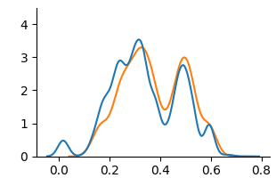
The image displays a line chart featuring two distinct lines (blue and orange) plotted on a Cartesian coordinate system. The chart appears to represent two probability density functions or similar continuous distributions, each exhibiting multiple peaks (multimodal distributions). There is no explicit title, legend, or axis labels beyond the numerical markers.
### Components/Axes
* **X-Axis (Horizontal):**
* **Scale:** Linear.
* **Range:** Approximately 0.0 to 0.8.
* **Markers/Ticks:** Labeled at intervals of 0.2: `0.0`, `0.2`, `0.4`, `0.6`, `0.8`.
* **Title/Label:** None visible.
* **Y-Axis (Vertical):**
* **Scale:** Linear.
* **Range:** 0 to 4.
* **Markers/Ticks:** Labeled at integer intervals: `0`, `1`, `2`, `3`, `4`.
* **Title/Label:** None visible.
* **Data Series:**
* **Series 1 (Blue Line):** A solid blue line.
* **Series 2 (Orange Line):** A solid orange line.
* **Legend:** No legend is present in the image. Series are distinguished solely by color.
### Detailed Analysis
**Trend Verification & Data Point Extraction:**
* **Blue Line Trend:** The line starts near y=0 at x=0.0, rises to a small initial peak, dips, then ascends to a major peak, descends into a valley, rises to a second major peak, and finally descends toward zero.
* **Approximate Key Points (x, y):**
* (0.0, ~0.0)
* First small peak: (~0.05, ~0.5)
* First major peak: (~0.30, ~3.5)
* Valley between peaks: (~0.40, ~1.0)
* Second major peak: (~0.50, ~2.8)
* End: (~0.70, ~0.0)
* **Orange Line Trend:** Follows a similar bimodal pattern but with different peak magnitudes and slight positional shifts. It starts near y=0, rises more gradually to its first peak, dips, rises to a second peak that is higher than its first, then descends.
* **Approximate Key Points (x, y):**
* (0.0, ~0.0)
* First peak: (~0.30, ~3.2) [Slightly lower than blue's first peak]
* Valley between peaks: (~0.40, ~1.5) [Shallower valley than blue]
* Second peak: (~0.50, ~3.0) [Slightly higher than blue's second peak]
* End: (~0.65, ~0.0)
**Spatial Grounding & Cross-Reference:**
* The two lines intersect at least twice: once near x=0.4 (where the blue line is in its deep valley and the orange line is in its shallower valley) and again near x=0.55 on the descending slope after the second peak.
* The blue line's first peak (x≈0.30) is the highest point on the entire chart (y≈3.5).
* The orange line's second peak (x≈0.50) is its highest point (y≈3.0).
### Key Observations
1. **Multimodality:** Both distributions are clearly bimodal, with two distinct peaks.
2. **Peak Asymmetry:** For the blue line, the first peak is higher. For the orange line, the second peak is higher.
3. **Valley Depth:** The valley between the peaks is significantly deeper for the blue line (dropping to y≈1.0) compared to the orange line (dropping to y≈1.5).
4. **Right Skew:** Both distributions are skewed to the right, with the tail extending further towards higher x-values (up to ~0.7-0.8) than lower ones.
5. **Overlap and Divergence:** The lines follow very similar paths but diverge notably in the region between x=0.2 and x=0.5, particularly in the depth of the central valley.
### Interpretation
This chart visually compares two continuous, bimodal distributions. The data suggests two underlying populations or processes, each with two primary modes or clusters. The blue distribution has a more pronounced separation between its modes (deeper valley), indicating a clearer distinction between its two sub-groups. The orange distribution shows more blending between its modes.
The shift in which peak is dominant (first for blue, second for orange) could indicate a difference in the relative frequency or concentration of data points between the two modes in each dataset. For example, if this represented test scores, the blue group might have more people scoring in the lower mode, while the orange group has more in the higher mode.
Without axis labels, the specific context is unknown. However, the pattern is characteristic of data from mixed sources, such as:
* Measurements from two different species or machine types.
* Results from two different experimental conditions.
* Outputs from two different algorithms or models processing the same input range.
The right skew suggests that while most values cluster below 0.6, there is a non-negligible presence of higher values up to 0.8. The precise alignment and misalignment of the peaks provide a direct visual comparison of how the central tendencies and spreads of the two distributions relate.