\n
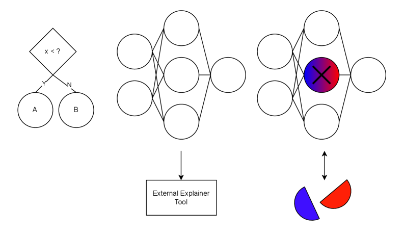
## Diagram: Explainable AI Workflow
### Overview
The image depicts a simplified workflow for explaining the decisions made by a neural network. It shows an input stage, a neural network, and an external explainer tool that visualizes the importance of different features. The diagram is primarily conceptual and does not contain numerical data.
### Components/Axes
The diagram consists of the following components:
* **Input Stage:** Two circles labeled "A" and "B" connected to a diamond shape.
* **Diamond Shape:** Contains the text "x < ?" and labels "y" and "w" on its sides.
* **Neural Network:** A multi-layered network of interconnected circles.
* **Highlighted Neuron:** A neuron within the neural network is highlighted with a red circle and a large "X" inside.
* **External Explainer Tool:** A rectangular box labeled "External Explainer Tool".
* **Visualization:** A pie chart-like visualization with red and blue segments.
* **Arrow:** An arrow indicates the flow of information from the neural network to the explainer tool and back.
### Detailed Analysis or Content Details
* **Input Stage:** Circles A and B represent input features. The diamond shape represents a decision or a condition being evaluated. The text "x < ?" suggests a comparison operation. The labels "y" and "w" likely represent weights or parameters associated with the input features.
* **Neural Network:** The network appears to have multiple hidden layers, represented by the interconnected circles. The connections between the circles represent weighted connections between neurons.
* **Highlighted Neuron:** The red circle and "X" indicate that this neuron is particularly important for the current decision.
* **External Explainer Tool:** This tool is used to interpret the internal workings of the neural network.
* **Visualization:** The pie chart-like visualization shows the relative importance of different features. The red segment is larger than the blue segment, suggesting that the features associated with the red segment are more influential in the decision. The visualization is split approximately 70% red and 30% blue.
* **Flow:** The arrow indicates that the explainer tool receives information from the neural network (specifically, the highlighted neuron) and provides a visualization of the feature importance.
### Key Observations
* The diagram emphasizes the importance of understanding *why* a neural network makes a particular decision, not just *what* decision it makes.
* The highlighted neuron suggests that the explainer tool focuses on identifying the most influential neurons in the network.
* The visualization provides a simple way to communicate the relative importance of different features to a human user.
### Interpretation
This diagram illustrates a common approach to explainable AI (XAI). The goal is to make the "black box" of a neural network more transparent and understandable. The diagram suggests that an external tool can be used to analyze the internal state of the network (e.g., the activation of specific neurons) and provide insights into the factors that influenced the decision. The visualization (pie chart) is a simplified representation of feature importance, allowing users to quickly grasp which features are most relevant. The "x < ?" condition in the input stage suggests that the network is making a decision based on a threshold or comparison. The diagram highlights the need for tools that can bridge the gap between complex machine learning models and human understanding.