\n
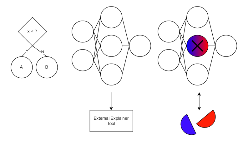
## Diagram: Model Interpretability Workflow
### Overview
The image is a conceptual diagram illustrating a workflow for interpreting machine learning model decisions. It visually connects a simple decision process, a neural network's internal structure, and an external tool used to explain the network's output. The diagram is composed of three main visual sections arranged horizontally, with additional explanatory elements below.
### Components/Axes
The diagram contains the following distinct components, described from left to right:
1. **Decision Flowchart (Top-Left):**
* A diamond-shaped decision node containing the text: `x < ?`
* Two outgoing branches labeled `Y` (Yes) and `N` (No).
* These branches lead to two circular outcome nodes labeled `A` and `B`, respectively.
2. **Neural Network Diagram (Top-Center):**
* A standard feedforward neural network representation.
* **Input Layer:** Two circles on the left.
* **Hidden Layer:** Three circles in the center.
* **Output Layer:** One circle on the right.
* Lines connect all nodes from the input layer to the hidden layer, and from the hidden layer to the output layer.
3. **Highlighted Neural Network Diagram (Top-Right):**
* Structurally identical to the center network (2 input, 3 hidden, 1 output nodes).
* **Key Difference:** The central node in the hidden layer is highlighted. It is filled with a radial gradient transitioning from blue (left) to red (right) and has a large black `X` drawn over it.
* A double-headed vertical arrow (`↕`) connects this highlighted node to a pie chart below.
4. **External Tool Label (Bottom-Center):**
* A rectangular box containing the text: `External Explainer Tool`.
* A single downward-pointing arrow (`↓`) connects the center neural network diagram to this box.
5. **Pie Chart (Bottom-Right):**
* A simple pie chart with two segments.
* **Left Segment:** Blue.
* **Right Segment:** Red.
* The chart is connected via the double-headed arrow to the highlighted node in the right-hand network.
### Detailed Analysis
The diagram establishes a visual narrative about model interpretability:
* **Spatial Flow:** The primary conceptual flow is from left to right, moving from a simple, interpretable decision model (flowchart) to a complex, opaque model (neural network), and finally to a state where a specific component of that complex model is being analyzed.
* **Component Relationships:**
* The `External Explainer Tool` is positioned as an intermediary that processes the standard neural network (center).
* The output of this tool's analysis is represented by the highlighted node and the associated pie chart (right). The double-headed arrow suggests a bidirectional relationship: the tool identifies the important node, and the node's state (the red/blue gradient) is explained by the pie chart's proportions.
* **Color and Symbolism:**
* The `X` on the highlighted node likely signifies that this specific neuron's activation or weight is being examined or "cross-examined."
* The red/blue gradient in the node and the corresponding red/blue pie chart segments suggest the explainer tool is attributing the neuron's behavior or importance to two distinct factors, classes, or features. The exact meaning is not labeled.
* **Text Transcription:** All embedded text has been extracted: `x < ?`, `Y`, `N`, `A`, `B`, `External Explainer Tool`.
### Key Observations
1. **Conceptual Abstraction:** The diagram uses abstract symbols (circles, lines, diamonds) rather than specific technical details (like neuron counts, activation functions, or feature names).
2. **Focus on Attribution:** The core of the diagram is the connection between the highlighted hidden node and the pie chart, emphasizing the goal of explaining *why* a complex model made a decision by attributing importance to internal components.
3. **Contrast in Interpretability:** The leftmost flowchart is inherently interpretable (a clear rule), while the neural networks are not, necessitating the "External Explainer Tool."
### Interpretation
This diagram illustrates the **"post-hoc interpretability"** paradigm in machine learning. It argues that while complex models like neural networks (center) are powerful, their decisions are opaque. To understand them, we must apply external analytical tools.
The workflow suggests:
1. A complex model makes a prediction.
2. An external explainer tool (like LIME, SHAP, or an attention mechanism) analyzes the model.
3. The tool's output identifies critical internal components (the highlighted neuron) and quantifies their contribution to the decision (the pie chart). The red/blue split could represent, for example, the contribution of this neuron toward predicting "Class Red" vs. "Class Blue."
The diagram's power lies in its simplicity. It bridges the gap between the intuitive logic of a decision tree and the black-box nature of deep learning, proposing that we can gain understanding not by simplifying the model itself, but by building tools to probe and visualize its internal state. The lack of specific labels on the pie chart is intentional, making the diagram a general template for any attribution-based explanation method.