\n
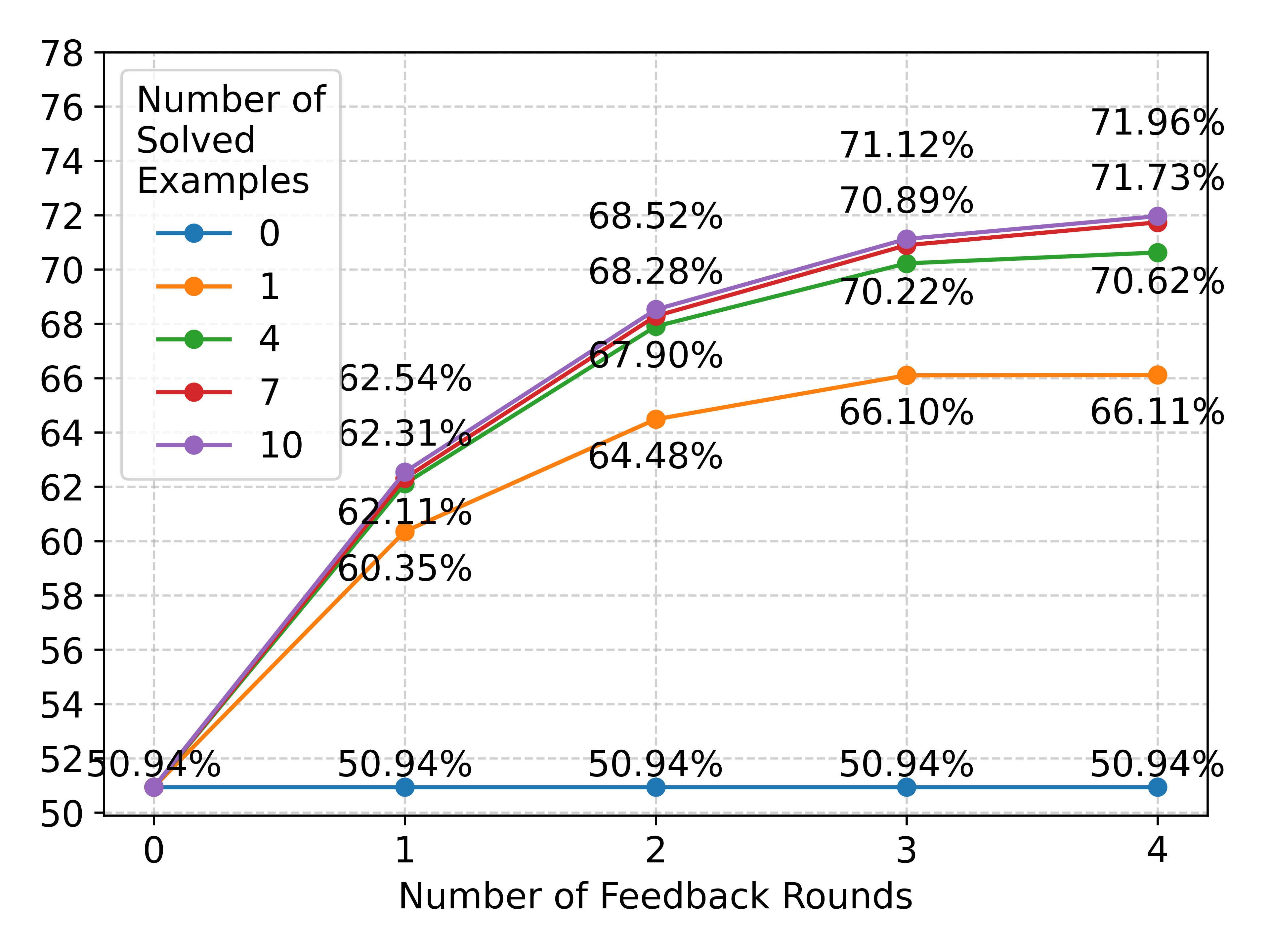
## Line Chart: Performance vs. Feedback Rounds by Number of Solved Examples
### Overview
The image is a line chart plotting a performance metric (percentage) against the number of feedback rounds. It compares five different conditions, each defined by a specific "Number of Solved Examples" (0, 1, 4, 7, 10). The chart demonstrates how performance improves with iterative feedback, with the degree of improvement strongly correlated with the initial number of solved examples provided.
### Components/Axes
* **X-Axis:** Labeled "Number of Feedback Rounds". It has discrete integer markers at 0, 1, 2, 3, and 4.
* **Y-Axis:** Represents a percentage value, likely accuracy or success rate. The scale runs from 50 to 78, with major gridlines every 2 units (50, 52, 54, ..., 78).
* **Legend:** Located in the top-left corner of the chart area. It is titled "Number of Solved Examples" and defines five data series:
* **Blue line with circle markers:** 0
* **Orange line with circle markers:** 1
* **Green line with circle markers:** 4
* **Red line with circle markers:** 7
* **Purple line with circle markers:** 10
* **Data Labels:** Each data point on the chart is annotated with its exact percentage value.
### Detailed Analysis
**Data Series and Trends:**
1. **Series "0" (Blue Line):**
* **Trend:** Perfectly flat, horizontal line.
* **Data Points:** 50.94% at Round 0, 50.94% at Round 1, 50.94% at Round 2, 50.94% at Round 3, 50.94% at Round 4.
* **Interpretation:** With zero solved examples provided, the system's performance does not improve at all with feedback.
2. **Series "1" (Orange Line):**
* **Trend:** Increases sharply from Round 0 to Round 2, then plateaus.
* **Data Points:** 50.94% at Round 0, 60.35% at Round 1, 64.48% at Round 2, 66.10% at Round 3, 66.11% at Round 4.
* **Interpretation:** One solved example enables significant learning from feedback, but gains diminish rapidly after two rounds.
3. **Series "4" (Green Line):**
* **Trend:** Steady, strong increase from Round 0 to Round 3, with a very slight increase to Round 4.
* **Data Points:** 50.94% at Round 0, 62.11% at Round 1, 67.90% at Round 2, 70.22% at Round 3, 70.62% at Round 4.
* **Interpretation:** Four solved examples provide a strong foundation for learning, leading to consistent improvement over three feedback rounds.
4. **Series "7" (Red Line):**
* **Trend:** Very similar trajectory to Series "4" (Green), but consistently achieves slightly higher percentages.
* **Data Points:** 50.94% at Round 0, 62.31% at Round 1, 68.28% at Round 2, 70.89% at Round 3, 71.73% at Round 4.
* **Interpretation:** Seven solved examples yield a marginal but consistent performance advantage over four examples across all feedback rounds.
5. **Series "10" (Purple Line):**
* **Trend:** The highest-performing series. It follows a similar curve to Series "4" and "7" but sits at the top.
* **Data Points:** 50.94% at Round 0, 62.54% at Round 1, 68.52% at Round 2, 71.12% at Round 3, 71.96% at Round 4.
* **Interpretation:** Ten solved examples provide the best starting point, resulting in the highest final performance after four feedback rounds.
**Spatial Grounding & Cross-Reference:**
* All lines originate from the same point at Round 0 (50.94%), which is the baseline performance with no feedback.
* The legend is positioned in the top-left, overlapping the gridlines but not obscuring any data points.
* The lines for 4, 7, and 10 solved examples are tightly clustered, especially at Rounds 1 and 2, but their distinct colors and data labels allow for precise differentiation. The purple line (10) is visually the highest at every point after Round 0, confirmed by its data labels (e.g., 71.96% at Round 4 vs. 71.73% for red and 70.62% for green).
### Key Observations
1. **Critical Threshold:** There is a fundamental difference between having 0 solved examples (no learning) and having at least 1 (significant learning).
2. **Diminishing Returns:** The performance gap between having 1 example and 4 examples is much larger than the gap between 4 and 7, or 7 and 10. This suggests diminishing marginal returns from additional solved examples.
3. **Feedback Saturation:** For the "1" example series, performance plateaus after Round 2. For the higher series (4, 7, 10), the rate of improvement slows considerably after Round 3, indicating that most of the benefit from feedback is captured within 3-4 rounds.
4. **Consistent Hierarchy:** The performance order (10 > 7 > 4 > 1 > 0) is maintained consistently from Round 1 onward.
### Interpretation
This chart illustrates the powerful synergy between **exemplars (solved examples)** and **iterative feedback** in a learning or optimization process. The data suggests:
* **Exemplars are a Prerequisite for Learning:** Without any solved examples (0 series), feedback is useless. The system cannot improve. This implies the examples provide the necessary framework or pattern for interpreting and applying feedback.
* **Feedback Amplifies the Value of Exemplars:** Once a minimal exemplar threshold is met (1 example), feedback drives substantial performance gains. More exemplars (4, 7, 10) create a better initial model, which feedback can then refine to a higher ultimate ceiling.
* **Practical Implications:** For system design, this indicates that investing in a small set of high-quality solved examples (even just 1-4) is crucial to unlock the benefits of a feedback loop. However, beyond a certain point (e.g., 10 examples), adding more yields only incremental gains. The most cost-effective strategy may be to provide a modest number of examples and then invest in 3-4 rounds of feedback.
* **Underlying Mechanism:** The pattern is consistent with a model that learns from corrections. The examples teach the model the "shape" of a correct solution, and feedback iteratively adjusts its parameters to better match that shape. The plateau suggests the model's capacity or the feedback's informativeness is eventually exhausted.