## Line Chart: Number of Solved Examples vs. Number of Feedback Rounds
### Overview
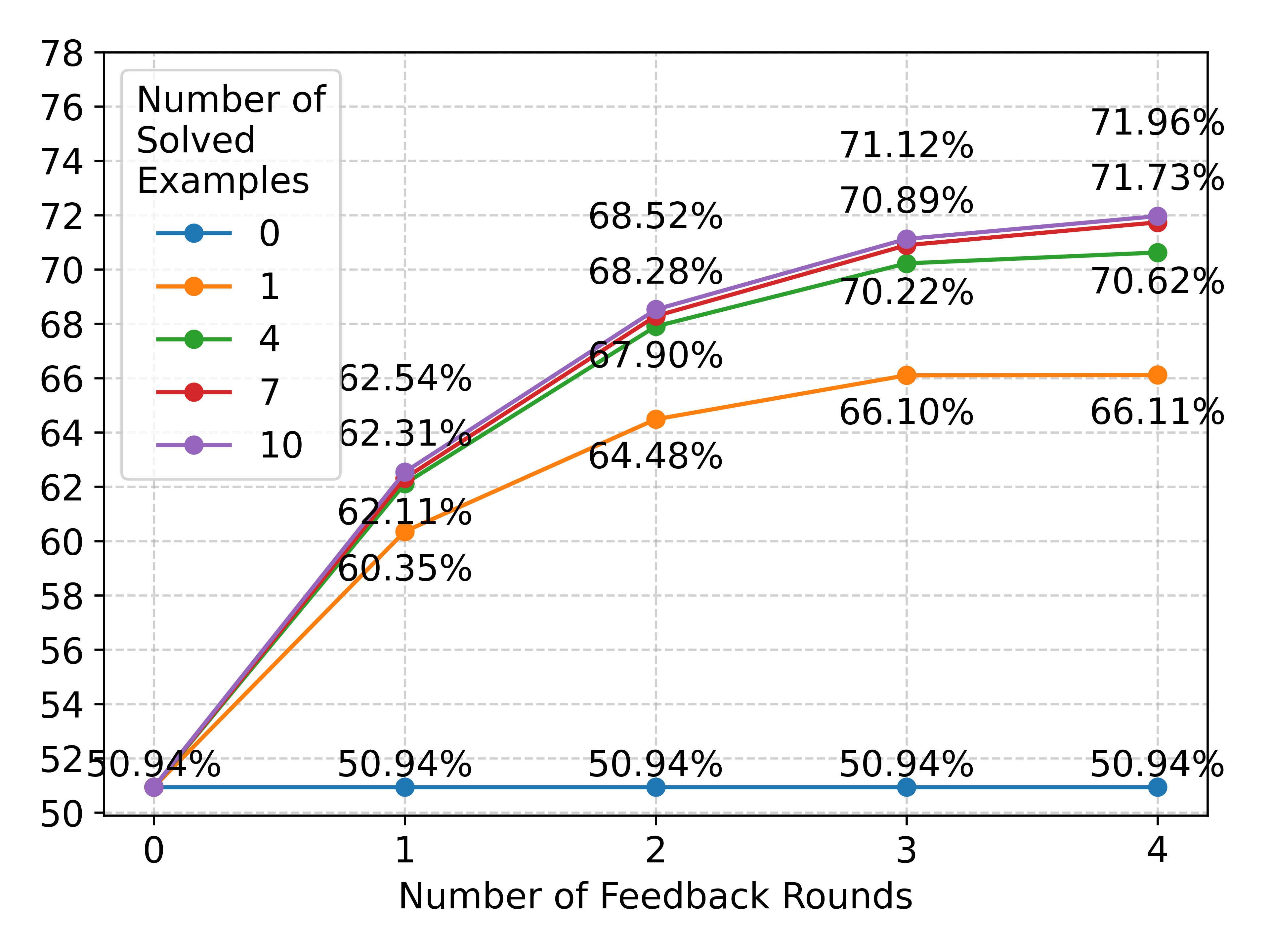
The image is a line chart showing the relationship between the number of solved examples and the number of feedback rounds. The chart displays five different lines, each representing a different number of solved examples (0, 1, 4, 7, and 10). The x-axis represents the number of feedback rounds (0 to 4), and the y-axis represents the percentage score.
### Components/Axes
* **Title:** There is no explicit title for the chart.
* **X-axis:**
* Label: "Number of Feedback Rounds"
* Scale: 0, 1, 2, 3, 4
* **Y-axis:**
* Label: No explicit label, but the values represent a percentage score.
* Scale: 50 to 78, with increments of 2.
* **Legend:** Located in the top-left corner.
* "Number of Solved Examples"
* Blue: 0
* Orange: 1
* Green: 4
* Red: 7
* Purple: 10
### Detailed Analysis
* **Line 0 (Blue):** This line represents 0 solved examples. It remains constant at approximately 50.94% across all feedback rounds.
* Round 0: 50.94%
* Round 1: 50.94%
* Round 2: 50.94%
* Round 3: 50.94%
* Round 4: 50.94%
* **Line 1 (Orange):** This line represents 1 solved example. It increases from round 0 to round 2, then plateaus.
* Round 0: 60.35%
* Round 1: 62.11%
* Round 2: 64.48%
* Round 3: 66.10%
* Round 4: 66.11%
* **Line 4 (Green):** This line represents 4 solved examples. It increases from round 0 to round 3, then plateaus slightly.
* Round 0: 62.11%
* Round 1: 62.54%
* Round 2: 67.90%
* Round 3: 70.22%
* Round 4: 70.62%
* **Line 7 (Red):** This line represents 7 solved examples. It increases from round 0 to round 4.
* Round 0: 62.31%
* Round 1: 68.28%
* Round 2: 70.89%
* Round 3: 71.73%
* **Line 10 (Purple):** This line represents 10 solved examples. It increases from round 0 to round 4.
* Round 0: 50.94%
* Round 1: 68.52%
* Round 2: 71.12%
* Round 3: 71.96%
### Key Observations
* The performance with 0 solved examples remains constant regardless of the number of feedback rounds.
* The performance generally increases with more solved examples.
* The lines representing 4, 7, and 10 solved examples show a similar trend of increasing performance with more feedback rounds, but the rate of increase diminishes as the number of feedback rounds increases.
* The line representing 1 solved example plateaus after 2 feedback rounds.
### Interpretation
The chart suggests that providing solved examples significantly improves performance. The more solved examples provided, the better the initial performance and the greater the improvement with feedback rounds. However, the benefit of additional feedback rounds diminishes as the number of rounds increases, especially when only one solved example is provided. The flat line for 0 solved examples indicates that feedback alone is not sufficient to improve performance without any initial examples. The data demonstrates the importance of providing a sufficient number of solved examples to facilitate learning and improvement through feedback. The outlier is the flat line for 0 solved examples, which highlights the necessity of having some initial examples for feedback to be effective.