\n
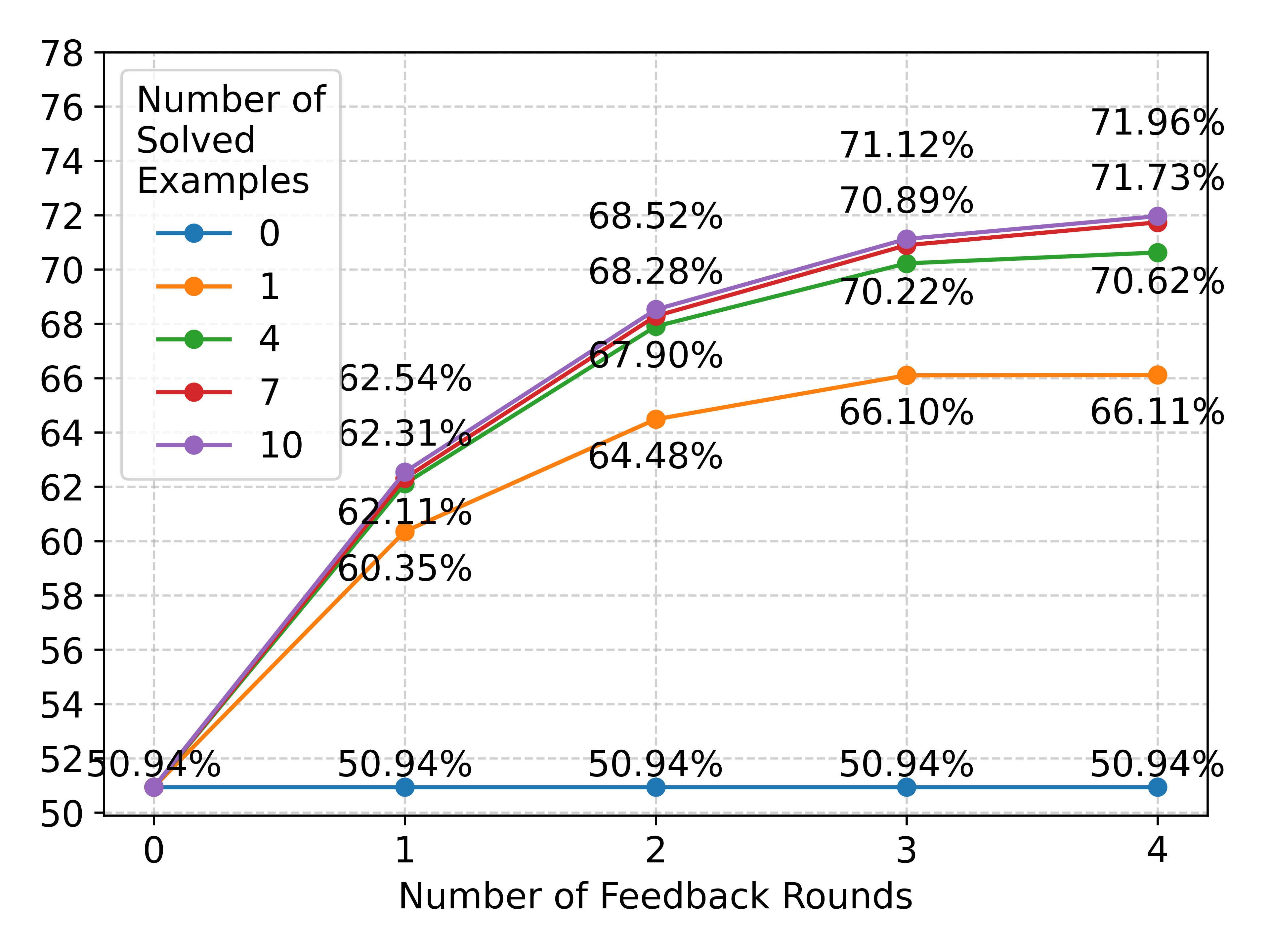
## Line Chart: Performance Improvement with Feedback Rounds
### Overview
This line chart illustrates the performance improvement (measured as the percentage of solved examples) across different numbers of feedback rounds. The chart displays five lines, each representing a different initial number of solved examples. The x-axis represents the number of feedback rounds (0 to 4), and the y-axis represents the percentage of solved examples (from 50% to 78%).
### Components/Axes
* **X-axis Title:** Number of Feedback Rounds
* **Y-axis Title:** Percentage of Solved Examples
* **Y-axis Scale:** Linear, ranging from approximately 50 to 78, with increments of 2.
* **Legend:** Located in the top-left corner.
* Orange Line: 0
* Yellow Line: 1
* Green Line: 4
* Red Line: 7
* Purple Line: 10
### Detailed Analysis
The chart shows the percentage of solved examples increasing with each feedback round for all initial conditions.
* **Orange Line (Initial 0 solved):** Starts at 50.94% at 0 feedback rounds. It increases to approximately 68.52% at 2 rounds, 70.89% at 3 rounds, and 71.96% at 4 rounds. The line shows a consistent upward trend, with diminishing returns after 3 rounds.
* **Yellow Line (Initial 1 solved):** Starts at 50.94% at 0 feedback rounds. It increases to approximately 68.28% at 2 rounds, 70.22% at 3 rounds, and 71.73% at 4 rounds. Similar to the orange line, it shows a consistent upward trend with diminishing returns.
* **Green Line (Initial 4 solved):** Starts at 50.94% at 0 feedback rounds. It increases to approximately 67.90% at 2 rounds, 66.10% at 3 rounds, and 70.62% at 4 rounds. This line shows a slight dip between rounds 2 and 3, before recovering in round 4.
* **Red Line (Initial 7 solved):** Starts at 50.94% at 0 feedback rounds. It increases to approximately 64.48% at 2 rounds, 66.11% at 3 rounds, and 71.33% at 4 rounds. This line shows a consistent upward trend.
* **Purple Line (Initial 10 solved):** Starts at 50.94% at 0 feedback rounds. It increases to approximately 62.31% at 1 round, 62.54% at 2 rounds, 60.35% at 3 rounds, and 62.11% at 4 rounds. This line shows a more erratic pattern, with a slight decrease between rounds 2 and 3.
The percentage values are displayed directly above each data point on the lines.
### Key Observations
* All lines demonstrate an increasing trend in the percentage of solved examples as the number of feedback rounds increases.
* The initial number of solved examples appears to influence the rate of improvement. Lines starting with lower initial values (0, 1) show a more pronounced increase in the early feedback rounds.
* The rate of improvement diminishes with each subsequent feedback round for most lines.
* The green line (initial 4 solved) exhibits a slight dip in performance between rounds 2 and 3, which is an anomaly.
* The purple line (initial 10 solved) shows the least consistent improvement, with a slight decrease between rounds 2 and 3.
### Interpretation
The data suggests that providing feedback rounds is an effective strategy for improving performance, regardless of the initial level of understanding. The initial number of solved examples influences the magnitude of improvement, with those starting with lower performance showing more significant gains from each feedback round. The diminishing returns observed with increasing feedback rounds suggest that there is a point at which additional feedback provides less benefit. The anomaly observed in the green line could be due to various factors, such as the specific examples used or individual learning styles. The purple line's erratic behavior might indicate that individuals with a higher initial understanding require different types of feedback or have reached a plateau in their learning. Overall, the chart highlights the importance of iterative feedback in the learning process.