## Line Graph: Number of Solved Examples vs. Number of Feedback Rounds
### Overview
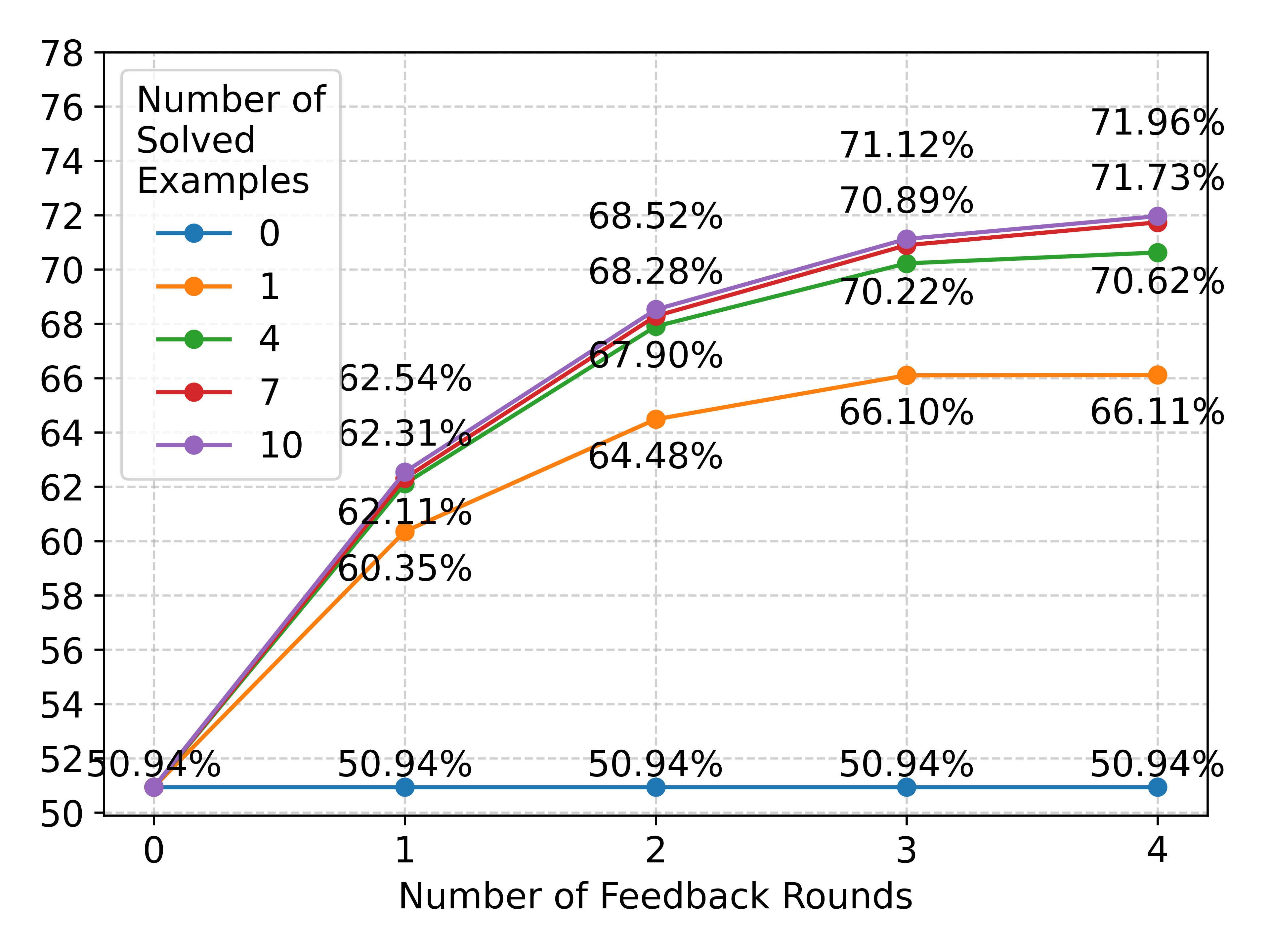
The image is a line graph comparing the percentage of solved examples across different numbers of feedback rounds (0–4). Five data series are plotted, each representing a fixed number of solved examples (0, 1, 4, 7, 10). The y-axis ranges from 50% to 78%, and the x-axis ranges from 0 to 4 feedback rounds. Percentages are annotated above each data point.
---
### Components/Axes
- **X-axis**: "Number of Feedback Rounds" (0, 1, 2, 3, 4).
- **Y-axis**: "Number of Solved Examples" (50% to 78%, increments of 2%).
- **Legend**: Located in the top-left corner, with five color-coded lines:
- **Blue**: 0 solved examples.
- **Orange**: 1 solved example.
- **Green**: 4 solved examples.
- **Red**: 7 solved examples.
- **Purple**: 10 solved examples.
- **Data Points**: Each line has five markers (circles) at x = 0, 1, 2, 3, 4, with percentages labeled above them.
---
### Detailed Analysis
1. **Blue Line (0 solved examples)**:
- Flat line at **50.94%** across all feedback rounds.
- No improvement observed regardless of feedback rounds.
2. **Orange Line (1 solved example)**:
- Starts at **50.94%** (x=0) and increases to **66.11%** (x=4).
- Gradual upward trend: 60.35% (x=1), 64.48% (x=2), 66.10% (x=3).
3. **Green Line (4 solved examples)**:
- Starts at **50.94%** (x=0) and rises to **70.62%** (x=4).
- Steeper trend: 62.31% (x=1), 67.90% (x=2), 70.22% (x=3).
4. **Red Line (7 solved examples)**:
- Starts at **50.94%** (x=0) and peaks at **71.73%** (x=4).
- Consistent growth: 62.54% (x=1), 68.52% (x=2), 70.89% (x=3).
5. **Purple Line (10 solved examples)**:
- Starts at **50.94%** (x=0) and reaches **71.96%** (x=4).
- Slightly higher than the red line at x=4 but dips below it at x=2 (68.28% vs. 68.52%).
---
### Key Observations
- **Flat Line for 0 Solved Examples**: The blue line remains constant at 50.94%, indicating no improvement with feedback rounds when no examples are solved.
- **Positive Correlation**: Higher numbers of solved examples (1, 4, 7, 10) show increasing percentages with more feedback rounds.
- **Crossover at x=2**: The red line (7 solved) briefly surpasses the purple line (10 solved) at x=2 (68.52% vs. 68.28%), but the purple line regains the lead by x=3.
- **Diminishing Returns**: The rate of improvement slows for all lines as feedback rounds increase, especially noticeable in the 10 solved examples line.
---
### Interpretation
The data demonstrates a clear relationship between the number of solved examples and performance improvement with feedback rounds:
1. **No Solved Examples (Blue Line)**: Feedback rounds have no impact, suggesting that solved examples are a prerequisite for learning.
2. **Increasing Solved Examples**: More solved examples correlate with higher performance gains. For instance:
- 1 solved example improves from 50.94% to 66.11%.
- 10 solved examples improve from 50.94% to 71.96%.
3. **Crossover Phenomenon**: At x=2, the 7 solved examples line outperforms the 10 solved examples line, possibly due to diminishing returns or saturation effects in the 10 solved examples series.
4. **Practical Implications**: The graph highlights the importance of initial solved examples in leveraging feedback rounds. Without solved examples, feedback is ineffective. With more solved examples, feedback rounds yield progressively better results, though the marginal gains may plateau.
This analysis underscores the value of incremental learning and the role of solved examples in optimizing feedback-driven improvement.