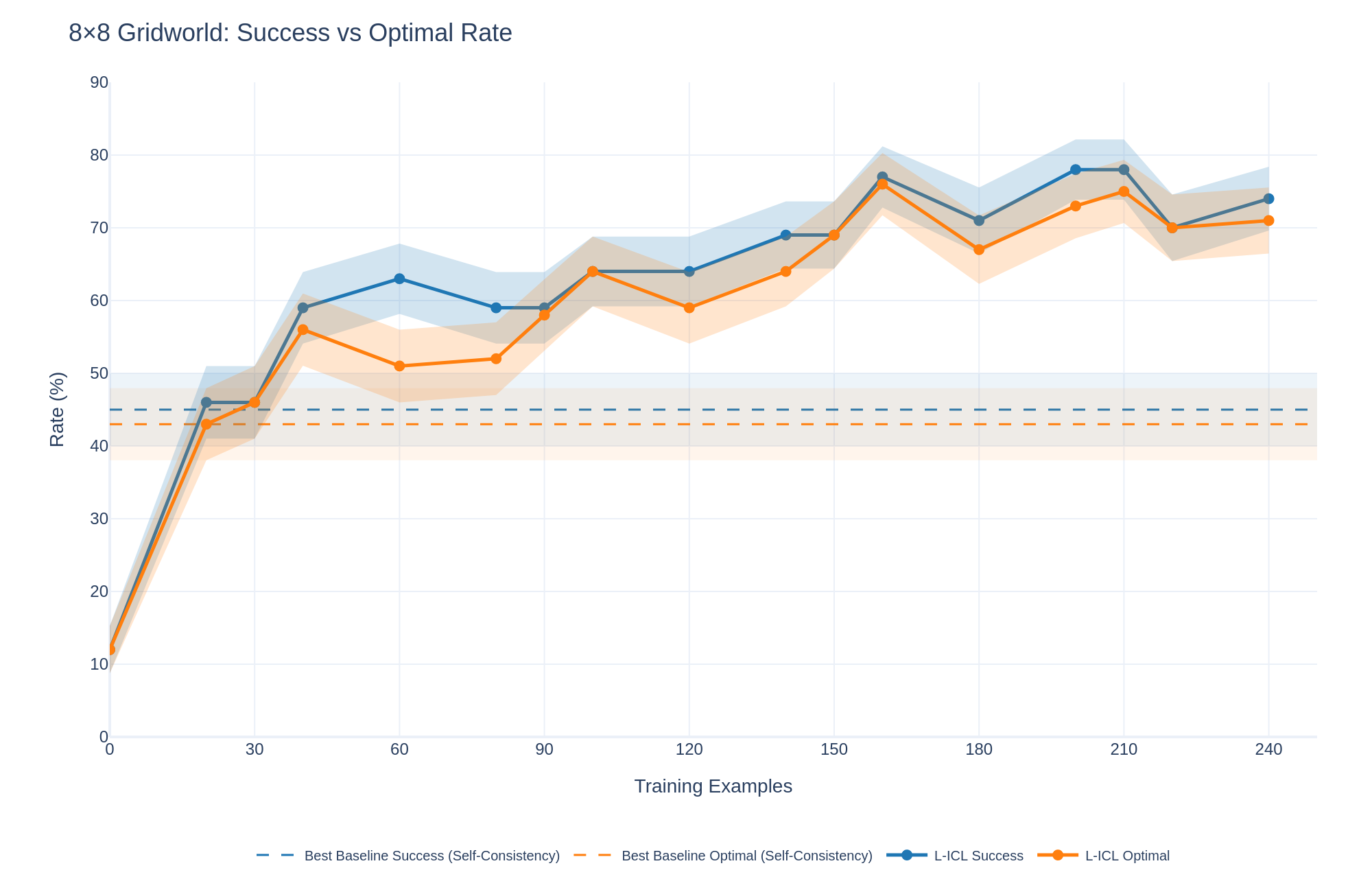
## Line Chart: 8×8 Gridworld: Success vs Optimal Rate
### Overview
The image displays a line chart comparing the performance of two methods ("L-ICL Success" and "L-ICL Optimal") against two baseline benchmarks over an increasing number of training examples. The chart tracks two metrics—Success Rate and Optimal Rate—measured as percentages. The data shows a general upward trend for the L-ICL methods, with performance surpassing the static baselines after approximately 30 training examples.
### Components/Axes
* **Title:** "8×8 Gridworld: Success vs Optimal Rate" (Top-left corner).
* **Y-Axis:** Labeled "Rate (%)". Scale ranges from 0 to 90, with major tick marks at intervals of 10 (0, 10, 20, ..., 90).
* **X-Axis:** Labeled "Training Examples". Scale ranges from 0 to 240, with major tick marks at intervals of 30 (0, 30, 60, ..., 240).
* **Legend:** Positioned at the bottom center of the chart. It contains four entries:
1. `--` **Best Baseline Success (Self-Consistency)**: A dashed blue line.
2. `--` **Best Baseline Optimal (Self-Consistency)**: A dashed orange line.
3. `●-` **L-ICL Success**: A solid blue line with circular markers.
4. `●-` **L-ICL Optimal**: A solid orange line with circular markers.
* **Data Series & Confidence Intervals:** Each solid line (L-ICL) is accompanied by a shaded region of the same color, representing a confidence interval or variance band around the mean performance.
### Detailed Analysis
**Trend Verification & Data Points (Approximate):**
* **L-ICL Success (Blue Line with Markers):**
* **Trend:** Shows a steep initial increase, followed by a generally upward but fluctuating trend. It consistently remains above the L-ICL Optimal line.
* **Key Points:**
* At 0 examples: ~12%
* At 30 examples: ~46%
* At 60 examples: ~63%
* At 120 examples: ~64%
* At 150 examples: ~69%
* At 165 examples (peak): ~77%
* At 180 examples: ~71%
* At 210 examples: ~78%
* At 240 examples: ~74%
* **L-ICL Optimal (Orange Line with Markers):**
* **Trend:** Follows a very similar trajectory to the Success line but is consistently a few percentage points lower. Also shows an initial steep rise and subsequent fluctuations.
* **Key Points:**
* At 0 examples: ~12%
* At 30 examples: ~43%
* At 60 examples: ~51%
* At 120 examples: ~59%
* At 150 examples: ~64%
* At 165 examples (peak): ~76%
* At 180 examples: ~67%
* At 210 examples: ~75%
* At 240 examples: ~71%
* **Best Baseline Success (Dashed Blue Line):**
* **Trend:** Horizontal, constant line.
* **Value:** Approximately 45% across all training examples.
* **Best Baseline Optimal (Dashed Orange Line):**
* **Trend:** Horizontal, constant line.
* **Value:** Approximately 43% across all training examples.
**Confidence Intervals (Shaded Regions):**
* The shaded bands for both L-ICL lines are narrow at low training example counts (0-30) and widen significantly as the number of examples increases, particularly beyond 90 examples. This indicates greater variance or uncertainty in performance with more training data.
* The blue shaded region (Success) is generally wider than the orange one (Optimal) at higher example counts.
### Key Observations
1. **Performance Crossover:** Both L-ICL methods surpass their respective baselines after approximately 30 training examples.
2. **Metric Hierarchy:** The "Success" rate is consistently higher than the "Optimal" rate for the L-ICL method, which is logically consistent if "Optimal" represents a stricter performance criterion.
3. **Plateau and Fluctuation:** After the initial rapid learning phase (0-60 examples), performance gains slow and exhibit noticeable fluctuations (e.g., dips at 180 examples), though the overall trend remains positive.
4. **Peak Performance:** Both L-ICL metrics appear to peak around 165-210 training examples before a slight decline at 240.
5. **Baseline Comparison:** The static baselines (Self-Consistency) are outperformed by the L-ICL approach with sufficient data, suggesting the latter is a more effective learning method in this context.
### Interpretation
The chart demonstrates the learning curve of an "L-ICL" (likely "Learning from In-Context Learning") approach on an 8x8 Gridworld task. The key takeaway is that L-ICL is data-efficient, quickly exceeding strong baseline performance with only ~30 examples. The continued, albeit noisy, improvement up to ~210 examples suggests the method benefits from more data, though returns diminish and variance increases.
The consistent gap between "Success" and "Optimal" rates implies that while the agent often succeeds in reaching a goal (Success), it less frequently finds the most efficient or correct path (Optimal). The widening confidence intervals could indicate that with more diverse training examples, the model's performance becomes less predictable—some runs excel while others struggle, increasing the variance. This chart would be critical for a researcher to determine the optimal amount of training data to collect and to understand the reliability (via confidence intervals) of the L-ICL method at different data scales.