\n
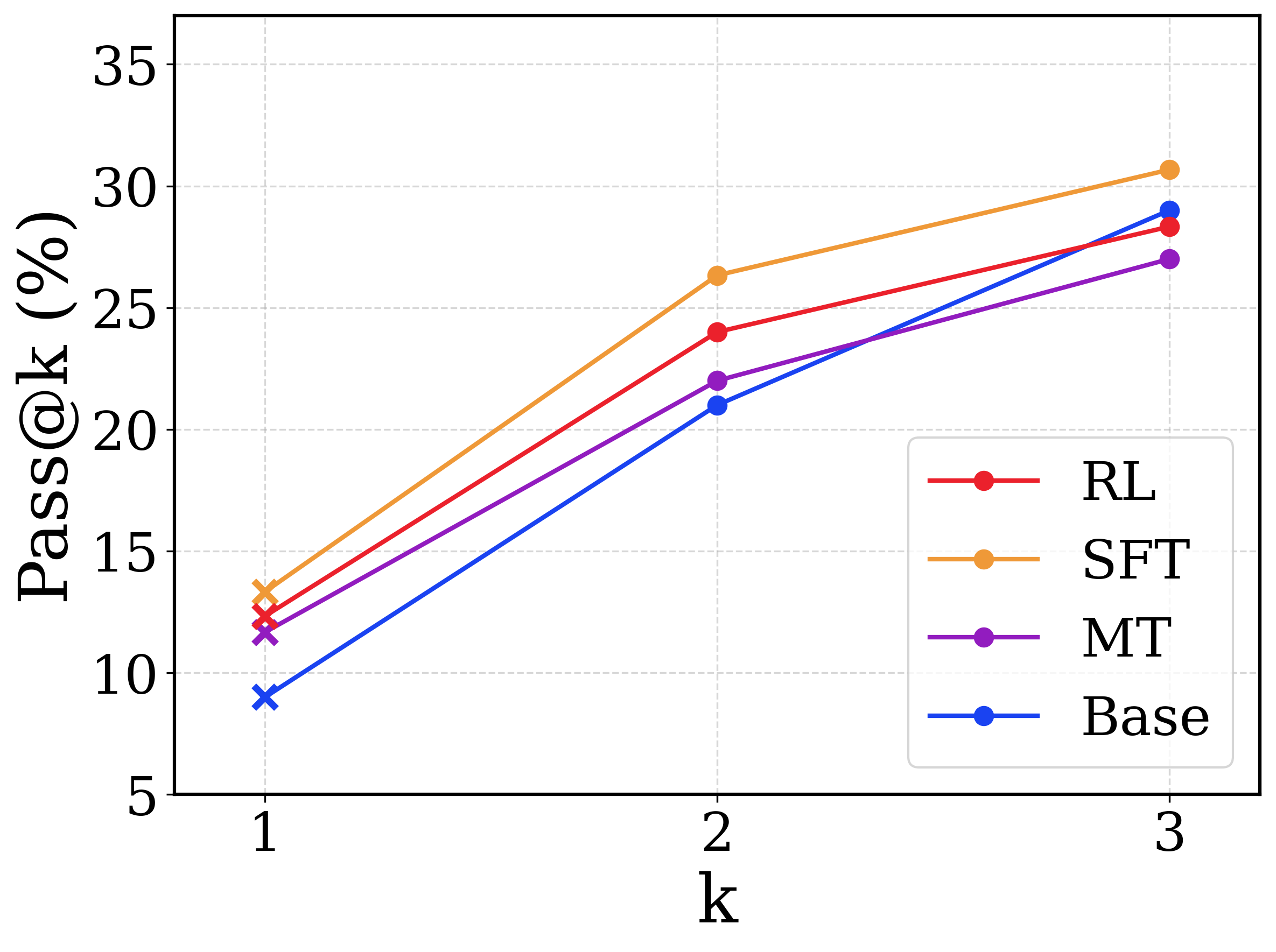
## Line Chart: Pass@k vs. k for Different Models
### Overview
This image presents a line chart illustrating the relationship between the Pass@k metric (in percentage) and the value of 'k' for four different models: RL, SFT, MT, and Base. The chart displays how the Pass@k score changes as 'k' increases from 1 to 3.
### Components/Axes
* **X-axis:** Labeled "k", with values ranging from 1 to 3. The axis is linearly scaled.
* **Y-axis:** Labeled "Pass@k (%)", with values ranging from 5 to 35. The axis is linearly scaled.
* **Legend:** Located in the top-right corner of the chart. It identifies the four data series:
* RL (Red line with circular markers)
* SFT (Orange line with circular markers)
* MT (Purple line with circular markers)
* Base (Blue line with circular markers)
* **Gridlines:** Horizontal and vertical gridlines are present to aid in reading values.
### Detailed Analysis
The chart shows four lines, each representing a different model's Pass@k performance as 'k' varies.
* **Base (Blue):** The line slopes upward consistently.
* At k=1, Pass@k is approximately 9%.
* At k=2, Pass@k is approximately 20%.
* At k=3, Pass@k is approximately 29%.
* **MT (Purple):** The line slopes upward consistently, and is generally above the Base line.
* At k=1, Pass@k is approximately 12%.
* At k=2, Pass@k is approximately 23%.
* At k=3, Pass@k is approximately 28%.
* **SFT (Orange):** The line slopes upward consistently, and is generally above the MT line.
* At k=1, Pass@k is approximately 14%.
* At k=2, Pass@k is approximately 25%.
* At k=3, Pass@k is approximately 31%.
* **RL (Red):** The line slopes upward consistently, and is generally above the SFT line.
* At k=1, Pass@k is approximately 13%.
* At k=2, Pass@k is approximately 25%.
* At k=3, Pass@k is approximately 26%.
### Key Observations
* All models show an increasing Pass@k score as 'k' increases. This indicates that allowing more attempts (higher 'k') generally improves the probability of passing.
* The SFT model consistently outperforms the other models across all values of 'k'.
* The Base model has the lowest Pass@k scores across all values of 'k'.
* The RL model has a similar performance to the SFT model at k=1 and k=2, but falls behind at k=3.
### Interpretation
The chart demonstrates the impact of the 'k' parameter on the Pass@k metric for different models. The Pass@k metric, representing the percentage of times a model passes when given 'k' attempts, is a measure of the model's reliability or success rate. The consistent upward trend for all models suggests that increasing the number of attempts ('k') improves performance. The superior performance of the SFT model indicates that this model is more robust and reliable than the others, achieving higher pass rates even with a smaller number of attempts. The differences in performance between the models suggest that the training methods or architectures used for each model have a significant impact on their ability to succeed. The slight divergence in the RL model's performance at k=3 could indicate diminishing returns or a saturation point for this model's capabilities. The data suggests that for maximizing Pass@k, the SFT model is the preferred choice, and increasing 'k' is a generally effective strategy for improving performance across all models.