\n
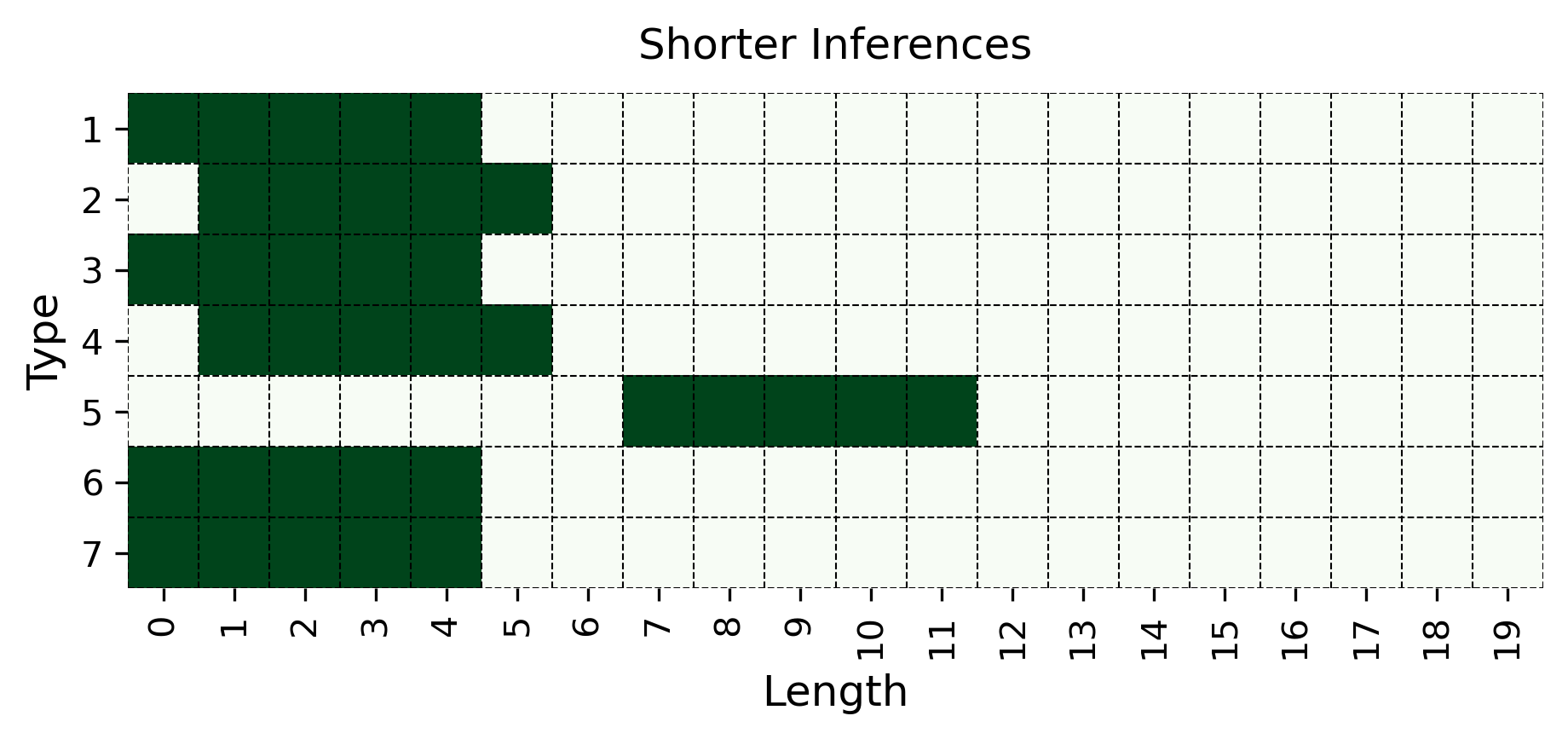
## Bar Chart: Shorter Inferences
### Overview
The image presents a bar chart titled "Shorter Inferences". The chart visualizes the distribution of data across two dimensions: 'Length' on the x-axis and 'Type' on the y-axis. The bars are colored dark green. The chart appears to represent counts or frequencies of different 'Type' values for various 'Length' ranges.
### Components/Axes
* **Title:** "Shorter Inferences" - positioned at the top-center of the chart.
* **X-axis Label:** "Length" - positioned at the bottom-center of the chart. The x-axis scale ranges from 0 to 19, with tick marks at integer values.
* **Y-axis Label:** "Type" - positioned at the left-center of the chart. The y-axis scale ranges from 1 to 7, with tick marks at integer values.
* **Bars:** Dark green rectangular bars representing the data.
### Detailed Analysis
The chart displays the following data points (approximated from visual inspection):
* **Type 1:** Extends from Length 0 to approximately Length 3. Approximate count: 3.
* **Type 2:** Extends from Length 0 to approximately Length 5. Approximate count: 5.
* **Type 3:** Extends from Length 0 to approximately Length 5. Approximate count: 5.
* **Type 4:** Extends from Length 0 to approximately Length 6. Approximate count: 6.
* **Type 5:** Extends from Length 10 to approximately Length 11. Approximate count: 2.
* **Type 6:** Extends from Length 0 to approximately Length 5. Approximate count: 5.
* **Type 7:** Extends from Length 0 to approximately Length 4. Approximate count: 4.
### Key Observations
* Types 1, 2, 3, 4, 6, and 7 are concentrated at lower 'Length' values (between 0 and 6).
* Type 5 is observed only at higher 'Length' values (between 10 and 11).
* Type 4 has the highest count among all types.
* There is a clear separation in the 'Length' distribution between Type 5 and the other types.
### Interpretation
The chart suggests a relationship between 'Type' and 'Length'. Most types are associated with shorter lengths, while Type 5 is exclusively associated with a specific, longer length. This could indicate that Type 5 represents a different category or process that requires a longer duration or complexity. The concentration of other types at lower lengths suggests that these types are more common or efficient at shorter lengths. The chart could be visualizing the length of inferences made by a system, categorized by their type. The outlier Type 5 might represent a more complex inference that takes longer to generate. The data suggests a potential need to investigate why Type 5 inferences are significantly longer than others.