## Histogram Series: Relative Performance Distribution by Dimension (d)
### Overview
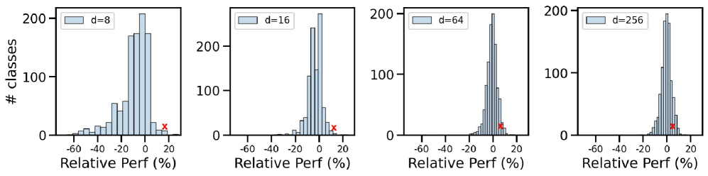
The image displays a series of four histograms arranged horizontally, each showing the distribution of "Relative Perf (%)" for a different value of a parameter labeled "d". The histograms illustrate how the performance distribution changes as the dimension `d` increases from 8 to 256.
### Components/Axes
* **Chart Type:** Four separate histograms (subplots).
* **Common X-Axis:** Labeled **"Relative Perf (%)"**. The scale runs from approximately -60 to +20, with major tick marks at -60, -40, -20, 0, and 20.
* **Common Y-Axis:** Labeled **"# classes"**. The scale runs from 0 to 200, with major tick marks at 0, 100, and 200.
* **Legends:** Each subplot contains a legend in its **top-left corner**. The legend is a light blue rectangle matching the bar color, followed by the text "d=[value]".
* Subplot 1 (leftmost): `d=8`
* Subplot 2: `d=16`
* Subplot 3: `d=64`
* Subplot 4 (rightmost): `d=256`
* **Additional Marker:** A red "x" symbol is plotted on the x-axis of each histogram, located in the positive performance region.
### Detailed Analysis
**Subplot 1 (d=8):**
* **Distribution Shape:** The distribution is wide and somewhat irregular. It has a primary peak centered near 0% relative performance, with a significant left tail extending to -60%. There are smaller secondary peaks or clusters around -40% and -20%.
* **Data Range:** The bars span from approximately -60% to +10%.
* **Peak Height:** The tallest bar (at ~0%) reaches just above 200 on the y-axis.
* **Red 'x' Marker:** Positioned at approximately **+15%** on the x-axis.
**Subplot 2 (d=16):**
* **Distribution Shape:** The distribution is narrower than for d=8. It is strongly unimodal with a sharp peak centered near 0%. The left tail is much shorter, starting around -20%.
* **Data Range:** The bars span from approximately -20% to +10%.
* **Peak Height:** The tallest bar (at ~0%) reaches approximately 200 on the y-axis.
* **Red 'x' Marker:** Positioned at approximately **+10%** on the x-axis.
**Subplot 3 (d=64):**
* **Distribution Shape:** The distribution is very narrow and tightly clustered around 0%. It appears symmetric and leptokurtic (peaked).
* **Data Range:** The bars span a very narrow range, from approximately -10% to +10%.
* **Peak Height:** The tallest bar (at ~0%) reaches approximately 200 on the y-axis.
* **Red 'x' Marker:** Positioned at approximately **+5%** on the x-axis.
**Subplot 4 (d=256):**
* **Distribution Shape:** The distribution is extremely narrow, appearing as a single, sharp spike centered at 0%. The variance is minimal.
* **Data Range:** The bars are concentrated within a few percentage points of 0%.
* **Peak Height:** The tallest bar (at ~0%) reaches approximately 200 on the y-axis.
* **Red 'x' Marker:** Positioned at approximately **+2%** on the x-axis.
### Key Observations
1. **Trend of Variance:** There is a clear and dramatic trend: as the dimension `d` increases, the variance (spread) of the "Relative Perf (%)" distribution decreases significantly. The distribution transitions from a wide, multi-modal spread at `d=8` to an extremely narrow, single-peaked spike at `d=256`.
2. **Central Tendency:** The central peak of all distributions remains consistently located at or very near 0% relative performance.
3. **Marker Trend:** The red "x" marker, which likely represents a specific reference point (e.g., mean, median, or performance of a baseline model), moves progressively closer to 0% as `d` increases. Its position shifts from ~+15% (`d=8`) to ~+2% (`d=256`).
4. **Consistent Peak Count:** Despite the changing spread, the maximum frequency (height of the tallest bar) remains consistently around 200 classes for all values of `d`.
### Interpretation
This series of histograms demonstrates a strong inverse relationship between the parameter `d` (likely representing model dimension, embedding size, or a similar capacity parameter) and the variability in relative performance across a set of classes.
* **What the data suggests:** Increasing `d` leads to more consistent and predictable performance. At low `d` (e.g., 8), performance is highly variable, with some classes performing very poorly (down to -60%) and others near the baseline. At high `d` (e.g., 256), performance for nearly all classes is tightly clustered around the baseline (0%), indicating high consistency and robustness.
* **How elements relate:** The narrowing distribution and the red "x" marker converging toward 0% are two facets of the same phenomenon. The marker's movement suggests that the specific reference point's advantage diminishes as model capacity grows, while the shrinking spread shows that all classes are being pulled toward a similar performance level.
* **Notable implications:** This pattern is characteristic of a model or system that becomes more "stable" or "generalizes" better as its capacity increases. The high variance at low `d` might indicate underfitting or instability, where the model's performance is highly sensitive to the specific characteristics of each class. The low variance at high `d` suggests the model has sufficient capacity to handle all classes effectively, leading to uniform performance. The red "x" could represent a simpler baseline model; its relative advantage disappears as the more complex model (`d=256`) matches or exceeds its performance consistently across all classes.