## Histogram: Relative Performance vs. Number of Classes for Different 'd' Values
### Overview
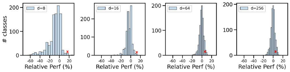
The image presents four histograms arranged horizontally. Each histogram displays the distribution of relative performance across a number of classes for a different value of 'd' (8, 16, 64, and 256). The x-axis represents relative performance in percentage, and the y-axis represents the number of classes. A red 'x' marker is present in each histogram, indicating a specific relative performance value.
### Components/Axes
* **X-axis (Relative Perf (%)):** Ranges from -60% to 20% in each histogram.
* **Y-axis (# classes):** Ranges from 0 to 200 in each histogram.
* **Histograms:** Each histogram represents a different 'd' value.
* d = 8 (top-left)
* d = 16 (top-middle-left)
* d = 64 (top-middle-right)
* d = 256 (top-right)
* **Red 'x' Marker:** Present in each histogram, indicating a specific relative performance value.
### Detailed Analysis
**Histogram 1: d = 8**
* The distribution is skewed to the right.
* The peak of the distribution is around 0% relative performance.
* The red 'x' marker is located at approximately 15% relative performance.
* The number of classes ranges from 0 to approximately 200.
**Histogram 2: d = 16**
* The distribution is skewed to the right, but more concentrated than d=8.
* The peak of the distribution is around 0% relative performance.
* The red 'x' marker is located at approximately 15% relative performance.
* The number of classes ranges from 0 to approximately 250.
**Histogram 3: d = 64**
* The distribution is highly concentrated around 0% relative performance.
* The red 'x' marker is located at approximately 10% relative performance.
* The number of classes ranges from 0 to approximately 200.
**Histogram 4: d = 256**
* The distribution is very highly concentrated around 0% relative performance.
* The red 'x' marker is located at approximately 5% relative performance.
* The number of classes ranges from 0 to approximately 200.
### Key Observations
* As the value of 'd' increases, the distribution of relative performance becomes more concentrated around 0%.
* The red 'x' marker shifts towards 0% relative performance as 'd' increases.
* The spread of the data decreases as 'd' increases.
### Interpretation
The histograms suggest that as the value of 'd' increases, the relative performance of the classes becomes more consistent and centered around 0%. This could indicate that a higher 'd' value leads to more stable or predictable performance across different classes. The red 'x' marker likely represents a specific performance threshold or target, and its shift towards 0% with increasing 'd' suggests that the system is more likely to achieve this target as 'd' increases. The concentration of the distribution around 0% indicates that the variance in relative performance decreases with higher 'd' values.