\n
## Histograms: Relative Performance Distribution
### Overview
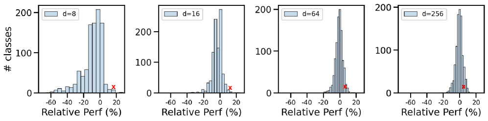
The image presents four histograms, each displaying the distribution of relative performance percentages. Each histogram corresponds to a different value of 'd' (8, 16, 64, and 256). Each histogram shows the number of classes (y-axis) against the relative performance percentage (x-axis). A red 'x' mark is present in each histogram, likely indicating a specific data point.
### Components/Axes
* **X-axis Label:** "Relative Perf (%)" - Represents the relative performance percentage, ranging from approximately -60% to +20%.
* **Y-axis Label:** "# classes" - Represents the number of classes, ranging from 0 to 200.
* **Histograms:** Four separate histograms, each with a light blue fill.
* **Legend:** Each histogram has a legend in the top-left corner indicating the value of 'd' for that histogram:
* d = 8
* d = 16
* d = 64
* d = 256
* **Red 'x' Markers:** A single red 'x' marker is present in each histogram.
### Detailed Analysis or Content Details
**Histogram 1 (d=8):**
* The distribution is centered around approximately -10% to 0%.
* The peak of the distribution is around -5%.
* The red 'x' is located at approximately 10% relative performance.
* The number of classes at the peak is approximately 190.
**Histogram 2 (d=16):**
* The distribution is centered around approximately -15% to 0%.
* The peak of the distribution is around -8%.
* The red 'x' is located at approximately 8% relative performance.
* The number of classes at the peak is approximately 180.
**Histogram 3 (d=64):**
* The distribution is centered around approximately -20% to 0%.
* The peak of the distribution is around -12%.
* The red 'x' is located at approximately 6% relative performance.
* The number of classes at the peak is approximately 170.
**Histogram 4 (d=256):**
* The distribution is centered around approximately -25% to 0%.
* The peak of the distribution is around -15%.
* The red 'x' is located at approximately 4% relative performance.
* The number of classes at the peak is approximately 160.
**Trend Verification:**
As 'd' increases, the distribution shifts to the left (more negative relative performance percentages) and the peak of the distribution decreases in height. The red 'x' also shifts to the right (more positive relative performance) with increasing 'd', but at a slower rate than the shift in the distribution.
### Key Observations
* The distributions are all approximately bell-shaped, suggesting a normal or near-normal distribution of relative performance.
* The center of the distribution shifts negatively as 'd' increases.
* The red 'x' consistently represents a relatively higher performance compared to the center of the distribution.
* The number of classes at the peak decreases as 'd' increases.
### Interpretation
The data suggests that as the value of 'd' increases, the typical relative performance decreases. The 'd' parameter likely represents a factor influencing performance, and higher values of 'd' lead to lower performance on average. The red 'x' could represent an outlier or a specific case with relatively high performance, even when 'd' is high. The shift in the distribution indicates a systematic effect of 'd' on performance, while the red 'x' suggests that individual cases can deviate from this trend. The decreasing peak height indicates a greater spread in performance as 'd' increases, meaning the outcomes are more variable. This could be due to increased sensitivity to other factors as 'd' increases.