## Bar Charts: Relative Performance Distribution Across Different 'd' Values
### Overview
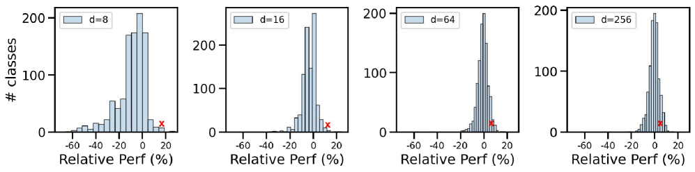
The image contains four bar charts comparing the distribution of relative performance (%) across four distinct 'd' values (8, 16, 64, 256). Each chart shows the frequency of classes (# Classes) at different relative performance levels, with a red "X" marker highlighting a specific data point in each distribution.
### Components/Axes
- **X-axis**: Relative Performance (%) ranging from -60% to +20% in 20% increments.
- **Y-axis**: Number of Classes (0–200) in 50-unit increments.
- **Legends**: Each chart is labeled with its corresponding 'd' value (e.g., "d=8", "d=16", etc.).
- **Red "X" Marker**: Positioned consistently at ~15% relative performance across all charts.
### Detailed Analysis
1. **d=8**:
- Peak frequency at 0% relative performance (~180 classes).
- Symmetric decline toward ±20%, with ~100 classes at -20% and ~20 classes at +20%.
- Red "X" at +15% (~10 classes).
2. **d=16**:
- Peak at 0% (~160 classes).
- Asymmetric distribution: ~80 classes at -20%, ~40 classes at +20%.
- Red "X" at +15% (~15 classes).
3. **d=64**:
- Peak at 0% (~140 classes).
- Narrower distribution: ~60 classes at -20%, ~30 classes at +20%.
- Red "X" at +15% (~20 classes).
4. **d=256**:
- Peak at 0% (~120 classes).
- Further narrowed distribution: ~40 classes at -20%, ~25 classes at +20%.
- Red "X" at +15% (~25 classes).
### Key Observations
- **Symmetry**: All distributions are roughly symmetric around 0% relative performance, except for d=16, which shows slight asymmetry.
- **Red "X" Consistency**: The red "X" marker is positioned identically at +15% across all charts, suggesting a standardized threshold or anomaly.
- **Trend with 'd'**: As 'd' increases, the peak frequency at 0% decreases slightly, and the distribution narrows, indicating reduced variability in relative performance for higher 'd' values.
### Interpretation
The data suggests that higher 'd' values correlate with more concentrated distributions of relative performance, centered at 0%. This could imply that larger 'd' values reduce variability in performance outcomes. The persistent red "X" at +15% across all charts may represent a critical performance benchmark or outlier threshold, warranting further investigation. The symmetry around 0% indicates balanced performance deviations, though the slight asymmetry in d=16 warrants exploration. The declining peak frequency with increasing 'd' might reflect diminishing class diversity or stricter performance constraints at higher 'd' values.