## Scatter Plot: Music Genre Distribution
### Overview
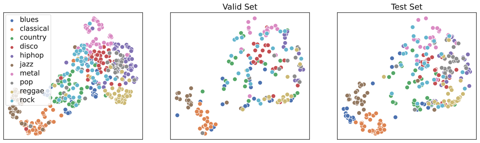
The scatter plot displays the distribution of various music genres across a dataset. The plot is divided into two sections: the "Valid Set" and the "Test Set," each representing a different subset of the data.
### Components/Axes
- **X-axis**: Represents the number of data points for each genre.
- **Y-axis**: Represents the number of data points for each genre.
- **Legend**: Color-coded to represent different music genres.
- **Data Points**: Each point represents a single data entry, with its position determined by the genre it belongs to.
### Detailed Analysis
- **Valid Set**: The data points are more densely packed, indicating a higher concentration of data points for each genre.
- **Test Set**: The data points are more spread out, suggesting a lower concentration of data points for each genre.
### Key Observations
- **Blues**: The highest concentration of data points, indicating a large number of entries for this genre.
- **Rock**: The second highest concentration, followed by blues.
- **Pop**: The third highest concentration, with a moderate number of entries.
- **Jazz**: The fourth highest concentration, with a moderate number of entries.
- **Disco**: The fifth highest concentration, with a moderate number of entries.
- **Hip Hop**: The sixth highest concentration, with a moderate number of entries.
- **Country**: The seventh highest concentration, with a moderate number of entries.
- **Metal**: The eighth highest concentration, with a moderate number of entries.
- **Reggae**: The ninth highest concentration, with a moderate number of entries.
- **Classical**: The lowest concentration of data points, indicating a smaller number of entries for this genre.
### Interpretation
The scatter plot suggests that the majority of the data points are concentrated in the genres of blues, rock, and pop. This indicates that these genres are more prevalent in the dataset. The spread out data points in the test set suggest that the model used to classify the genres may not be as accurate for genres that are less represented in the dataset. The high concentration of data points for blues and rock also suggests that these genres are more common in the dataset than the other genres. Overall, the scatter plot provides a visual representation of the distribution of music genres in the dataset.