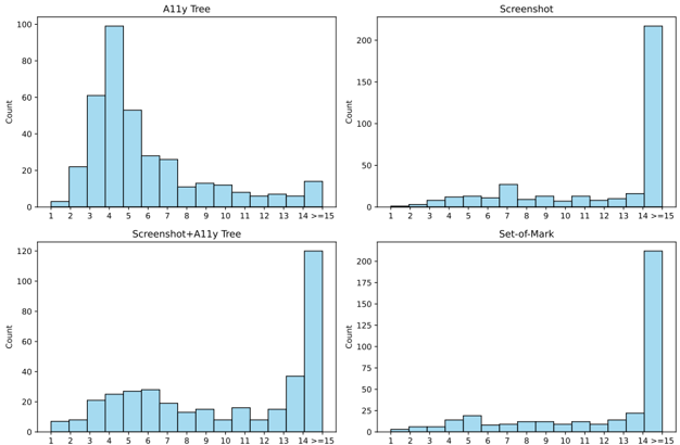
# Technical Data Extraction: Comparative Histograms of Data Modalities
This document provides a comprehensive extraction of data from a 2x2 grid of histograms. Each chart represents a different data modality or processing method, showing the distribution of a "Count" (y-axis) across a numerical range (x-axis).
## General Layout and Global Parameters
- **Image Type:** 2x2 Grid of Histograms.
- **Color Scheme:** Light blue bars with black outlines.
- **Y-Axis (All Charts):** Label: "Count". Scale varies by chart.
- **X-Axis (All Charts):** Numerical bins ranging from 1 to ">=15".
- **Language:** English.
---
## 1. Top-Left Chart: A11y Tree
**Trend Analysis:** This distribution is unimodal and right-skewed. It shows a significant peak at the value of 4, with a steady decline as values increase, followed by a minor uptick in the final ">=15" bin.
### Data Points (Approximate Counts)
| X-Value | Count (Approx.) |
| :--- | :--- |
| 1 | 3 |
| 2 | 22 |
| 3 | 61 |
| 4 | 99 |
| 5 | 53 |
| 6 | 28 |
| 7 | 26 |
| 8 | 11 |
| 9 | 13 |
| 10 | 12 |
| 11 | 8 |
| 12 | 6 |
| 13 | 7 |
| 14 | 6 |
| >=15 | 14 |
---
## 2. Top-Right Chart: Screenshot
**Trend Analysis:** This distribution is heavily skewed toward the maximum value. It shows very low frequency for values 1-13, with a massive spike in the ">=15" category, indicating that most data points in this modality fall into the highest bin.
### Data Points (Approximate Counts)
| X-Value | Count (Approx.) |
| :--- | :--- |
| 1 | < 5 |
| 2 | < 5 |
| 3 | 12 |
| 4 | 12 |
| 5 | 12 |
| 6 | 12 |
| 7 | 27 |
| 8 | 12 |
| 9 | 12 |
| 10 | 12 |
| 11 | 12 |
| 12 | 12 |
| 13 | 12 |
| 14 | 16 |
| >=15 | 218 |
---
## 3. Bottom-Left Chart: Screenshot+A11y Tree
**Trend Analysis:** This chart shows a hybrid distribution. It has a relatively flat "plateau" between values 3 and 7, followed by a significant spike in the ">=15" bin. It combines the mid-range density of the A11y Tree with the high-end concentration of the Screenshot modality.
### Data Points (Approximate Counts)
| X-Value | Count (Approx.) |
| :--- | :--- |
| 1 | 7 |
| 2 | 8 |
| 3 | 21 |
| 4 | 25 |
| 5 | 27 |
| 6 | 28 |
| 7 | 19 |
| 8 | 13 |
| 9 | 15 |
| 10 | 8 |
| 11 | 16 |
| 12 | 8 |
| 13 | 15 |
| 14 | 37 |
| >=15 | 120 |
---
## 4. Bottom-Right Chart: Set-of-Mark
**Trend Analysis:** Similar to the "Screenshot" chart, this distribution is dominated by the ">=15" bin. The values between 1 and 14 show a relatively uniform, low-frequency distribution with minor fluctuations.
### Data Points (Approximate Counts)
| X-Value | Count (Approx.) |
| :--- | :--- |
| 1 | < 10 |
| 2 | < 10 |
| 3 | < 10 |
| 4 | 14 |
| 5 | 19 |
| 6 | 12 |
| 7 | 12 |
| 8 | 12 |
| 9 | 12 |
| 10 | 12 |
| 11 | 12 |
| 12 | 12 |
| 13 | 12 |
| 14 | 22 |
| >=15 | 212 |
---
## Summary of Findings
* **A11y Tree** is the only modality where the majority of data points are concentrated in the lower-to-middle range (specifically around 4).
* **Screenshot** and **Set-of-Mark** are nearly identical in their distribution, with over 200 counts concentrated in the ">=15" bin.
* **Screenshot+A11y Tree** acts as a middle ground, retaining a higher count in the 3-7 range than the pure Screenshot method, but still peaking heavily at ">=15".