## Path Comparison: Optimal vs. Model
### Overview
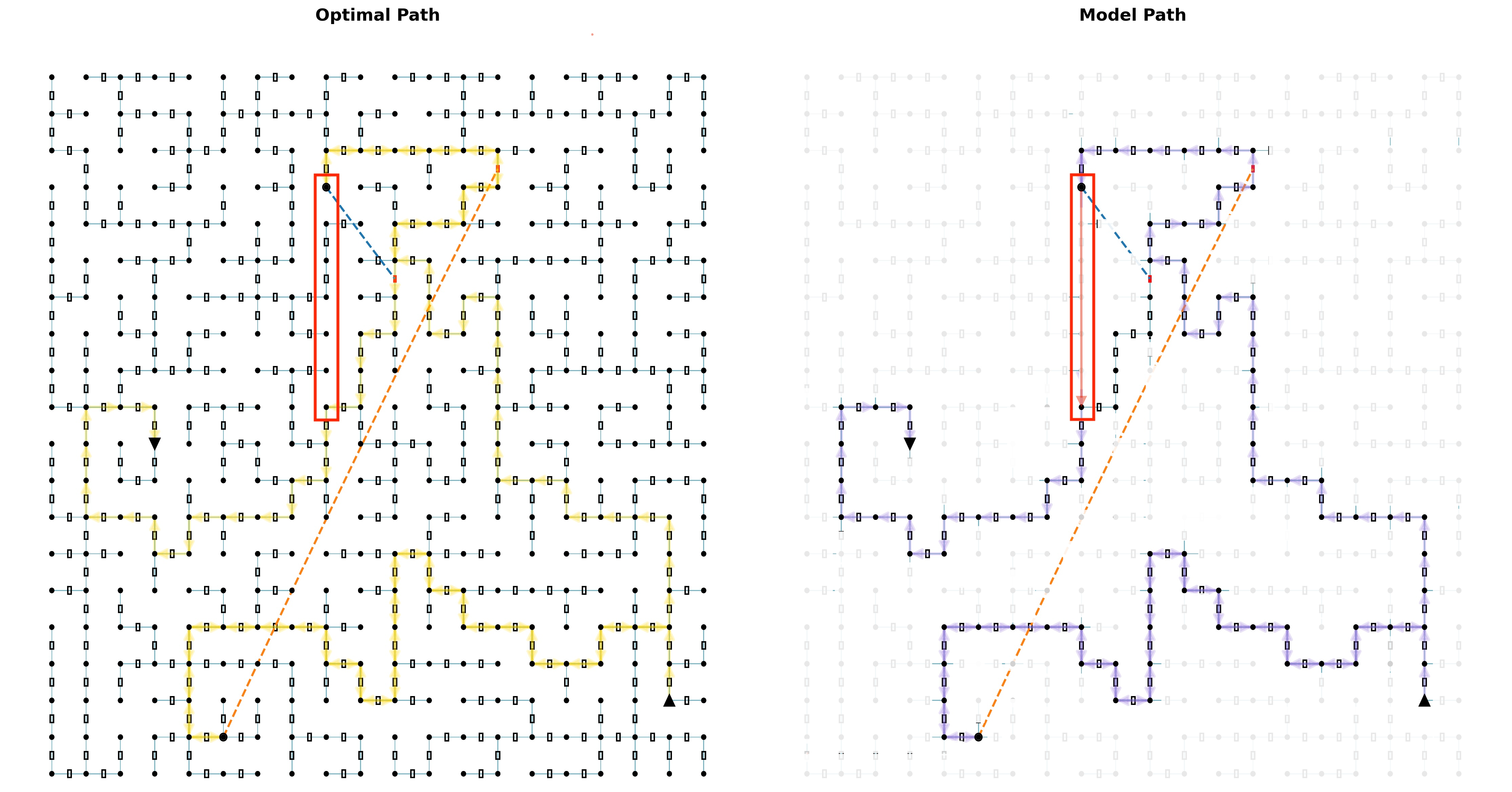
The image presents two diagrams side-by-side, visually comparing an "Optimal Path" and a "Model Path" through a grid-like structure. Each diagram depicts a maze-like network of interconnected nodes, with a designated start and end point. The paths taken through these networks are highlighted, and a red box emphasizes a specific region of interest in both diagrams.
### Components/Axes
* **Titles:**
* Left Diagram: "Optimal Path"
* Right Diagram: "Model Path"
* **Grid Structure:** Both diagrams share a similar grid-like structure, consisting of nodes (small circles) connected by lines. Each node has up to four connections (North, South, East, West).
* **Start and End Points:** Each diagram has a distinct start point (filled circle) and end point (filled triangle).
* Start point is located at the bottom-left.
* End point is located at the bottom-right.
* **Paths:**
* Optimal Path (Left): Highlighted in yellow.
* Model Path (Right): Highlighted in purple with arrows indicating direction.
* **Red Box:** A red rectangular box highlights a specific vertical section of the grid in both diagrams.
* **Dashed Lines:** Both diagrams contain a dashed orange line connecting the start and end points. A dashed blue line connects the path to the dashed orange line.
### Detailed Analysis
**Optimal Path (Left Diagram):**
* The optimal path, highlighted in yellow, appears to be the most efficient route through the grid.
* The path starts at the bottom-left and navigates through the grid, reaching the end point at the bottom-right.
* The dashed orange line represents a direct path from start to end.
* The dashed blue line connects the optimal path to the dashed orange line.
* The optimal path is mostly horizontal, with some vertical deviations.
**Model Path (Right Diagram):**
* The model path, highlighted in purple with arrows, represents a different route through the grid.
* The path starts at the bottom-left and navigates through the grid, reaching the end point at the bottom-right.
* The dashed orange line represents a direct path from start to end.
* The dashed blue line connects the model path to the dashed orange line.
* The model path is more circuitous and less direct than the optimal path.
* The arrows on the purple path indicate the direction of travel.
**Comparison:**
* The red box highlights a region where the optimal path takes a direct vertical route, while the model path deviates.
* The model path appears to be less efficient, taking a longer and more complex route compared to the optimal path.
### Key Observations
* The "Optimal Path" is more direct and efficient than the "Model Path."
* The red box highlights a key difference in path selection between the two approaches.
* The model path includes directional arrows, suggesting a step-by-step decision-making process.
### Interpretation
The image visually demonstrates the difference between an optimal solution and a potentially suboptimal solution generated by a model. The "Optimal Path" represents the most efficient route, while the "Model Path" represents a route that, while achieving the same goal, is less direct and potentially less efficient. The red box emphasizes a specific area where the model deviates from the optimal path, suggesting a potential area for improvement in the model's decision-making process. The dashed lines provide a visual reference for the direct distance between the start and end points, further highlighting the efficiency of the optimal path compared to the model path.