TECHNICAL ASSET FINGERPRINT
0eae67ce1bb93a09090b67b8
Click to view fullscreen
Press ESC or click to close
FOUND IN PAPERS
EXPERT: gemini-2.5-flash-free VERSION 1
RUNTIME: google-free/gemini-2.5-flash
INTEL_VERIFIED
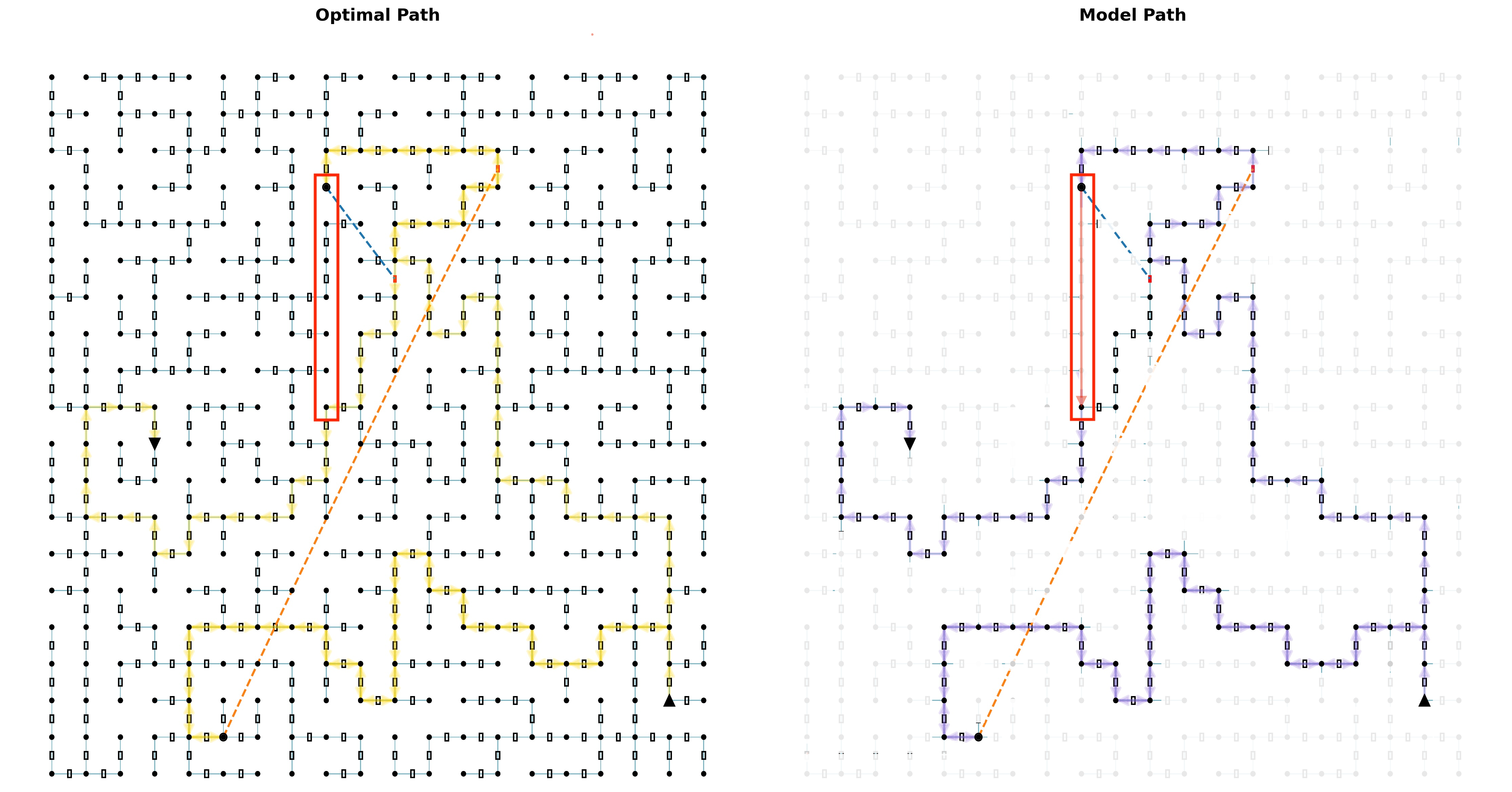
## Two Grid-based Path Diagrams: Optimal vs. Model Path
### Overview
The image presents two side-by-side grid diagrams, each illustrating a path from a designated start point to an end point. The left diagram, titled "Optimal Path," displays a path highlighted in yellow/orange. The right diagram, titled "Model Path," shows a path highlighted in purple. Both diagrams share an identical underlying grid structure, start/end points, and several reference lines, but the highlighted paths differ significantly, particularly in their interaction with a prominent red rectangular region. The grid in the "Model Path" diagram is faded compared to the "Optimal Path" diagram.
### Components/Axes
The image does not contain traditional axes or a formal legend, but elements are color-coded and positioned consistently across both diagrams.
**Common Elements in Both Diagrams:**
* **Grid Structure**: Both diagrams feature a visible grid composed of approximately 15 columns and 15 rows of nodes.
* **Nodes**: Represented by small black solid circles in the "Optimal Path" diagram and faded light grey circles in the "Model Path" diagram.
* **Segments**: Connections between adjacent nodes, represented by thin blue-green lines with small, empty rectangular boxes in their centers in the "Optimal Path" diagram, and faded light grey lines and boxes in the "Model Path" diagram.
* **Start Point**: A larger solid black circle, consistently located at approximately the 5th column from the left and the 14th row from the top (or 2nd row from the bottom) of the grid.
* **End Point**: A solid black upward-pointing triangle, consistently located at approximately the 14th column from the left and the 14th row from the top (or 2nd row from the bottom) of the grid.
* **Dashed Orange Line**: A straight, dashed orange line connecting the Start Point to the End Point, representing the direct Euclidean distance between them.
* **Dashed Blue Line**: A short, dashed blue line originating from a node within the red rectangular region (specifically, the node at the 5th column, 4th row from the top) and pointing diagonally downwards and rightwards towards the node at the 7th column, 5th row from the top.
* **Red Rectangle**: A prominent red rectangular outline highlighting a vertical column of grid segments. This rectangle spans from the node at the 5th column, 3rd row from the top, down to the node at the 5th column, 10th row from the top. It encompasses 7 vertical segments and 8 nodes.
* **Inverted Black Triangle**: A small, solid black inverted triangle, consistently located at the node at the 5th column, 7th row from the top.
**Specific Path Elements:**
* **Optimal Path (Left Diagram)**: Highlighted in a bright yellow/orange color, indicating the chosen route.
* **Model Path (Right Diagram)**: Highlighted in a distinct purple color, indicating the chosen route.
### Detailed Analysis
**Left Diagram: "Optimal Path"**
The grid is clearly visible with black nodes and blue-green segments.
* **Path Trend**: The yellow/orange "Optimal Path" starts at the black circle near the bottom-left. It initially moves rightwards, then zig-zags upwards and rightwards, making several turns. Crucially, it makes a significant detour to the right to completely bypass the region highlighted by the red rectangle. It then continues its upward and rightward progression, eventually reaching the black triangle at the bottom-right.
* **Interaction with Red Rectangle**: The "Optimal Path" does not enter or traverse any segment within the red rectangle. It passes to the right of this highlighted column.
* **Inverted Black Triangle**: The inverted black triangle is located on a node that is part of the grid but is *not* part of the yellow/orange "Optimal Path."
**Right Diagram: "Model Path"**
The underlying grid is faded to light grey, making the purple path more prominent.
* **Path Trend**: The purple "Model Path" starts at the black circle near the bottom-left. It also moves rightwards, then zig-zags upwards and rightwards. Unlike the "Optimal Path," it takes a more direct route through the central part of the grid.
* **Interaction with Red Rectangle**: The "Model Path" directly enters the red rectangle from its bottom (at the node at the 5th column, 10th row from the top), traverses vertically upwards through all 7 segments within the red rectangle, and exits at its top (at the node at the 5th column, 3rd row from the top). After exiting, it continues its zig-zag pattern towards the black triangle at the bottom-right.
* **Inverted Black Triangle**: The inverted black triangle is located on a node that is part of the grid and *is* part of the purple "Model Path."
### Key Observations
1. **Grid Visibility**: The "Optimal Path" diagram shows a fully visible, distinct grid, while the "Model Path" diagram features a faded, less prominent grid.
2. **Path Divergence**: The primary difference between the two diagrams is the route taken by the highlighted paths.
3. **Red Rectangle Interaction**: The "Optimal Path" explicitly avoids the red rectangular region, suggesting it represents an obstacle or high-cost area. In contrast, the "Model Path" directly traverses this region.
4. **Inverted Triangle Significance**: The inverted black triangle, located within the red rectangle, is *not* on the "Optimal Path" but *is* on the "Model Path," reinforcing the differing treatment of this region.
5. **Reference Lines**: The dashed orange (direct) and dashed blue (local connection) lines are identical in both diagrams, serving as consistent visual references.
### Interpretation
This image effectively illustrates a comparison between a theoretically "Optimal Path" and a "Model Path" generated by an algorithm or system.
The "Optimal Path" (yellow/orange) suggests that, under true or ideal conditions, the region marked by the red rectangle is either impassable or carries a very high cost for traversal. The path's significant detour around this area indicates that avoiding it, even if it means a longer physical route, results in a lower overall cost (e.g., time, resources, risk). The dashed blue line originating from within the red box, but not taken by the optimal path, could represent a potential but ultimately undesirable connection. The inverted black triangle being off the optimal path further emphasizes the undesirability of that specific node/region.
The "Model Path" (purple), by contrast, demonstrates that the underlying model perceives the environment differently. The model's path directly cuts through the red rectangular region. This implies that the model either:
1. **Does not recognize the obstacle**: It fails to identify the red rectangle as an impassable or high-cost zone.
2. **Assigns a lower cost**: It assigns a sufficiently low cost to traversing this region, making it appear as a more efficient shortcut compared to the longer detour.
3. **Has incomplete information**: The faded grid might visually suggest that the model operates with a less detailed or accurate understanding of the environment's constraints.
The discrepancy between the two paths highlights a potential flaw or limitation in the "Model Path" generation. The model's path, while appearing more direct visually, is likely sub-optimal in the context of the true environmental costs or obstacles represented by the red rectangle. This comparison is crucial for evaluating the accuracy and effectiveness of pathfinding models, especially in scenarios where certain regions might be dangerous, restricted, or simply more expensive to traverse. The image serves as a clear visual diagnostic tool for identifying where a model's understanding of an environment deviates from the optimal reality.
DECODING INTELLIGENCE...